Create Better Profile Backgrounds and Banners with AI Tools | Cliptics

I stared at my Twitter profile the other day and realized something embarrassing. My header image? Blank. Just that default blue void Twitter gives you when you can't be bothered. My LinkedIn banner wasn't much better. I think I uploaded something in 2019 and never looked at it again.
You know what's weird? I obsess over everything else online. The exact wording of my bio. Whether my profile picture makes me look approachable. But these massive banner images that take up half the screen when someone visits my page? I'd completely ignored them.
So I started wondering: what if I actually put some thought into this? Not hiring a designer or spending hours in Photoshop. Just creating something that felt like me without turning it into a whole production.
When Your Background Actually Says Something
Here's the thing about banner images that I didn't get before. Your profile picture is just your face. Generic. Everyone has one. But that background space? That's where you can actually show something about yourself.
I wanted to try making something abstract but warm. Not one of those inspirational quote images that scream "I read motivational books." Something with color and shape that suggested I care about visual stuff without being loud about it.
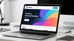
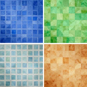
I played around with an AI image generator and described what I wanted. Warm oranges, some blues, geometric shapes that didn't look like a corporate PowerPoint. Within maybe two minutes I had something interesting.
When I actually put it up as my banner, people noticed. Not in a "wow you hired a designer" way. More like "oh, didn't know you were into that kind of thing." It started conversations I wasn't expecting.
What surprised me most? How specific you can get with this stuff now. You want something that shows you work in tech? Done. Love nature? Easy. Want bold colors because you're tired of minimalism? Go for it.
I watched someone use Cliptics' image generator to make a banner that matched their consulting business. They just described their vibe and got something usable in seconds. Their profile went from looking like a resume template to actually feeling like a real person worked there.
Making It Look Like Where You Actually Work
I got curious about something else. What if your profile background showed your actual workspace instead of some stock photo fantasy?
Most office photos online are absurd. Perfect desks. Perfect lighting. Zero evidence that anyone actually works there. I wanted something that felt real without looking messy or unprofessional.
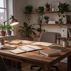
So I generated a home office scene. Books stacked on a desk. Plants on shelves. Warm lighting that suggested afternoon instead of that harsh fluorescent nonsense. The kind of space where work actually happens.

When I used this on a few platforms, something shifted. People asked about my setup. Conversations started differently. It gave them something concrete to respond to instead of just my job title.
You can do this for any kind of work. Design background with color swatches and sketches. Writing space with books and notebooks. Startup energy with motion and chaos. The tools let you get really specific about these details in ways that photographers can't always capture.
Looking Consistent Without Being Boring
This is where it gets interesting. Most people either use the exact same image everywhere, which feels lazy, or use nothing at all. I wanted a third option.
What if you could have the same visual idea across platforms but adapted for each one? Not forcing one image to fit everywhere. Actually regenerating it for different dimensions and contexts.
LinkedIn banners are wide and short. Twitter headers have different proportions. Instagram stories are vertical. Instead of cropping the same image awkwardly for each platform, I generated variations of the same core concept.
Same color palette. Same general vibe. Different executions for different spaces.
I tested this across LinkedIn, Twitter, Instagram, and my website. It created this subtle consistency that people noticed without being able to explain why. They'd see my LinkedIn, recognize the style, then see Twitter and immediately know it was me. Not because everything was identical. Because the aesthetic made sense together.
Permission to Change Your Mind
The best part of all this? You don't have to commit forever.
Used to be that creating a custom background meant hiring someone. Once you had it, you felt obligated to use it. Changing it meant spending more money and time. That pressure made people either overthink the first version or just give up entirely.
With AI generation, that whole anxiety disappears. You can make five different backgrounds in fifteen minutes. Try one. Live with it for a week. Notice what you like and what bugs you. Make another version.
I worried this freedom would make me overthink everything. Actually did the opposite. Knowing I could change it meant I stopped trying to make it perfect. I generated something, used it, learned from it, made something better.

By my third iteration I had something that genuinely felt right. Not because I planned it perfectly from the start. Because I experimented without pressure.
What Actually Matters Here
The thing that keeps surprising me is how accessible this has become. You don't need design skills. You don't need a budget. You just need an idea and a few minutes to try it out.
That blank space on your profile can actually say something now. It can change when you want it to change. It can reflect who you are instead of just being empty real estate or some default image you never bothered to replace.
I'm still playing with this. Still generating new versions when I get ideas. Still noticing how much difference it makes when someone lands on my profile and sees something that feels intentional instead of ignored.
Your profile background doesn't have to be complicated. It just has to be something instead of nothing. And now making it something is easier than it's ever been.