How to Use Cliptics' Animated Gradient Generator to Build | Cliptics

The first thing visitors see on your website determines whether they stay or bounce. An animated gradient hero section does something a static image can't: it creates the impression of life, of movement, of a site that's actively doing something. Done right, it signals quality before a single word is read.
I've been building hero sections for client sites for years, and the shift toward animated gradients in 2026 is real and measurable. Scroll-depth analytics consistently show longer engagement on pages with motion elements in the viewport. But getting a smooth, professional-looking gradient animation without writing complex keyframe CSS from scratch has always been the friction point.
Cliptics' Animated Gradient Generator solves that problem directly.
What Makes a Hero Gradient Actually Work
The difference between a gradient that looks professional and one that looks like 2008 MySpace is almost entirely in the choices: color count, transition speed, and direction.
Most beginners grab three or four colors that seem to work in isolation and are surprised when the animation looks muddy or harsh. The problem is usually chroma overload. Colors that are individually strong often fight each other in transition, especially when they're on opposite sides of the color wheel without a neutral bridge.
The second mistake is speed. A 2-second animation cycle feels frantic and cheap. 8 to 12 seconds feels intentional and high-end. The difference is the speed of luxury branding versus the speed of a clearance banner.
Direction matters too. Diagonal gradients (135deg) feel dynamic without being aggressive. Pure horizontal often looks like a loading bar. Pure vertical can feel static despite animating.
Step-by-Step: Building Your Hero Gradient in Cliptics
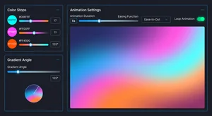
Open Cliptics Animated Gradient Generator and start with the color selection panel.
For a modern SaaS product feel, try this palette combination: deep indigo (#4F46E5), soft violet (#7C3AED), and a rose accent (#EC4899). These three work because the indigo and violet are close enough in hue to transition smoothly, while the rose creates a pop moment without a harsh jump.
Set your animation duration to 10 seconds. This is the sweet spot for most hero sections: noticeable enough to feel alive, slow enough to feel expensive.
Select your gradient angle. For full-width hero sections, 135 degrees works for most layouts. If your site is text-heavy on the left with a visual element on the right, try 115 degrees to direct the eye toward the center.
The generator outputs clean CSS that you can drop directly into your stylesheet.
The CSS You Get and How to Use It
Here's what the output looks like for that indigo-violet-rose combination:
.hero-gradient {
  background: linear-gradient(-45deg, #4F46E5, #7C3AED, #EC4899, #7C3AED);
  background-size: 400% 400%;
  animation: gradientShift 10s ease infinite;
}

@keyframes gradientShift {
  0% { background-position: 0% 50%; }
  50% { background-position: 100% 50%; }
  100% { background-position: 0% 50%; }
}
The background-size: 400% 400% is what makes the animation work. By making the gradient four times larger than its container and shifting the background position, you get smooth motion without actually redrawing anything, which keeps performance clean.
Apply this class to your hero section container and your text overlay will need a contrast check. Light text on these colors works well with a text-shadow: 0 2px 4px rgba(0,0,0,0.3) applied to ensure legibility across all animation states.
For Tailwind users, Cliptics also outputs a Tailwind CSS gradient generator format that drops directly into your config without custom CSS.
No-Code Setup for Webflow and Squarespace
If you're not working in code, the workflow is slightly different but equally achievable.
In Webflow: Create your hero section, add a div block as a background layer, apply the generated CSS through the custom code panel (Site Settings > Custom Code > Head Code). Target your hero class in the selector.
In Squarespace: CSS injection works through Design > Custom CSS. The gradient animation applies to any section you give the matching class name.
In both cases, test on mobile before publishing. Mobile GPUs occasionally struggle with large gradient animations on older devices, so add a fallback solid color for users on low-power mode:
@media (prefers-reduced-motion: reduce) {
  .hero-gradient {
    animation: none;
    background: #4F46E5;
  }
}
This is both good accessibility practice and good performance practice.
Performance Considerations
Animated gradients are GPU-composited in modern browsers, which means they're generally cheap from a CPU perspective. But a few things can cause performance degradation.
Avoid animating gradients on elements that also have box-shadow or filter effects applied. The combination forces the browser to do additional compositing work. If you need a shadow on your hero section, apply it to an absolutely-positioned pseudo-element instead of the gradient element itself.
Large gradient areas on mobile also benefit from will-change: transform applied to the element, which signals to the browser to optimize the layer ahead of time.
When to Use the Gradient Maker Instead
The Animated Gradient Generator is optimized for full-section backgrounds and overlay designs. For UI elements like buttons, cards, or icon backgrounds, Cliptics Gradient Maker gives you more granular control over static gradient stops and directions.
The distinction matters for workflow efficiency. Hero animations need the extended color range and animation parameters that the generator provides. Component-level gradients usually need precise static color stops that you can fine-tune visually.
What Great Hero Sections Have in Common
The animated gradient is the foundation, not the finished product. Every high-performing hero section I've analyzed in 2026 shares a few characteristics beyond the visual treatment.
The headline is single-minded. One idea, clearly stated, in under eight words. The gradient draws attention; the headline must keep it.
The call-to-action button uses contrast to stand out from the gradient, not compete with it. A white button with dark text on an animated gradient almost always outperforms a colored button trying to work with the gradient palette.
And the overall composition breathes. Crowded hero sections with multiple competing elements neutralize the impact of any visual treatment, including the best gradient animation you can build.
Start with the gradient, build the space around it, and let the animation do its job. The result is a first impression that earns the scroll.