Animated Gradients Without JavaScript: Pure CSS Tutorial | Cliptics
The first time I saw a smoothly animated gradient background, I assumed it required complex JavaScript animation libraries.
Then I looked at the code and found about 15 lines of pure CSS. No frameworks. No JavaScript at all. Just CSS animations doing what they do best.
That moment changed how I think about web animation. We tend to reach for JavaScript immediately when we want things to move, but CSS animations are incredibly powerful for certain effects. Animated gradients are one of those perfect use cases where CSS alone creates something that looks sophisticated but is remarkably simple under the hood.
Why Animated Gradients Work So Well
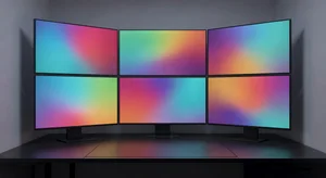
There's something mesmerizing about gradients in motion. They add depth and interest without being distracting. They create ambiance that makes interfaces feel more polished and modern.
I've used animated gradients for hero sections that needed visual interest without competing with content. Landing pages where the background needed to feel dynamic but not overwhelming. Loading states that looked better than spinning circles. Card hover effects that added subtle delight.
The beauty of pure CSS gradients is performance. The browser's rendering engine handles CSS animations efficiently, using GPU acceleration automatically in most cases. JavaScript-based gradient animations often struggle with smoothness, especially on lower-end devices. CSS animations just work.
Plus, they're accessible by default. CSS animations respect the prefers-reduced-motion media query, automatically respecting user preferences for reduced animation. You don't need to write extra JavaScript to handle accessibility, it's built into how CSS animations work.
The Core Technique
The fundamental approach is simpler than you might expect. You create a gradient that's larger than the container, then animate its position.
Here's the basic structure. Define a background with linear or radial gradient. Make it bigger than the element, typically 200% to 400% of the container size. Use CSS keyframes to animate the background-position property, shifting the gradient over time.
The browser handles the interpolation between positions smoothly. You define the start and end states, the animation duration, and the timing function. The rendering engine does the actual animation work.
What makes this work well is that background-position animation is relatively cheap performance-wise. The browser can optimize it effectively. Compare that to animating individual color values, which triggers more expensive calculations.
Building Your First Animated Gradient
Let me walk through creating a basic animated gradient from scratch.
Start with your color palette. Pick 3 to 4 colors that work well together. Too few and the animation feels boring. Too many and it looks chaotic. I usually work with colors that share similar saturation and lightness values to keep transitions smooth.
Create the gradient itself. A diagonal linear gradient works well for most cases. Something like linear-gradient at 45 degrees through your color stops. Make the background-size 200% or more so there's room to animate.
Define your keyframes. At 0%, set background-position to one corner. At 50%, move to the opposite corner. At 100%, return to the starting position. This creates a loop that feels natural.
Apply the animation to your element with a duration that feels right. Too fast and it's jarring. Too slow and it feels sluggish. I find 8 to 15 seconds works well for background animations. Use ease-in-out timing function for smooth transitions.
Set animation-iteration-count to infinite so it loops continuously. Add animation-direction alternate to make it reverse smoothly rather than jumping back to the start.
That's the basic pattern. From there, you can customize endlessly.
Advanced Techniques That Add Polish
Once you understand the basics, several techniques can make your gradients more interesting.
Multiple gradient layers create depth. Stack two or three gradients with different animations at different speeds. Use CSS blend modes like multiply or screen to combine them visually. This creates complex, organic-feeling motion from simple animations.
Radial gradients instead of linear create different effects. A radial gradient animating from the center outward feels more like a pulse. Animating background-size along with background-position creates a breathing effect.
Color stop animation adds another dimension. Instead of just moving the gradient, you can animate the color stop positions themselves. This changes how the colors blend and transition over time.

Hue rotation creates continuous color shifts. Use the filter hue-rotate property with animation to shift all the colors through the spectrum. Combined with a gradient, this creates evolving color combinations without defining every state explicitly.
Pseudo-elements for complex effects let you animate multiple gradient layers independently. Put one gradient on the element itself, another on its before pseudo-element, maybe a third on after. Animate each differently for complex, layered motion.
Performance Considerations That Actually Matter
Animated gradients are relatively performant, but there are ways to make them even better.
Use transform and opacity for additional animations instead of other properties. If you're combining gradient animation with other effects, keep the other animations on GPU-accelerated properties. Transform and opacity are safe. Width, height, and margin are not.
Limit the number of color stops. Each color stop is another calculation for the browser. 3 to 5 stops usually creates smooth gradients without unnecessary overhead. More than that rarely looks better and definitely costs more performance.
Apply will-change: background-position to hint the browser about upcoming animations. This lets the browser optimize for that specific property. Don't overuse will-change, only apply it to elements that actually animate.
Consider using conic gradients for certain effects. They can create similar visual effects to radial gradients but sometimes perform slightly better depending on the specific animation.
Test on mobile devices and lower-end hardware. What runs smoothly on a powerful laptop might stutter on a phone. If you notice performance issues, reduce the animation duration slightly or simplify the gradient.
Common Mistakes I See Repeatedly
After reviewing countless gradient setups, certain problems show up over and over.
Animating background-color or gradient colors directly is the most common mistake. This forces the browser to recalculate colors at every frame, which is expensive. Animate position instead and let the browser optimize.
Using too many color stops creates gradients that look muddy when animated. Fewer, more distinct colors typically look better in motion than lots of subtle transitions.
Forgetting about contrast makes text unreadable. Animated backgrounds need to maintain sufficient contrast with foreground content throughout the animation. Either keep the gradient subtle or overlay a semi-transparent layer to ensure readability.
Not respecting prefers-reduced-motion accessibility. Always wrap animations in a media query that checks for this preference. Users who need reduced motion should see a static gradient instead.
Making the animation too fast creates distraction. Background animations should be subtle. If users notice the motion more than the content, slow it down.
Practical Use Cases
I've used animated gradients successfully in several specific scenarios.
Hero sections benefit from subtle background animation. It adds visual interest to what would otherwise be static space. Keep the motion slow and gentle so it enhances rather than competes with headlines and CTAs.
Loading states and skeleton screens feel more alive with animated gradients. Instead of a static gray placeholder, a gentle shimmer effect shows the user that something is happening. This is the same effect you see in apps like Facebook and LinkedIn.
Card hover effects can use gradient animation to indicate interactivity. When a user hovers over a card, a gradient animation draws attention without being heavy-handed about it.
Button states sometimes work well with subtle gradient shifts. Not every button needs this, but for primary CTAs, a gentle background animation can make them feel more premium.
Section dividers and decorative elements are perfect for more experimental gradient animations. These non-critical design elements can be bolder since they don't compete with content.
Tools That Speed Up The Process
While understanding the code is essential, tools can dramatically speed up iteration and experimentation.
Gradient generators like the animated gradient generator let you visually design gradients and see the animation in real time. Adjust colors, positions, animation timing, all with immediate visual feedback. Copy the final CSS when you're satisfied.
The CSS gradients tool helps with building the base gradient before you add animation. Get the color stops and angle right, then take that gradient and animate it.
These tools are particularly valuable when you're exploring different color combinations. It's faster to try twenty variations visually than to hand-code and preview each one.
I typically start in a generator to explore options quickly, then refine the code by hand to optimize for the specific use case. The generator gets me 80% there, manual refinement handles the last 20%.
Browser Support and Fallbacks
In 2026, CSS gradient animation support is essentially universal. All modern browsers handle it smoothly.
The one consideration is older browsers that still exist in some enterprise environments. For these, provide a static gradient as the fallback. The background property naturally falls back to earlier declarations if the browser doesn't support later ones.
Progressive enhancement is straightforward here. Define a solid color first, then a static gradient, then the animated gradient. Browsers use the most advanced version they support, older browsers get something that still looks fine.
The prefers-reduced-motion media query is well supported now too. Wrapping animations in a query that checks for no-preference ensures accessibility without extra effort.
What Makes Gradients Feel Smooth
There's a subtle art to making gradient animations feel right rather than mechanical.
Timing functions matter enormously. Linear timing feels robotic. Ease-in-out creates more natural acceleration and deceleration. Cubic bezier curves let you fine-tune the exact feel.
Animation duration affects perception. Very fast animations feel energetic but can be tiring. Very slow animations create calm but might not be noticed. I find 10 to 15 seconds hits a sweet spot for background animations.
Color relationships determine how smooth transitions feel. Colors that are too different create jarring shifts. Colors that are too similar create boring animation. Adjacent colors on the color wheel typically transition smoothly.
Direction and movement should feel purposeful. Random directions feel chaotic. Consistent directional movement feels intentional and polished.
Where This Technique Fits in Modern Design
Animated gradients had a moment of being overused, then a backlash, and now they've settled into being a useful technique when applied appropriately.
They work well in contexts where visual interest is needed but content is minimal. Landing pages, coming soon pages, authentication screens. Places where the background has room to shine without competing.
They're less appropriate for content-heavy pages where readability is paramount. Blog posts, documentation, detailed product pages. The animation becomes distraction rather than enhancement.
The trend toward subtle, sophisticated gradients with slow animation feels more mature than the aggressive, fast-moving gradients that were popular a few years ago. Restraint makes the technique more versatile.
What I Keep Coming Back To
After building hundreds of gradients, both static and animated, what stands out is how much impact you can create with relatively simple code.
15 to 20 lines of CSS can transform a bland background into something that feels premium and polished. That's a remarkable return on investment for such a small amount of code.
The key is restraint. Animated gradients are like seasoning, a little enhances everything, too much ruins it. Use them where they add value, skip them where they don't.
And when you're experimenting with options, use tools like the animated gradient generator to iterate quickly. There's no point hand-coding twenty variations when you can explore them visually in minutes.
The web has gotten really good at beautiful, performant animation without JavaScript. That's worth taking advantage of.