Color Psychology in E-commerce: How to Use Cliptics | Cliptics
In 2024, a DTC skincare brand changed their add-to-cart button from blue to a specific warm coral color. Nothing else changed. Same copy, same price, same product photos. Conversion rate went up 19%. That's not marketing mythology, that's color psychology at work in a controlled environment.
The relationship between color and buying behavior is one of the most documented phenomena in retail and consumer psychology. Understanding the mechanisms behind it and knowing how to set up the findings in your store design is the difference between guessing and building with intent.
Why Color Moves People Toward or Away From Purchase
Color perception triggers emotional responses faster than conscious thought. This isn't metaphorical: the visual cortex processes color information and routes it to the amygdala (emotional processing center) before the prefrontal cortex has time to form a deliberate opinion.
This means customers are making emotional assessments of your store before they've read a word of copy or evaluated your price point. The color palette signals: can I trust this? Is this for someone like me? Does this feel like quality?
For ecommerce specifically, three color-psychology principles have the most consistent impact on purchase behavior.
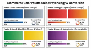
Trust establishment: Blue tones (particularly mid-range blues, not electric or neon) consistently register as trustworthy across cultures. This is why so many financial services, technology brands, and healthcare adjacent ecommerce sites use blue as their primary palette color. PayPal, Visa, healthcare supplement brands. The association is established and reliable.
Urgency and action: Red and orange create measurable physiological arousal: slightly elevated heart rate, heightened attention. This is why clearance sections, sale banners, and countdown timers reliably use red. It works biologically, not just conventionally.
Premium and exclusivity: Black, deep navy, gold, and platinum tones read as premium. The challenge with these palettes is that they can feel cold or exclusionary without careful balance against warm accent colors or high-quality photography.
Building Your Conversion Palette in Cliptics
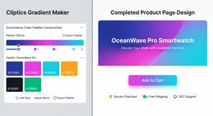
Start at Cliptics Gradient Maker. The tool is the right place to test palette combinations visually because you can see how colors work together at scale rather than evaluating swatches in isolation.
For an ecommerce site targeting the mid-to-premium market, try this combination: a deep forest green primary (#2D6A4F), warm gold accent (#D4A847), and clean warm white for backgrounds (#FAFAF8). This combination signals both trust (green association: safety, growth) and quality (gold accent), while the warm white prevents the cold clinical feeling that pure white sometimes carries.
Use Cliptics Color Picker Tool to extract color values from competitor sites or aspirational brands in your category. Identify what successful brands in your space are doing, then deliberately choose to echo their trust signals or deliberately differentiate.
Convert any hex values you're working with using the Hex to RGB Converter, which matters if your store platform requires RGB values for design elements.
The Checkout Funnel Color Strategy
The color palette that builds trust on your homepage serves a different function than the color that drives action at checkout. The most sophisticated ecommerce sites use this distinction deliberately.
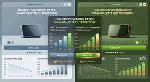
Browsing phase: warmer, inviting tones that create a positive emotional state. Think of how a physical store uses ambient lighting, not fluorescent, not spotlights. The digital equivalent is a palette that feels comfortable rather than urgent.
Product page: introduce your action color on the add-to-cart button. This is where urgency-triggering colors earn their place. A warm orange or vibrant green button on a more neutral product page background creates a visual hierarchy that directs the eye.
Checkout: shift to trust-signaling. Introduce blue or green accent tones in the security indicators, form field borders, and progress indicators. Customers are entering payment information and every cue that signals safety matters.
This isn't about using three completely different palettes. It's about knowing which colors to foreground at each stage.
Gradient Applications That Work in Ecommerce
The most effective gradient uses in ecommerce are subtle. A gradient that loudly announces itself as a design choice distracts from the product. The gradients that convert are the ones that create atmosphere without drawing attention to themselves.
Hero section gradient: a subtle direction from your primary brand color to a slightly lighter or complementary tone. This creates depth without competing with the product. Try a 3-5% opacity gradient overlay on product imagery hero sections rather than a full-color gradient behind the image.
Category section backgrounds: alternating between white and a very light tint of your primary color creates visual breathing room in long category pages without requiring significant design work.
Button gradients: a subtle gradient on primary CTA buttons (lighter shade of the button color in the upper-left corner, base color in the lower-right) adds visual dimension and often outperforms flat buttons in A/B tests, though this varies by brand style.
Colors That Consistently Underperform
Some color choices reliably hurt conversion, not through any inherent wrongness but through specific associations they carry in purchase contexts.
Neon or highly saturated colors as primary palette colors: they read as discount or novelty rather than quality. Strong neons work as accent colors in very specific brand contexts but almost never as primary palette choices.
Complex multi-color palettes: four or more distinct colors in active use create visual confusion that slows decision-making. The decision fatigue research in consumer psychology suggests that visual complexity reduces purchase confidence. Simpler palettes consistently outperform complex ones in ecommerce contexts.
Gray as a sole background palette: medium gray reads as uncertainty and indecision. It's not the clean neutrality of white or the warmth of off-white. Ecommerce sites built primarily on gray palettes tend to have lower engagement metrics, though this is confounded by the fact that gray-palette sites often have other design issues.
Testing Your Color Decisions
Psychology research provides priors, not certainties. Your specific audience, product category, and brand positioning create context that modifies the general findings.
The right approach: use the psychology research to make informed starting choices, then A/B test your most important color decisions. Primary button color, trust badges, checkout page accents. Run clean tests with a single variable and meaningful traffic volumes.
Tools like Google Optimize (or its successors) let you test color variations without developer resources. Set up the test, let it run for statistical significance (typically 1-2 weeks with decent traffic), and let the data confirm or override the psychology prediction.
The skincare brand that got the 19% lift from a button color change had enough traffic to test and confirm. Without testing, that was one data point in a sea of possibilities. With testing, it became a confirmed business result. The palette you build using color psychology principles is your informed hypothesis. Testing is how you confirm it works for your specific customers.
Start with what the research suggests. Test to confirm. And recognize that color is one element in a larger conversion system. A beautifully designed palette can't overcome poor product photography, weak copy, or a checkout process with unnecessary friction. Color is the first impression. The rest of the experience has to hold up.