Color Tools Every Designer Needs: RGB, HEX, HSL Converters | Cliptics
I spent three hours last Tuesday trying to match a brand color across two different design tools. Three hours. The hex code looked right, the RGB values seemed right, but something was just barely off on screen. That frustrating little gap between "close enough" and "exactly right" is something every designer knows intimately.
It got me thinking about how much of our creative time actually goes toward wrangling color values rather than making design decisions. And honestly, having the right color tools within reach changes everything. Not in some dramatic way. In that quiet, cumulative way where small efficiencies add up to hours saved every week.
So I wanted to put together something I wish I'd had when I started: a thoughtful, practical guide to the color tools that actually matter for working designers.
Understanding the Three Color Languages
Before jumping into tools, it helps to sit with why we even have multiple color systems. RGB, HEX, and HSL aren't competing standards. They're different lenses for looking at the same thing.
RGB (Red, Green, Blue) speaks the language of screens. Every pixel you see is a combination of red, green, and blue light mixed at various intensities from 0 to 255. When you write rgb(66, 135, 245), you're telling the screen exactly how much of each primary light to emit. It's precise. It's literal. And it maps directly to how displays physically work.
HEX is really just RGB wearing a different outfit. That familiar #4287f5 notation encodes the same red, green, and blue values in hexadecimal format. Designers gravitate toward hex because it's compact and universally understood in CSS. You can paste it into Figma, drop it in code, share it in a Slack message. It's become the common tongue of digital color.
HSL (Hue, Saturation, Lightness) is where things get interesting from a design perspective. Instead of describing color as a mix of lights, HSL describes it the way humans actually think about color. Hue is the color itself, measured in degrees around a color wheel (0 to 360). Saturation is how vivid or muted it is. Lightness is how bright or dark. When a client says "can you make that blue a little more muted?", they're speaking HSL without knowing it.
The real power comes from moving fluidly between all three. A color code converter that handles RGB, HEX, and HSL simultaneously lets you think in whichever system matches the task at hand.
Why Converters Are More Than Convenience
Here's something I didn't appreciate early in my career. Color conversion isn't just about translating values. It's about maintaining intent across contexts.
When you pick a perfect blue in a design tool, that color needs to survive its journey into code, into email templates, into brand guidelines, into social media assets. Each destination might prefer a different format. Your CSS might want hex. Your animation library might want RGB. Your design tokens might store HSL so that generating color variations is simpler.
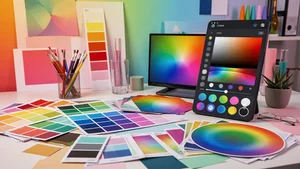
A reliable RGB to HEX converter handles this smoothly. But what separates a good converter from a great one is the ability to see all formats at once, to copy with a single click, and to maintain a history of recent conversions. Those small details respect the reality of how designers actually work: quickly, iteratively, jumping between tools.
I've watched designers manually calculate hex values from RGB. I've seen people open Photoshop just to use its color picker for a conversion. These aren't failures of knowledge. They're failures of having the right tool at the right moment. Cliptics built their color picker tool specifically for this kind of workflow, where you need accurate conversions without leaving your browser or breaking your creative momentum.
The Art and Science of Gradients
Gradients have had quite a journey in design. From the heavy, glossy gradients of early web design to the flat revolt against them, and now back to subtle, sophisticated uses in modern interfaces. Understanding gradient tools is worth some genuine attention.
A good gradient maker does more than blend two colors together. It gives you control over the transition curve, the angle, the number of color stops, and the type (linear, radial, conic). These controls matter because the human eye is remarkably sensitive to color transitions. A gradient that shifts too abruptly between warm and cool tones creates a muddy middle that feels wrong even if you can't articulate why.
One technique I keep coming back to is building gradients in HSL space rather than RGB. When you transition between two colors in RGB, the intermediate values can pass through unexpected muddy tones. In HSL, you can keep the saturation and lightness consistent while rotating the hue, which often produces more natural, pleasing transitions.
The practical application goes beyond backgrounds and hero sections. Gradients in data visualization help convey magnitude. Gradient overlays on images create consistent text readability. Gradient borders add depth without heavy shadow effects. Having a gradient tool that outputs clean CSS you can copy directly into your stylesheet saves the back and forth that slows projects down.
Building a Color System That Scales
Individual color conversions solve immediate problems. But if you're working on anything beyond a single page, you need to think in systems.
This is where HSL really shines. Once you have a base color defined as an HSL value, generating a consistent palette becomes almost mathematical. Need a lighter variant for hover states? Increase lightness by 10%. Need a muted version for disabled elements? Reduce saturation by 30%. Need a complementary accent? Shift the hue by 180 degrees.
Design tokens built on HSL values make theme switching straightforward. Dark mode isn't a separate color palette; it's a transformation of lightness values. Brand color updates don't require hunting through thousands of hex codes; they require changing a few base hue values and letting the system recalculate.
This systematic approach also makes accessibility easier to manage. WCAG contrast ratios depend on relative luminance, and while luminance isn't identical to HSL lightness, working in lightness terms gives you intuitive control over contrast. You can quickly assess whether your text will be readable against a background by comparing their lightness values as a starting point.
Practical Workflow Recommendations
After years of watching my own habits and talking with other designers, here's what I've landed on as a workflow that actually sticks.
Start every project by defining your core palette in HSL. Use a color picker to find your base hues, then build out the scale of tints and shades systematically. Document the hex values for your development team, since hex remains the most universally understood format in code reviews and handoff documents.
Keep a color converter bookmarked and accessible. Not buried in a tab somewhere. Right there, a keyboard shortcut away. The moment converting a color requires more than five seconds, you'll start approximating instead. Approximating leads to inconsistency. Inconsistency leads to three hours on a Tuesday trying to figure out why two blues don't match.
Use gradient tools to prototype color transitions before building them in code. The visual feedback loop is faster than tweaking CSS values and refreshing a browser. Once you have something that works, grab the CSS output and move on.
What I Keep Coming Back To
Color is one of those areas in design where the gap between knowing the theory and having practical tools makes a real difference. You can understand color science deeply and still lose time to clunky workflows. You can be a beginner and work efficiently with the right tools in reach.
What matters most is reducing the friction between having a color idea and executing on it. Whether that means converting a brand hex code to RGB for an animation, picking the perfect gradient for a hero section, or building an entire design system from a handful of base hues, the tools should get out of your way and let you focus on the creative decisions that actually matter.
That's what good color tools do. They don't make you a better designer. They stop you from being a slower one.