CSS Animation Performance: Optimizing for 60fps | Cliptics

My first CSS animation attempt looked smooth on my MacBook Pro and janky as hell on actual user devices.
Stuttering, frame drops, animations that made the whole page lag. I learned the hard way that what works on a developer machine doesn't necessarily work for real users.
Here's how to actually get smooth 60fps CSS animations that perform well everywhere.
Why Most CSS Animations Are Slow
Animating the wrong properties. If you're animating width, height, top, left, or margin, you're forcing the browser to recalculate layout every frame.
Layout recalculation is expensive. It kills performance on slower devices instantly.
Not using GPU acceleration. The browser can offload animations to the GPU for way better performance, but only for certain properties.
Too many elements animating at once. Each animation takes processing power. Stack too many and you overwhelm the browser.
The Properties That Actually Perform
Transform and opacity are the only properties you should animate if you care about performance.
Transform lets you move, scale, and rotate elements. Opacity fades them in and out. Together these cover 90% of animation needs.
The browser can optimize these properties in ways it can't optimize others. They run on the GPU, they don't trigger layout or paint, they're smooth.
The Will Change Hint
Adding will-change: transform; to an element tells the browser to optimize it for animation before the animation starts.
This pre optimization prevents janky first frames when animation begins.
But don't put will change on every element. It uses extra memory. Only use it on elements you're actually going to animate.
Reducing Animation Scope
Animate fewer elements. Five smoothly animating elements beats twenty janky ones.
Use simpler easing functions. Complex cubic bezier curves require more calculation than linear or ease in out.
Keep animation duration reasonable. Long complex animations are harder for the browser to maintain at 60fps.
The Layer Promotion Trick
Browsers create compositing layers for certain elements. Animated elements should be on their own layer for best performance.
Adding transform: translateZ(0); or will change: transform; promotes an element to its own layer.
Layers can be animated by the GPU without affecting the rest of the page.
Testing on Slow Devices
Your development machine is probably way faster than most user devices.
Test on actual phones. Old phones if possible. If it's smooth there, it'll be smooth everywhere.
Use Chrome DevTools CPU throttling to simulate slower devices. Set it to 4x slowdown and see if your animations still hit 60fps.
Avoiding Jank From JavaScript
If JavaScript blocks the main thread, your CSS animations will stutter even if they're perfectly optimized.
Keep JavaScript work light. Long running scripts pause animations.
Use requestAnimationFrame for any JavaScript based animations. Never use setInterval or setTimeout for animation.
The Hardware Acceleration Problem
Forcing GPU acceleration on every element sounds like a good idea but actually wastes memory and can make things worse.
Only promote animated elements to their own layers. Leave static elements alone.
Too many compositing layers uses more memory than the performance benefit is worth.
Specific Optimization Techniques
Use transform: translate() instead of position: relative with top/left changes.
Use transform: scale() instead of animating width and height.
Use opacity transitions instead of visibility or display changes.
Combine transforms in one property: transform: translateX(100px) scale(1.2) rotate(45deg);
Measuring Actual Performance
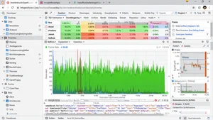
Open Chrome DevTools performance tab. Record while your animation runs. Look at the FPS meter.
60fps is the goal. Anything below 30fps feels noticeably janky.
Check for long tasks that block the main thread. These cause animation stutters.
When CSS Animations Aren't Enough
Complex timeline animations with many steps might need JavaScript animation libraries.
Animations that respond to user input or dynamic data need JavaScript control.
Very complex easing or physics simulations are better handled by JavaScript.
But for simple transitions and keyframe animations, CSS is faster and smoother than JavaScript.
My Current Approach
I only animate transform and opacity properties. If I need something else animated, I find a way to achieve the visual effect using these two.
I use will change sparingly. Only on elements where I noticed first frame jank.
I test every animation on an old phone before shipping. If it stutters there, I simplify until it doesn't.
I keep animations under two seconds usually. Short snappy animations are easier to optimize than long elaborate ones.
CSS animations can be incredibly smooth when you work with the browser instead of against it. Stick to transform and opacity, promote animated elements to their own layers, test on slow devices, and you'll hit 60fps consistently.