CSS Gradient Generator: Create Beautiful Website | Cliptics
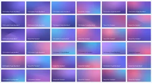
There is something about a good gradient that makes a website feel alive. Solid color backgrounds look flat. Single images can feel heavy. But a gradient? A well crafted gradient adds depth and movement without any performance cost. And the best part is you do not need to be a design expert to create one.
I have spent more time than I care to admit tweaking gradient values by hand, refreshing the browser, adjusting hex codes by one character, refreshing again. It was painful. Then I discovered visual CSS gradient generators and everything changed. What used to take twenty minutes of guess and check now takes about ten seconds.
Let me walk you through everything you need to know about CSS gradients, from the basics to animated effects, with code you can copy and paste right into your projects.
Understanding CSS Gradients
CSS supports three types of gradients: linear, radial, and conic. Each one creates a different visual effect, and knowing when to use which type is half the battle.
Linear gradients flow in a straight line from one color to another. They are the most common type and work well for backgrounds, buttons, and section dividers. The syntax is straightforward:
background: linear-gradient(135deg, #667eea 0%, #764ba2 100%);
That gives you a diagonal purple flow that looks polished on almost any element. The 135deg controls the angle. Zero degrees goes bottom to top, 90 degrees goes left to right, and 135 degrees creates that popular diagonal sweep.
Radial gradients expand outward from a center point. They are perfect for spotlight effects, glowing buttons, or creating depth behind content:
background: radial-gradient(circle at 30% 50%, #00d2ff 0%, #3a47d5 100%);
The circle at 30% 50% part positions the gradient center slightly left of middle, which creates an asymmetric look that feels more natural than a perfectly centered glow.
Conic gradients rotate around a center point like a color wheel. They are newer and less common but produce striking effects:
background: conic-gradient(from 45deg, #ff6b6b, #feca57, #48dbfb, #ff9ff3, #ff6b6b);
Building Multi Stop Gradients
Single color transitions are clean, but multi stop gradients give you much more control. You can create complex color stories by adding multiple color stops with precise positions:
background: linear-gradient(
  to right,
  #0f0c29 0%,
  #302b63 35%,
  #24243e 70%,
  #0f0c29 100%
);
This creates a dark purple vignette effect that works beautifully as a hero section background. The key is keeping color stops close in hue. Jumping from red to green to blue creates muddy midpoints. Staying within a color family produces smooth, professional results.
A quick trick: use a CSS gradient tool to visually preview your stops before committing to the code. It saves enormous amounts of time compared to manual tweaking.
Gradient Patterns That Actually Work
After building hundreds of gradient backgrounds, certain combinations come up again and again because they just work. Here are the ones I reach for most:
The Sunset Hero:
background: linear-gradient(135deg, #f093fb 0%, #f5576c 50%, #4facfe 100%);
The Dark Mode Section:
background: linear-gradient(180deg, #0c0c1d 0%, #1a1a2e 50%, #16213e 100%);
The Fresh CTA Button:
background: linear-gradient(90deg, #43e97b 0%, #38f9d7 100%);
border-radius: 8px;
The Glassmorphism Base:
background: linear-gradient(135deg, rgba(255,255,255,0.1) 0%, rgba(255,255,255,0.05) 100%);
backdrop-filter: blur(10px);
Each of these patterns solves a real design problem. The sunset hero catches attention without being aggressive. The dark mode section provides depth without feeling like a black hole. The fresh CTA button feels modern without trying too hard.
Adding Animation to Gradients
Static gradients are good. Animated gradients are memorable. The technique involves creating an oversized gradient background and then shifting its position with keyframes:
.animated-gradient {
  background: linear-gradient(-45deg, #ee7752, #e73c7e, #23a6d5, #23d5ab);
  background-size: 400% 400%;
  animation: gradientShift 15s ease infinite;
}

@keyframes gradientShift {
  0% { background-position: 0% 50%; }
  50% { background-position: 100% 50%; }
  100% { background-position: 0% 50%; }
}
The background-size: 400% 400% is the magic ingredient. It makes the gradient four times larger than the element, so when you animate the position, you see different parts of the color spectrum smoothly cycling through. The 15 second duration keeps it subtle. Anything faster than 5 seconds starts to feel distracting.
You can experiment with different animation speeds and color combinations using an animated gradient generator to find the right feel for your project.
Performance Considerations
Gradients render on the GPU, so they are extremely efficient. But there are a few things to keep in mind.
Animated gradients that change background-position trigger a repaint on every frame. For full page backgrounds, this is usually fine. For dozens of small elements animating simultaneously, you might notice janking on lower end devices. The fix is simple: use will-change: background-position or move the animation to a pseudo element with transform instead.
Complex multi stop gradients with more than 6 or 7 color stops can occasionally cause banding on some displays. Adding a tiny amount of noise via an SVG filter or overlaying a subtle texture eliminates the problem completely.
Also worth noting: gradients do not increase page weight the way images do. A gradient background is a few bytes of CSS versus a 200KB JPEG. For performance conscious developers, that difference adds up fast.
Mesh Gradients and the Next Wave
Traditional CSS gradients follow linear or radial paths, but the design trend right now is mesh gradients. These blend multiple color points in an organic, freeform way that looks almost like watercolor.
Pure CSS cannot create true mesh gradients yet, but you can approximate them by layering multiple radial gradients:
background:
  radial-gradient(at 40% 20%, #7f5af0 0px, transparent 50%),
  radial-gradient(at 80% 0%, #2cb67d 0px, transparent 50%),
  radial-gradient(at 0% 50%, #e16162 0px, transparent 50%),
  radial-gradient(at 80% 50%, #7f5af0 0px, transparent 50%),
  radial-gradient(at 0% 100%, #2cb67d 0px, transparent 50%);
background-color: #16161a;
This stacks five radial gradients at different positions, each fading to transparent. The result is a rich, multi directional color blend that feels organic and modern.
Making Gradients Accessible
Not everyone sees color the same way. When using gradients behind text, contrast matters more than aesthetics. A beautiful purple to pink gradient might look stunning, but if your white text sits on the lighter pink section, readability suffers.
The fix: always test gradient backgrounds with a contrast checker at every point along the gradient, not just the start and end colors. Adding a dark overlay or text shadow provides a safety net:
.gradient-hero {
  background: linear-gradient(135deg, #667eea 0%, #764ba2 100%);
  color: white;
  text-shadow: 0 1px 3px rgba(0,0,0,0.3);
}
That subtle text shadow maintains readability across the entire gradient range.
Wrapping Up
CSS gradients are one of those rare tools that are both easy to learn and genuinely powerful. With a visual generator to handle the exploration phase and the code patterns above for setup, you can transform flat designs into polished, professional layouts in minutes.
Start with a simple two color linear gradient. Get comfortable with angles and stops. Then experiment with animation and layered radials. The progression from basic to advanced happens naturally once you understand how each property works.
The web deserves better backgrounds. Gradients are how you get there.