CSS Grid Generator: Build Complex Layouts Fast Without Code | Cliptics
You just spent 45 minutes wrestling with grid-template-columns and grid-template-rows, and the layout still looks nothing like what you had in your head. Sound familiar?
I have been there more times than I want to admit. CSS Grid is incredibly powerful, but translating a visual layout idea into the right combination of properties, gap values, and area names can feel like solving a puzzle blindfolded. That frustration is exactly why CSS grid generator tools exist, and honestly, they have changed the way I build layouts entirely.
Let me walk you through how these tools work, which ones are worth your time, and how to actually integrate the generated code into real projects.
What a CSS Grid Generator Actually Does
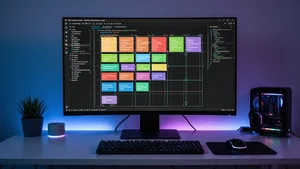
A CSS grid generator is a visual tool that lets you design grid layouts by clicking, dragging, and adjusting properties in a graphical interface. Instead of writing CSS from scratch, you define your rows, columns, gaps, and content areas visually. The tool then outputs clean, production ready CSS that you can copy straight into your project.
Think of it like the difference between hand coding SVG paths versus using a vector editor. Both get you to the same result, but one lets you actually see what you are building while you build it.
The best generators handle all the tricky parts: fractional units, minmax functions, auto-fill versus auto-fit, named grid areas, and responsive breakpoints. You manipulate sliders and drag handles. The code updates in real time.
The Tools That Are Actually Worth Using
After testing dozens of grid generators over the past year, a few stand out for different reasons.
Cliptics CSS Grid Generator is what I reach for most often. The interface is clean, it handles both explicit and implicit grids, and the code output is minimal without unnecessary vendor prefixes or bloat. You can define named areas by literally painting them onto a visual grid, which makes complex magazine style layouts almost trivial to set up. Try it at cliptics.com/css-grid-generator.
Layoutit Grid is another solid option. It has been around for years and the team keeps updating it. The drag to resize columns and rows feature is intuitive, and it exports both CSS and HTML. Where it falls short is responsive design. You are mostly building for a single viewport width.
CSS Grid Garden is not a generator per se, but if you are still learning Grid concepts, play through it before using any generator. Understanding what the generated code actually does will save you hours of debugging later.
For Tailwind CSS users, the Cliptics Tailwind Grid Generator outputs utility classes directly instead of raw CSS. That means no context switching between a CSS tool and your Tailwind workflow. You get the exact class names you need: grid-cols-3, gap-4, col-span-2, all of it.
From Generator to Production Code
Here is where most tutorials stop, and where real problems begin. Generating the grid CSS is step one. Integrating it into a responsive, maintainable codebase is the actual work.
Start with the generated code as a foundation, not a finished product. A typical output might look like this:
.layout {
  display: grid;
  grid-template-columns: 1fr 2fr 1fr;
  grid-template-rows: auto 1fr auto;
  grid-template-areas:
    "header header header"
    "sidebar main aside"
    "footer footer footer";
  gap: 16px;
}
That works perfectly at desktop widths. But you need breakpoints. I usually add a mobile first override that collapses everything to a single column:
@media (max-width: 768px) {
  .layout {
    grid-template-columns: 1fr;
    grid-template-areas:
      "header"
      "main"
      "sidebar"
      "aside"
      "footer";
  }
}
Notice how the area names stay the same. That is the beauty of named grid areas. Your HTML does not change at all between breakpoints. Only the CSS grid definition shifts.
Common Mistakes That Generators Will Not Catch
Even with a visual tool, there are patterns that trip people up consistently.
Overusing fixed pixel values. Generators make it easy to set column widths to exact pixel amounts. Resist that urge. Use fractional units (fr) and minmax() instead. Your layouts will be inherently more flexible.
Ignoring the implicit grid. When content overflows your defined rows, CSS Grid creates implicit rows automatically. Most generators only define explicit tracks, so you should always add grid-auto-rows: minmax(100px, auto) to handle overflow gracefully.
Nesting grids too deeply. Just because you can put a grid inside a grid inside a grid does not mean you should. Two levels deep is usually the practical maximum before the layout becomes a maintenance nightmare. If you find yourself going deeper, consider whether flexbox or a simpler approach would work for the inner components.
Forgetting about gap inheritance. Gaps do not cascade from parent grids to child grids. Each grid container needs its own gap definition. This catches people off guard when they nest grids and the inner one suddenly has no spacing.
When to Use Grid Versus Flexbox
This question comes up constantly. Here is my simple rule: if your layout is fundamentally two dimensional (rows AND columns matter), use Grid. If it is one dimensional (items flowing in a single direction), use Flexbox.
A page layout with header, sidebar, main content, and footer? Grid. A navigation bar with evenly spaced links? Flexbox. A card grid where items wrap to new rows? Actually, either works, but Grid gives you more control over the exact placement.
The visual generators like the Cliptics box shadow generator and grid tools make it easy to experiment with both approaches quickly without committing to either one upfront.
Browser Support in 2026
One concern I still hear from developers is whether CSS Grid is safe to use in production. The answer in 2026 is a resounding yes. Every major browser has supported CSS Grid for years now, including subgrid which landed in all browsers by late 2024. Even features like the grid-template shorthand and container queries paired with grid layouts have solid support across Chrome, Firefox, Safari, and Edge.
If your project needs to support Internet Explorer (and some enterprise projects still do), that is the one scenario where you would need a fallback strategy. But for the vast majority of web projects today, you can use the full CSS Grid spec without hesitation. The code that generators output will work everywhere your users actually are.
Practical Workflow for New Projects
Here is the workflow I have settled on after building dozens of layouts with these tools:
Step 1: Sketch the layout on paper or in a design tool. Identify the major content areas and how they should restack on smaller screens.
Step 2: Open a grid generator and build the desktop version first. Export the CSS.
Step 3: Add your responsive breakpoints manually. Most generators do not handle responsive well, so this step is always manual.
Step 4: Test with real content. Generated layouts always look perfect with placeholder boxes. Real text, images, and dynamic content will reveal spacing issues immediately.
Step 5: Refine the grid values based on actual content. Swap fixed values for flexible ones. Add minmax where content length varies.
This whole process takes maybe 15 to 20 minutes for a standard page layout. Compare that to the hour plus it takes to write complex grid CSS from memory, debug it, and iterate on the values.
The Bottom Line
CSS Grid generators are not shortcuts for avoiding learning CSS. They are productivity tools that let you focus on design decisions instead of syntax recall. The best developers I know use them constantly, not because they cannot write grid CSS by hand, but because visual feedback loops are simply faster for spatial layouts.
If you have not tried one yet, start with the Cliptics CSS Grid Generator. Build a layout in five minutes. Copy the code. Customize it for responsive. Ship it. That first experience of seeing a complex layout come together visually, then getting clean code you actually understand, is what converts people from grid skeptics to grid enthusiasts.
The tooling has gotten good enough that there is no reason to struggle with grid syntax from memory anymore. Use the generators. Build faster. Spend your mental energy on the parts of development that actually require creative thinking.