CSS Grid vs Flexbox in 2026: When to Use Each (With | Cliptics
I've been building layouts with CSS for over a decade, and I still sometimes pause and think: should this be Grid or Flexbox?
That hesitation used to frustrate me. Shouldn't I just know by now? But after thousands of layouts and countless conversations with other developers, I've realized that question is actually the right instinct. Because the answer genuinely depends on context, and the developers who pause to consider are usually the ones making better architectural decisions.
Here's what I've learned about when to reach for Grid, when Flexbox makes more sense, and how the choice impacts everything from development speed to long term maintainability.
The Fundamental Difference Nobody Explains Well
Every tutorial starts with "Grid is two-dimensional, Flexbox is one-dimensional." Which is technically accurate but doesn't actually help you make decisions.
Here's how I think about it now.
Flexbox is about relationships between items in a single direction. How should these navigation links space themselves? How should this card's content align vertically? How should these buttons position themselves relative to each other? It's relational thinking within a line or column.
Grid is about defining a structure and then placing items into it. This is the overall page layout with header, sidebar, content, and footer regions. This is a product gallery that needs to maintain specific proportions across different screen sizes. It's architectural thinking about the whole container.
The difference becomes obvious in practice. With Flexbox, items influence each other. One item growing affects where others position. With Grid, you define the structure first, then items fit into that structure without necessarily affecting each other.
Neither approach is better. They solve different problems.
When Flexbox Makes Perfect Sense
There are layout scenarios where Flexbox is clearly the right choice, and forcing Grid into those situations just creates unnecessary complexity.
Navigation bars are classic Flexbox territory. You want items in a row, evenly spaced or clustered to one side. Maybe some items align left, others align right. The spacing between items matters more than specific positioning. Flexbox handles this elegantly with justify-content and align-items.
Form layouts benefit from Flexbox's content-first approach. Labels and inputs that need to align. Buttons that should stack on mobile but sit side by side on desktop. Form validation messages that appear inline. These are relational spacing problems that Flexbox solves naturally.
Card internals work beautifully with Flexbox. Image at the top, text content in the middle, actions at the bottom. You want the content area to grow and push the buttons down. That's exactly what flex-grow does effortlessly.
Anything centering related is trivially easy with Flexbox. The display flex, justify-content center, align-items center pattern is muscle memory at this point. You can center something perfectly in three lines of CSS.
Dynamic content where you don't know how many items you'll have or how wide they need to be plays to Flexbox's strengths. A row of tags that wrap naturally. A list of filter chips. Product feature badges. Let the content determine the layout.
When Grid Is Obviously Superior
Grid shines in completely different scenarios, and trying to fake these layouts with Flexbox leads to fragile, hack-filled code.
Page-level layouts are Grid's natural domain. Header spans the full width, sidebar takes fixed space, main content area fills remaining space, footer spans full width again. This is trivial with Grid template areas, painful with Flexbox nesting.
Magazine-style layouts with content spanning different numbers of columns and rows become straightforward. Feature article takes up 2x2 space, smaller articles fill single cells around it. Grid's explicit placement makes this declarative and clear.
Photo galleries and product grids where you want consistent sizing and gaps benefit from Grid's built-in gap property and fraction-based columns. Define columns as 1fr 1fr 1fr and items automatically size equally with perfect gutters.
Responsive layouts that fundamentally restructure at breakpoints are cleaner with Grid. You can completely redefine the grid template at different screen sizes rather than fighting with Flexbox wrapping and order.

Alignment-heavy interfaces where you need items to align across both rows and columns simultaneously need Grid's two-dimensional control. Think dashboards with widgets that need to line up both horizontally and vertically.
The Scenarios Where Both Could Work
This is where it gets interesting. Many layouts could reasonably be built with either approach, and the choice comes down to preference and priorities.
A card grid could be Flexbox with wrapping, or Grid with auto-fill columns. Flexbox gives you content-driven sizing. Grid gives you more predictable structure. Neither is wrong.
A sidebar layout could be Flexbox with flex-basis for the sidebar width, or Grid with explicit column widths. Flexbox might feel more natural if you're used to float-based layouts. Grid provides cleaner syntax.
A toolbar with multiple sections could nest Flexbox containers, or use Grid with column spans. Flexbox is probably simpler for this case unless you need complex alignment.
When both work, I tend to choose based on what the layout might evolve into. If I think it might get more complex with items spanning multiple columns or rows, I start with Grid. If it's likely to stay simple and linear, Flexbox is less overhead.
The Performance Question
People ask about performance differences. In 2026, for the vast majority of use cases, the performance difference is negligible.
Both are highly optimized in modern browsers. Both avoid the old layout thrashing issues that plagued float-based layouts. The browser's layout engine handles both efficiently.
Where performance differences might appear is in extremely complex layouts with hundreds or thousands of items. Grid can sometimes be slightly faster for initial layout calculation because the structure is more explicit. But we're talking about differences measured in single-digit milliseconds that users won't perceive.
The bigger performance consideration is code maintainability. A clean Grid layout is easier to optimize later than a convoluted nest of Flexbox containers trying to achieve Grid-like behavior. Write clear, semantic layouts, and performance will follow.
How Generator Tools Change The Workflow
I used to hand-code every Grid and Flexbox layout from scratch. That was valuable for learning, but it's not the most efficient workflow once you understand the fundamentals.
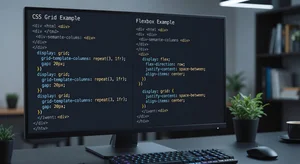
Generator tools like the CSS Grid generator let you visualize and experiment with grid structures quickly. Drag to define rows and columns, place items, adjust gaps, and see the code generated in real time.
This is particularly useful when you're exploring different grid structures for a complex layout. Instead of writing CSS, refreshing the browser, tweaking values, and repeating, you can iterate visually and copy the final code when you land on something that works.
The Tailwind Grid generator serves the same purpose for Tailwind-based projects. If you're working in a Tailwind stack, getting the utility class combinations right for Grid layouts can be tedious. The generator gives you the correct classes immediately.
What I appreciate about these tools is they're learning aids as much as productivity tools. You see the relationship between visual structure and the code that creates it. Over time, you internalize those patterns and write the code directly more often. But having the tool available for complex cases or quick exploration is valuable.
Common Mistakes I See Repeatedly
After reviewing countless codebases, certain anti-patterns show up over and over.
Using Grid for simple one-dimensional layouts where Flexbox would be simpler. I see this often from developers who learn Grid first and try to use it everywhere. A row of buttons doesn't need display grid with one row and auto columns. That's just display flex with extra steps.
Nesting Flexbox containers multiple levels deep to fake two-dimensional control. This creates brittle layouts that break when content changes or new requirements emerge. If you're three or four Flexbox levels deep, you probably should have used Grid at the parent level.
Not using Grid's named template areas for complex layouts. Grid line numbers are powerful but hard to read. Named areas make page-level layouts self-documenting. The code literally shows the visual structure.
Forgetting about aspect ratio control. Grid with fr units sometimes creates unexpected aspect ratios. If you need squares or specific aspect ratios, you need additional properties like aspect-ratio or padding-based techniques.
Fighting the browser defaults instead of working with them. Both Grid and Flexbox have sensible defaults. If you're writing lots of override CSS, you might be using the wrong layout system for that particular problem.
The Practical Decision Framework
When I'm starting a new component or layout, here's my mental checklist.
First question: is this fundamentally one-dimensional? Am I arranging things in a row or column where their relationship to each other matters more than absolute position? That's probably Flexbox.
Second question: do I need two-dimensional control where items can span multiple rows and columns, or where alignment needs to work in both directions? That's Grid territory.
Third question: is the layout content-driven or structure-driven? If items should size based on their content and flow naturally, lean toward Flexbox. If you want a defined structure that content fits into, Grid makes more sense.
Fourth question: how might this evolve? Sometimes I choose Grid even for simpler layouts if I anticipate future complexity. The refactoring cost of switching from Flexbox to Grid later can be significant.
Fifth question: what's clearest to read and maintain? Six months from now, will another developer or future me understand this layout at a glance? Clear, semantic code trumps clever optimizations.
What's Changed in 2026
Browser support is essentially universal now. Even conservative enterprise environments have updated to browsers with full Grid and Flexbox support. You can use these without fallbacks or prefixes.
The subgrid feature has matured and gained broader support. This lets grid items become grids themselves while aligning to the parent grid's tracks. It solves the nested grid alignment problem that used to require workarounds.
Container queries have changed how we think about responsive layouts. Instead of media queries based on viewport size, we can now make layout decisions based on container size. This works beautifully with both Grid and Flexbox for truly modular components.
CSS Grid auto-fit and auto-fill with minmax have become the standard approach for responsive grids without media queries. Define minimum and maximum sizes, let Grid handle the wrapping and sizing automatically.
Development tools have improved dramatically. Browser dev tools let you visualize Grid and Flexbox layouts, see the invisible gaps and tracks, understand why things align the way they do. Debugging layouts is so much easier than it was even two years ago.
Where This Goes Next
I'm watching a few emerging patterns with interest.
Grid-first approaches where Grid handles the overall structure and Flexbox is used sparingly for specific components within grid areas. This inverts the old Flexbox-everywhere pattern and often results in cleaner code.
Utility-first frameworks like Tailwind have influenced how people think about layout. The composition of small utility classes versus writing custom layout CSS. Both approaches work, but they change how you architect layouts.
AI-assisted layout generation is emerging. Describe a layout in natural language, get working Grid or Flexbox code. We're still early, but the trajectory is clear. The fundamentals still matter for refining and debugging, but the initial scaffolding gets faster.
CSS-in-JS libraries have matured in how they handle Grid and Flexbox, making it easier to create dynamic, prop-driven layouts that maintain good performance.
What Actually Matters
After all this technical detail, here's what I keep coming back to.
The best layout system is the one that makes your specific problem simple to solve and easy to maintain. Not the newest technique. Not the most clever solution. The one that works clearly and reliably.
Both Grid and Flexbox are powerful, well-supported, and essential to modern web development. Learning when to use each comes from practice, not just reading about it.
Build things. Make mistakes. Refactor layouts when you realize a different approach would be clearer. Over time, the decision between Grid and Flexbox becomes intuitive.
And when you're stuck, use visualization tools like the CSS Grid generator to explore options quickly. There's no shame in using tools to understand structure better.
The web has never been easier to layout beautifully. That's worth appreciating.