Why Developer Side Projects Fail | Cliptics
I've shipped 47 personal side projects over the last nine years. By "shipped" I mean pushed to production and made available to actual users, not abandoned in a GitHub repo. Most developers I know have shipped zero. A few have shipped one or two.
The difference isn't programming ability. It's the visual assets problem.
Software development is, for most developers, a tractable set of problems. You know what you don't know, and what you don't know you can learn or look up. The gap between knowing nothing about React and building a functional React application is learnable, uncomfortable, and finite.
The gap between no design background and producing visual assets that don't make a technically excellent product look amateurish is different. It's not a skills gap that you can just work through. It's a craft that takes years to develop, and most developers haven't developed it.
The Exact Failure Point
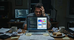
The failure point is almost always one of three things: the logo looks homemade, the landing page color palette is wrong, or the product screenshots look like a developer made them (which they did). These visual signals tell potential early adopters something before they've evaluated a single feature.
Users make tool quality assessments from visual quality cues faster than they evaluate functional merit. An excellent tool with poor visual assets will be evaluated as a poor tool in first impressions. An adequate tool with excellent visual assets will be evaluated as a promising tool. This is well-documented cognitive bias, and it affects your side project regardless of whether you think it should.
The developers who ship side projects that people actually use have usually solved this problem one of three ways: they have a designer co-founder, they hired a designer (expensive), or they learned to use design tools themselves (time-intensive). In 2026, there's a fourth option that didn't exist before: AI-powered visual asset generation.
The Visual Asset Checklist for a Launchable Side Project
Before a side project is ready to show real users, it needs to clear a minimum visual bar in these areas:
Logo or wordmark: something that doesn't look like the default browser favicon or a 30-second icon attempt. It doesn't need to be brilliant. It needs to not be embarrassing.
Landing page: a color palette that has internal logic (not random colors), a hero section that communicates the value proposition clearly, and enough visual structure that the page doesn't feel assembled from defaults.
Screenshot/product visuals: the screenshots or feature visuals on your landing page are showing people what they'll experience inside the product. Unedited browser screenshots against a default desktop background signal lack of polish before anyone clicks the CTA.
Social preview image: the OG image that appears when someone shares your link. Most developer projects have this wrong (blank, default, or a screenshot that crops badly at link preview size).
Marketing collateral: if you're going to post on Product Hunt, Hacker News, Reddit, or Twitter/X, you need at least one visual asset that represents the product for social sharing.
The No-Code AI Toolkit for Developers
Here's the specific stack that handles all of the above without requiring design skills:
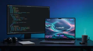
For product hero images and marketing visuals: Cliptics AI Image Generator generates custom images from text descriptions. For a developer tool, a prompt like "minimalist dashboard interface showing clean analytics graphs, blue and white color scheme, developer tool aesthetic" produces a usable hero image in under a minute.
For landing page gradients and background textures: Cliptics Gradient Maker produces the gradient backgrounds that give landing pages visual depth without requiring design judgment. The gradient you choose communicates tone: cool blues and purples for tech tools, warm ambers for productivity apps, green-adjacent palettes for sustainability or health-adjacent products. The tool generates clean CSS output that drops directly into your stylesheet.
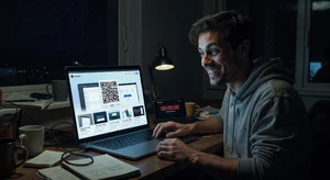
For QR codes on any physical or digital distribution: Cliptics QR Code Maker generates scannable QR codes for app store links, landing pages, or product demos. For products that benefit from physical distribution (developer events, conference demos), QR codes on a printed card or badge insert replace business card limitations.
The Logo Problem Specifically
The logo is the component most developers underestimate and most often get wrong. A poorly executed logo isn't just aesthetically bad. It signals lack of intentionality about the product.
You don't need a logo designed by a professional agency for an early-stage side project. You need something that passes a basic adequacy bar: readable at small sizes, not visually confused, and consistent with the product's tone.
For a text-based wordmark (the product name in a distinctive font treatment), the AI image generator can produce options from a description like "clean modern wordmark for [product name], minimal design, tech-forward, dark navy and white." Review the options and use the one that's closest to usable; minor adjustments in a basic image editor can finalize the execution.
For icon-based logos, the same approach works for icon concepts. A clean icon generated from description, exported as SVG, and refined slightly, is substantially better than a default icon or nothing.
Making the Landing Page Not Look Developer-Built
The single biggest landing page improvement most developer projects can make: stop using developer-default colors. Developer-generated color palettes tend toward the default: blues and whites from Bootstrap, or whatever the developer personally likes, regardless of what communicates quality to the target user.
Use the gradient maker to select a two-color palette that has internal logic. For almost every developer tool, a primary color in the 40-60% saturation range (not pure saturated, not washed out) with a neutral secondary creates the professional palette foundation.
Typography is the second biggest: choose one font for headings and one for body, both from the same visual family or deliberately contrasted (geometric sans for headings, humanist sans for body). Avoid system fonts for headings if you can, they read as "I didn't think about this."
Spacing is the third: most developer-built landing pages are too dense. More space between sections, larger line height on body text, and more padding around call-to-action elements dramatically increases the professional feel without any design skill required.
The Shipping Decision
The developers who ship side projects have made a deliberate decision that good enough visual presentation plus excellent technical execution is better than perfect technical execution with no users because they never shipped.
The visual assets toolkit I've described doesn't produce agency-quality design. It produces adequate professional design that doesn't actively hurt your product's first impression. That's the bar you need to clear to ship.
The product you build matters. But the product that ships to zero users because the landing page looks amateur has no market to validate it. The minimum viable presentation layer is as real a launch requirement as the minimum viable feature set.
Fix the visual assets problem first. Then build the features. The feedback loop from users who engage with an adequately presented product is worth more than the features you'd build while avoiding the visual problem.
Ship the thing.