Graphic Design Trends 2026: Minimalism, Typography & Color | Cliptics
There's something interesting happening in design right now. If you scroll through enough portfolios or browse the right corners of Dribbble, you start to notice patterns that weren't quite there last year. Not the loud, obvious stuff everyone talks about, but quieter shifts in how designers are approaching their work.
I've been watching this unfold, and it feels less like a revolution and more like a recalibration. After years of cold, sterile minimalism and algorithm-optimized everything, design seems to be remembering that humans are the ones looking at it. That matters more than you might think.
The Warmth Creeping Into Minimalism
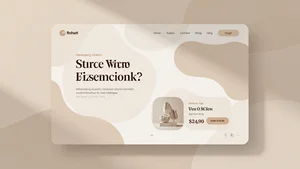
Minimalism isn't going anywhere. But it's changing. You know that ultra-stark, pure white background with razor-thin sans-serif type that defined the last few years? It's softening. Designers are reaching for cream instead of white, beige instead of gray. Shadows aren't perfectly crisp anymore. They're a little diffused, a little gentler.
What's driving this? Honestly, I think people got tired of feeling cold when they looked at websites and apps. The pendulum swung too far toward clinical, and now it's swinging back. Not all the way to maximalism, just enough to let things breathe and feel a bit more welcoming.
This shift shows up in the details. Rounded corners are getting slightly rounder. Padding is a little more generous. Grid systems are still there, but they're not quite so rigid. It's like the difference between a perfectly made hotel bed and your own bed at home. Both can be clean, but one feels lived in.
Typography Getting Bold Again
Here's where things get really interesting. For a while, everyone was playing it safe with typography. Neutral sans-serifs, medium weight, nothing that might upset the balance. That's changing fast.
Variable fonts are finally having their moment, not as a technical novelty but as an actual design tool. You're seeing type that moves and adapts, not just in size but in weight and width. Headlines that feel kinetic even when they're standing still. It's expressive in a way we haven't really seen since the early days of web design, but controlled and intentional this time around.
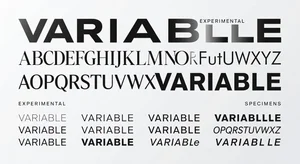
Serifs are coming back too, but not your grandfather's serifs. These are refined, sometimes a little quirky, often mixed with geometric sans-serifs in ways that shouldn't work but somehow do. There's this willingness to experiment that feels refreshing after years of playing it safe.
What's interesting is how this plays with accessibility. Bolder type hierarchies actually make content easier to scan. When done right, expressive typography isn't just artistic, it's functional. The best designers are threading that needle really well right now.
If you're working on visual content for platforms like Instagram or web tools, something like Cliptics' AI image editor can help you experiment with type treatments and visual compositions before committing to a full design. Sometimes you need to see a few variations before one clicks.
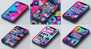
Color Palettes That Feel More Human
This might be the most noticeable shift. The color stories we're seeing in 2026 feel less… computational. For years, color palettes were optimized for screens, for contrast ratios, for what performed well in A/B tests. All important stuff, but it led to a certain sameness.
Now you're seeing colors that feel more instinctive. Dusty terracottas paired with muted teals. Warm ochres next to soft lavenders. These aren't colors that came from a algorithm or a trend forecasting report. They feel chosen, considered, maybe even a little personal.
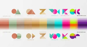
Gradients are back, but they're subtle. Not the rainbow Instagram gradients from a few years ago, more like atmospheric color shifts that add depth without screaming for attention. Think sunsets, not disco balls.
What's fascinating is watching brands navigate this. Some are leaning in hard, completely refreshing their visual identity with warmer, more complex palettes. Others are being more cautious, adding warmth at the edges while keeping their core colors intact. There's no right answer, it depends entirely on what story you're trying to tell.
What This Means for Actual Work
Theory is nice, but how does this translate when you're on deadline? A few things I've noticed:
First, there's more room for personality. Clients are more open to work that doesn't look like every other tech company or lifestyle brand. That's liberating if you've been feeling boxed in by convention.
Second, the technical tools are finally catching up with creative ambition. Variable fonts work reliably across browsers now. Color management is better. You can actually do the things you're imagining without massive compromises.
Third, and this is more subtle, there's less pressure to look "current" in the way there used to be. A design can reference things from different eras, mix influences, feel a little timeless and a little of-the-moment at the same time. That's actually harder to pull off than following a trend guide, but when it works, it works.
For projects that need quick visual assets, tools like background removers or AI image generators can speed up the grunt work so you have more time for the creative decisions that actually matter.
The Bigger Picture
Stepping back, what's really happening here isn't about specific trends. It's about design remembering its purpose. We went through this period where everything was optimized for metrics and algorithms, which makes sense from a business perspective. But somewhere along the way, a lot of design started feeling soulless.
What we're seeing now is a correction. Not a rejection of the last decade, more like an integration of what worked with what was missing. Keep the clarity and discipline of minimalism, but add warmth. Keep the functionality, but let personality back in. Use data to inform decisions, but don't let it make all the decisions.
This isn't just aesthetic preference. When design feels more human, people respond to it differently. They spend more time with it. They remember it. They trust it more. In a world where everyone is drowning in content, that's not a small thing.
Moving Forward
If you're designing anything in 2026, whether it's a website, an app, marketing materials, whatever, you have more creative freedom than you've had in years. The rules are looser. The tools are better. Audiences are hungry for work that feels genuine.
The challenge isn't figuring out what's trendy. It's figuring out what feels right for your specific project, your specific audience, your specific constraints. These broader shifts in minimalism, typography, and color are useful context, but they're not prescriptions. Use what serves your work, ignore what doesn't.
What excites me most is watching designers trust their instincts again. Not ignoring data or best practices, but not being slaves to them either. That balance is where interesting work happens. And 2026 feels like a year where interesting work is not just allowed but encouraged.
The design world moves fast, but not everything that's new is better, and not everything that's older is outdated. The sweet spot is usually somewhere in between, and right now, that's exactly where we're landing.