10 Graphic Design Trends Dominating Social Media in 2026 | Cliptics
Social media design moves faster than almost any other creative discipline. What looked fresh on Instagram 18 months ago now reads as dated. What's performing well right now in 2026 didn't exist as a coherent design language in 2024.
Understanding which visual trends are genuinely driving engagement and knowing how to execute them without a full-service design agency budget is the practical skill gap for most marketing teams and independent creators. Here are the 10 trends dominating 2026, with practical approaches for recreating each.
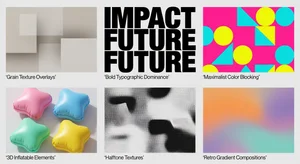
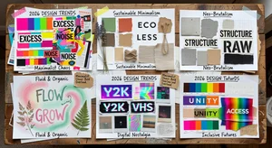
1. Grain Texture Overlays
The sleek, flat digital aesthetic that dominated the early 2020s is being replaced by tactile, imperfect surfaces. Grain overlays applied to photography and gradient backgrounds create the impression of physical media: film photography, printed materials, analog warmth.
Why it works: in a feed dominated by hyper-polished AI imagery, grain texture creates a handmade, authentic signal that stands out. Brands using grain have reported 15-30% higher engagement rates versus their clean-digital equivalent posts.
To recreate: generate a subtle noise texture in any image editor (CSS grain filters work for web, PNG grain overlays work for static imagery). Apply at 15-25% opacity over your base image. Stronger grain reads as intentional; weaker grain reads as unintentional photo noise.
2. Bold Typographic Dominance
Full-frame typography where text is the primary visual element, not supporting text. Large, bold, high-contrast type fills the composition in a way that makes the words the image rather than describing the image.
The trend is driven by the need to communicate quickly in contexts where users aren't pausing long enough for both image and text to register separately.
To recreate: work with a single strong statement, 4-8 words maximum. Choose a font with maximum optical weight. Fill 70-80% of the frame with the type, letting the remaining space breathe. Use a single background color that creates maximum contrast with the text color.
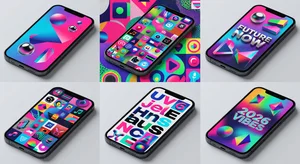
3. Maximalist Color Blocking
After years of muted palettes and neutral-adjacent color trends, 2026 social media is embracing maximum saturation color blocking. Bold adjacencies: electric blue next to warm orange, deep fuchsia next to chartreuse green. Colors that should clash but are executed with enough confidence to read as intentional.
The key execution distinction: maximalist color blocking requires exactly two to three colors applied at large scale. Multiple small color elements become chaotic. Two or three colors at large scale become bold.
4. 3D and Inflatable Design Elements
Three-dimensional, physically rendered design elements (inflatable-looking typography, soft rounded geometric shapes, glossy surfaces) have moved from novelty to trend. The aesthetic borrows from physical media while existing entirely in digital space.
This one is more technically demanding than the others. True 3D rendering requires tools like Spline or Blender for custom work. But the aesthetic can be approximated using high-quality 3D element stock imagery combined with compositional techniques that match the trend's sensibility.
5. Halftone and Print-Inspired Textures
Halftone dot patterns, risograph-style color registration misalignment, screen printing artifacts. Print media textures are appearing in digital contexts as a nostalgia signal and an authenticity marker.
To recreate: halftone filter effects are available in most image editors. For the risograph look, duplicate your image, shift the duplicate by 2-4 pixels in a contrasting direction, apply a single-color tint, and overlay at 60-70% opacity on the original.
6. Animated Gradient Backgrounds
Static gradients have given way to animated, shifting gradients as the background layer for video and story content. The movement creates attention without requiring subject motion.
For static posts, bold gradient backgrounds are the trend equivalent. For video content, CSS animation or video gradient backgrounds are the execution layer.
For recreating this trend on static content: use Cliptics Gradient Maker to create multi-stop gradients with unexpected color transitions. For animated versions on web-based content, the Animated Gradient Generator provides the code output directly.
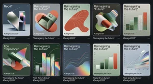
7. Retro-Futurism Aesthetics
Combining 1970s-80s science fiction visual language with contemporary production quality. Deep purples and blues, chrome metallic elements, starfield backgrounds, vintage typography with modern polish. The aesthetic evokes old futures: the way 1979 imagined what 2026 would look like.
This trend performs best for technology-adjacent brands and creative industries. The retro-future aesthetic communicates ambition and originality in ways that purely contemporary design doesn't.
8. Extreme Negative Space
The counter-trend to maximalism: compositions where 70-80% of the frame is empty, with a single small element positioned with precision. The intentional emptiness creates visual luxury and forces the viewer's attention to the single element that's present.
For brands with heritage and quality positioning, extreme negative space communicates confidence. The design choice says: we don't need to fill your attention with noise. What we have is worth the space we've given it.
9. Text-Forward Motion Graphics
Short video clips where the primary design element is animated text: words that appear, transform, stack, and dissolve. The motion is the design rather than an element supporting the design.
These perform exceptionally as Reels and Shorts because they force completion: a single message delivered across a 10-15 second animation, readable only by watching through. This drives completion rates, which drives algorithmic distribution.
10. Collage and Mixed Media Aesthetics
Compositing photographic elements with hand-drawn illustration, sticker-style elements, torn paper textures, and bold typographic cutouts. The aesthetic rejects clean digital production in favor of assembled, layered, physical-media-inspired compositions.
For marketing content, this trend creates the feeling of personalization and craft, even when executed digitally. The messiness is intentional and signals human involvement, which in an era of increasing AI-generated content, creates differentiation.
To recreate: use illustration elements, texture overlays, and typography layers at unexpected angles. The composition should look assembled rather than designed. Intentional imperfection is the design goal.
Applying These Trends Strategically
Chasing every trend simultaneously produces content that looks confused. The question isn't which trends exist but which trends align with your brand's visual positioning.
Pick one or two trends that connect authentically to your brand aesthetic and audience expectations. Experiment with them for 30-60 days. Watch your engagement data. Trends that resonate with your specific audience will show in completion rates, saves, and shares before they show in likes.
The highest-performing brand social content in 2026 looks trend-aware without looking trend-chasing. It demonstrates visual currency while maintaining brand coherence. That balance is the creative judgment that no design tool, however powerful, can make for you.
Start with the trends that feel like natural extensions of where your brand already is. The best adoption of a design trend looks inevitable rather than adopted.
Design trends are tools, not mandates. Use the ones that serve your content goals and let the others pass. The next wave will arrive in 18 months regardless, and the content that ages best is always the content that used trends in service of genuine communication rather than to signal trend awareness.