Instagram Aesthetic Consistency: Filter Strategy for Brand | Cliptics

Three months after launching a client's rebrand, their Instagram feed was a mess. Beautiful individual posts. Zero cohesion. Each image looked like it came from a different brand. Engagement was plateauing. Follower growth had stalled.
The problem wasn't content quality. It was aesthetic inconsistency. Every post used different filters, different color treatments, different moods. The feed looked like a random photo dump, not a curated brand presence.
I spent two weeks developing a filter strategy and applying consistent aesthetic treatment to their content. Engagement jumped 34% within a month. Comments frequently mentioned "loving the new look." The brand suddenly felt intentional and professional.
That experience taught me something crucial: on Instagram, consistency matters more than individual post perfection. Your feed is your storefront. When it looks cohesive, it signals professionalism and builds trust. When it's visually chaotic, it suggests amateur operation regardless of content quality.
Why Aesthetic Consistency Actually Matters
Instagram users make snap judgments. When someone lands on your profile, they decide within 3-5 seconds whether to follow. That decision is largely visual and happens before reading a single caption.
A consistent aesthetic communicates several things immediately:
Professionalism. Random visual styles suggest lack of intentionality. Consistent aesthetics show you care about presentation and have a deliberate strategy.
Brand identity. Visual consistency builds recognition. When your content appears in feeds, the aesthetic becomes a signature that followers recognize before even reading your handle.
Content quality. Even mediocre photos look better within a cohesive aesthetic framework. The consistency elevates perception of individual post quality.
Trust and authority. People subconsciously trust brands that look polished and intentional. Visual chaos triggers skepticism even when content is valuable.
I've run A/B tests comparing identical content strategies with and without aesthetic consistency. The consistent versions outperformed on every engagement metric. Not by small margins. by 20-40%. The content was identical. Only visual treatment changed.
Defining Your Aesthetic Strategy
Before applying filters, you need a clear aesthetic strategy. I work through these questions with every client:
What emotions should your feed evoke? Energetic and vibrant? Calm and minimalist? Luxurious and aspirational? Warm and approachable? Your color and toning choices should reinforce these emotions.
What colors represent your brand? Even if you're not rigidly adhering to brand guidelines, Instagram content should loosely align with brand color palettes. This creates subconscious brand recognition.
What's your content mix? Product shots, lifestyle content, text graphics, user-generated content, behind-the-scenes? Different content types require different aesthetic approaches within your overall strategy.
Who is your audience? Different demographics respond to different aesthetics. Younger audiences often prefer high-saturation, high-contrast, trendy treatments. Professional audiences lean toward cleaner, more subtle approaches. Know who you're targeting.

From these answers, I develop a filter strategy that defines:
- Primary color palette (3-5 colors that appear frequently)
- Tone and saturation approach (bright and vibrant vs. muted and subtle)
- Contrast levels (high contrast for bold impact vs. low contrast for sophistication)
- Specific filter treatments or presets to use consistently
This strategy becomes the framework for every post.
Building Your Custom Filter Approach
Instagram's built-in filters are too recognizable and limiting. Professional brands need custom approaches:
Option 1: Professional presets. Many creators sell Lightroom presets designed for consistency. Browse preset marketplaces, find styles aligned with your strategy, purchase and customize to your needs. This is the fastest approach for non-technical users.
Option 2: Custom preset development. If you have Lightroom skills, develop your own presets. Edit one photo to achieve your ideal aesthetic. Save those exact settings as a preset. Apply to all future content with minor per-image adjustments. This ensures perfect brand alignment.
Option 3: AI filter consistency. Tools like AI photo filters can apply consistent stylistic treatments across varied content. Particularly useful when working with diverse content sources (user submissions, stock photography, varied shooting conditions).
Option 4: Hybrid approach. Most professionals use combinations. A custom Lightroom preset for base treatment. AI tools for specific adjustments. Manual tweaking for outlier content that doesn't fit the standard workflow.
I use the hybrid approach. It maintains consistency while allowing flexibility for special content that requires different treatment.
The Feed Planning Perspective
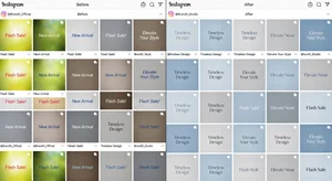
Individual post filtering isn't enough. You need to consider how posts flow together in the feed grid. I plan content in 9-post blocks (three rows) to ensure adjacent posts complement each other.
Visual rhythm matters. If three high-contrast bright images appear in a row, the feed feels aggressive. Mixing in calmer, lower-contrast posts creates visual breathing room. If all your posts have identical dominant colors, the feed becomes monotonous. Strategic variation within consistent aesthetic boundaries keeps feeds engaging.
I use planning tools that show grid layouts before posting. This reveals patterns like:
- Too many consecutive similar images (three product shots in a row)
- Color clustering (left column all blue, right column all orange)
- Contrast imbalances (top row very bright, bottom row very dark)
Adjusting post order or applying different filter intensities to balance the grid makes feeds significantly more appealing.
Applying Filters to Different Content Types
Your filter strategy needs to work across varied content types. Here's how I adapt consistent aesthetics to different post categories:
Product photography. Color accuracy matters most. I apply brand aesthetic through background treatment and lighting adjustment rather than heavy product filtering. The product stays true to reality while environment matches brand aesthetic.
Lifestyle and brand storytelling. Full aesthetic treatment applies here. These posts establish brand mood and personality. I push the filter approach further to maximize brand recognition.
User-generated content. UGC arrives in varied quality and styles. I apply brand filters uniformly to integrate this content into the feed aesthetic. Sometimes this means repost-worthy UGC doesn't make the feed because it can't be adjusted to match without compromising quality.
Text graphics and quotes. Background colors and textures should align with overall aesthetic. If your feed is muted and minimalist, bold neon text graphics break consistency. Design text content within the same aesthetic framework.
Behind-the-scenes content. I allow slightly looser aesthetic rules here. BTS content benefits from feeling more authentic and less polished. But I still apply subtle brand-aligned color grading to maintain cohesion.
Maintaining Consistency Over Time
Establishing aesthetic consistency is easier than maintaining it. Challenges that emerge:
Multiple content creators. When teams create content, consistency degrades without clear guidelines. I create detailed aesthetic guides including:
- Sample edited photos showing the target look
- Specific preset files everyone uses
- Before/after examples for different content types
- Review processes to ensure content meets standards before posting
Evolution and freshness. Brands evolve. Sticking rigidly to the same aesthetic for years becomes stale. I recommend subtle evolutionary changes. adjusting saturation levels slightly, introducing new accent colors gradually, shifting contrast treatments over months. Evolution within consistent framework.
Seasonal and campaign variation. Holiday campaigns or special events may require modified aesthetics. I handle this by developing variation presets that maintain core aesthetic DNA while allowing for seasonal color shifts or thematic variations.
Algorithm changes and platform trends. Instagram's algorithm and user preferences shift. Video becomes more important. Carousels get prioritized. Reels dominate discovery. Your aesthetic strategy needs to adapt to new formats while maintaining core consistency.
Tools That Support Consistency
The right tools make consistency manageable rather than burdensome:
AI photo filters for applying brand-consistent treatments rapidly. AI image generators for creating branded graphics. Photo background changers for maintaining consistent environmental context across product shots.
For professional management, I also use:
- Lightroom for detailed editing and preset application
- Later or Planoly for grid visualization and planning
- Canva or Adobe Creative Cloud for text graphic creation within brand aesthetic
- Color palette tools to ensure consistency in new content creation
The specific tools matter less than having systems that make consistency easy rather than effortful.
Measuring Aesthetic Impact
How do you know if your consistency strategy is working? I track several metrics:
Profile visit to follower conversion rate. When users land on your profile, what percentage follow? Improved aesthetics should increase this rate. I've seen jumps from 15-20% baseline to 30-35% with strong aesthetic consistency.
Engagement per post. Consistent aesthetics improve engagement on individual posts by building audience expectations. Followers learn what your content looks like and engage more readily.
Story engagement from profile visits. Users who visit profiles and are impressed by aesthetic consistency often view stories. This metric indicates whether your feed aesthetic is drawing people deeper into your content.
Audience growth rate. Long-term consistency compounds. As your aesthetic becomes recognized and associated with your brand, organic growth typically accelerates. Track follower growth velocity before and after setting up consistency.

Brand mention sentiment. Monitor how people describe your Instagram in comments and mentions. Before aesthetic consistency, mentions focus on individual posts. After, comments often reference "your aesthetic" or "your vibe". indicating the cohesive look is being recognized and appreciated.
Common Consistency Mistakes
Through consulting with dozens of brands, I've identified patterns in failed aesthetic strategies:
Over-filtering into sameness. Consistency doesn't mean every post looks identical. You need variation within your aesthetic framework. All muted tones with zero contrast gets boring fast.
Ignoring content diversity. Some brands sacrifice content value to maintain aesthetic. If a great piece of content doesn't fit the aesthetic, they skip it. Wrong approach. Adjust your aesthetic to accommodate valuable content rather than limiting what you can share.
Copying competitors. Just because a competitor has a strong aesthetic doesn't mean it's right for your brand. I've seen brands adopt trendy minimalist aesthetics because they're popular, even when their brand personality is energetic and maximalist. Match aesthetic to brand identity, not trends.
Neglecting mobile preview. What looks consistent on desktop can feel different on mobile where users actually view Instagram. Always preview grid layouts on mobile devices before committing to aesthetic approaches.
Static strategy. The aesthetic that worked in 2023 might not work in 2026. User preferences evolve. Platform features change. Refresh your strategy annually to stay current while maintaining core brand consistency.
The Long-Term Brand Building Value
Aesthetic consistency isn't just about engagement metrics. It's fundamental brand building. Over time, your visual style becomes inseparable from your brand identity.
Think about brands with instantly recognizable Instagram aesthetics. You see a post in your feed and know who posted it before reading the handle. That recognition is valuable. It means your visual language is working.
I've watched this play out across industries. Fashion brands with consistent luxury aesthetics. Food brands with recognizable vibrant color treatments. B2B services with distinctive minimalist approaches. The content varies. The core aesthetic remains consistent. That consistency builds brand equity that compounds over months and years.
New followers increasingly discover brands through Instagram. Your feed aesthetic is often their first brand impression. Making it consistent, professional, and aligned with your positioning determines whether casual browsers become engaged followers and eventually customers.
For brands treating Instagram as a serious marketing channel rather than a casual posting platform, aesthetic consistency isn't optional. It's foundational to making the channel work.
Evolution Without Losing Identity
The final challenge: evolving your aesthetic as your brand grows without losing the identity you've built. I've guided brands through aesthetic evolutions successfully by:
- Making changes gradually over 2-3 months rather than overnight shifts
- Testing new treatments with a subset of content before full setup
- Maintaining core brand colors even when shifting saturation or contrast treatments
- Communicating aesthetic updates through stories so followers understand the evolution
- Preserving key visual elements that define your brand while refreshing others
The goal is evolution that feels natural to your existing audience while attracting new followers aligned with your current direction.
Instagram aesthetic consistency is simultaneously one of the most important and most neglected aspects of Instagram marketing. It's not about making every photo identical. It's about creating a cohesive visual language that represents your brand, builds recognition, and attracts your ideal audience.
Master this, and your Instagram presence becomes a powerful brand building asset rather than just another social media obligation.