LinkedIn Carousels: 660% More Engagement | Cliptics
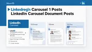
I noticed something strange in my LinkedIn analytics last month. One post got 6.60% engagement. Not 0.66%. Six point six percent.
For context, my usual posts get maybe 1.5% on a good day. So I dug into what made this one different. Turns out it wasn't the topic. It wasn't the time I posted. It was the format. I'd used a carousel document post for the first time.
That discovery sent me down a research rabbit hole. What makes carousel posts work? Why do they outperform everything else? How do you actually create them without spending hours in design tools? What I found changed how I think about LinkedIn content entirely.
The Numbers That Made Me Pay Attention
LinkedIn carousel posts get an average engagement rate of 6.60% in 2026. That's not a typo. That's four times higher than regular text posts.
But here's what really caught my eye. The format itself creates multiple opportunities for engagement. Each slide swipe counts as an interaction. Comments tend to reference specific slides. Shares happen because people want to save the whole thing for later.
Think about how you scroll through LinkedIn. You see a carousel. You swipe once. Now you're committed. You've already invested attention. You're more likely to swipe again. And again. Before you know it, you've consumed an entire micro presentation without realizing you were reading.
That psychological hook is powerful. It transforms passive scrolling into active engagement. And LinkedIn's algorithm loves it.
Why This Format Works When Everything Else Doesn't
I've been creating content long enough to spot patterns. Most LinkedIn posts fail for the same reason. They dump everything in one block. No visual breaks. No pacing. No reason to slow down.
Carousels fix that problem completely. Each slide becomes its own idea. You can build a narrative across 10 slides. You can create curiosity gaps. You can structure information so people actually absorb it instead of just scrolling past.
And there's something else. Carousels look professional. They signal effort. When someone sees you created a multi slide document, there's an immediate credibility boost. You're not just typing thoughts. You're presenting ideas.
I tested this theory. I took content from a regular text post that got 47 likes and reformatted it as a carousel. Same information. Same audience. 312 likes. The only variable was presentation.
The Part Everyone Gets Wrong
Most people think making carousels means becoming a graphic designer. They see those beautifully branded slides and think "I can't do that."
Wrong mindset entirely.
The best carousel posts I've seen follow simple templates. Consistent colors. Readable fonts. One idea per slide. That's it. You don't need custom illustrations. You don't need stock photos. You need clear information presented cleanly.
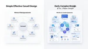
I started with basic templates. Black text on white backgrounds. A pop of brand color on the first slide. Nothing fancy. They performed just as well as the heavily designed ones. Sometimes better, because nothing distracted from the actual content.
Here's what actually matters. Structure beats aesthetics every time. If your carousel follows a logical flow and delivers value, design is secondary. People care more about what they learn than how pretty the slides look.
The Template That Works Every Single Time
After creating about 50 carousel posts, I found a structure that consistently performs. Ten slides. Every time. Here's the breakdown.
Slide 1: The hook. A bold statement or question that stops the scroll. This is your headline. Make it count.
Slide 2: The problem. What pain point are you solving? Why should anyone care?
Slides 3 through 8: The solution. One actionable point per slide. No walls of text. Just clear, specific advice.
Slide 9: The summary. Recap the main points in a list format.
Slide 10: The call to action. What do you want people to do next? Follow you? Comment? Visit your site? Be explicit.
I use this exact structure for strategy guides, case studies, how to posts, and thought leadership. The format works because it matches how people consume information on LinkedIn. Quick. Scannable. Valuable.
How to Actually Create These Without Losing Your Mind
The creation process used to take me three hours per carousel. Now it takes 30 minutes. The difference? Workflow optimization.
I write all the content first. No design. No visuals. Just the raw information across ten slides in a Google Doc. This lets me focus purely on the message without worrying about layout.
Once the content is solid, I move to design. I use Cliptics AI Image Editor for this. It's faster than traditional design tools because it handles the technical stuff automatically. I can focus on content placement instead of fighting with layers and alignment.
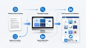
Here's my exact workflow. Write content in 15 minutes. Design slides in 10 minutes. Review and tweak in 5 minutes. Export as PDF. Upload to LinkedIn. Done.
The key is templates. I have five base templates saved. Different color schemes for different content types. Strategy posts get blue. Case studies get green. Personal stories get orange. I just swap in new content each time.
This removes decision fatigue. I'm not starting from scratch every post. I'm filling in a proven framework.
The Content Types That Perform Best
Not all carousel topics work equally well. I've tested dozens of angles. Here's what actually gets engagement.
How to guides crush it. People love step by step instructions. "How to Write Cold Emails That Get Responses" or "How to Optimize Your LinkedIn Profile in 10 Steps" perform consistently.
Data driven insights work brilliantly. If you have interesting statistics or research findings, carousels let you visualize them effectively. Each slide can highlight one data point with context.
Myth busting posts generate tons of comments. "5 LinkedIn Myths Killing Your Reach" sparks debate. People love to agree or disagree publicly.

Personal stories formatted as lessons also hit hard. "What I Learned Losing My First Client" or "How I 10x'd My Sales in 6 Months" combine narrative with takeaways.
What doesn't work? Generic motivational quotes. Surface level tips everyone already knows. Overly promotional content. Your carousel needs to deliver real value first. Promotion comes second.
Design Principles That Actually Matter
Let me save you hours of trial and error. These design rules make the difference between carousels people swipe through and carousels people ignore.
One idea per slide. Maximum. If you're explaining two concepts on one slide, split them. More slides is better than cramped information.
Text size matters more than you think. If someone is viewing on mobile and they have to zoom to read, you've already lost them. Big fonts. Lots of white space.
Consistent visual hierarchy across slides. Your headers should always be the same size and position. Your body text should always use the same font. This creates a rhythm that makes consumption effortless.
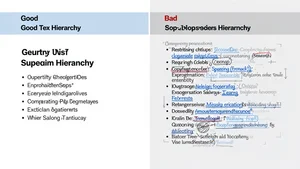
Color psychology is real but overblown. You don't need a perfect palette. You need consistency. Pick two or three colors and stick with them. Brand colors work great. If you don't have brand colors, blue for headers and black for body text works perfectly.
The first slide is your billboard. This is what shows up in the feed before anyone swipes. Make it visually distinct. Make the headline pop. Add your name or logo so it's recognizable as your content.
The Technical Details Nobody Talks About
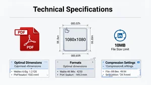
LinkedIn has specific requirements for carousel posts. File format must be PDF. Maximum file size is 100MB but keep it under 10MB for faster loading. You can have up to 300 slides but 10 to 15 is the sweet spot.
Resolution matters. I create slides at 1080px by 1080px. Square format works best because it displays consistently across devices. Vertical slides work too but can look awkward on desktop.
File compression is critical. A 50MB PDF takes forever to load on mobile. Use Cliptics Compress Images to reduce file size without killing quality. This improves user experience dramatically.
Upload timing weirdness. Sometimes LinkedIn takes a few minutes to process your PDF. Don't panic if it doesn't appear immediately. Wait five minutes before assuming something went wrong.
Alt text for accessibility. Add it. Not just because it's the right thing to do, but because it helps LinkedIn understand your content. This can improve distribution.
The Distribution Strategy That Multiplies Results
Creating a great carousel is half the battle. Getting it seen is the other half.
Post timing still matters. B2B content performs best Tuesday through Thursday between 7am and 9am in your audience's timezone. I schedule posts for 7:30am EST consistently.
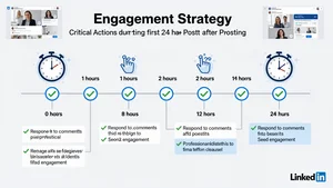
The first hour is critical. LinkedIn's algorithm decides whether to show your post to more people based on initial engagement. So I have a strategy for that first hour.
I send the post link to 3 to 5 colleagues immediately after posting. Ask them to engage genuinely. No "great post" comments. Real reactions to specific slides. This seeds the algorithm.
I respond to every comment in the first two hours. Fast responses signal to LinkedIn that the post is generating conversation. This increases distribution.
Repurposing is huge. One carousel can become a Twitter thread. A newsletter section. A blog post. Content should work across platforms. The initial effort pays dividends when you adapt it smartly.
Pin high performing carousels to your profile. They keep working long after the initial post. People visit your profile and see your best content first.
What I'm Seeing Work Right Now
The LinkedIn landscape changes constantly. What worked six months ago might not work today. Here's what's performing in early 2026.
Behind the scenes content is crushing it. "How We Actually Build Our Product" or "What My Calendar Looked Like This Week" feels authentic. People are tired of polished perfection.
Contrarian takes generate massive engagement. If everyone in your industry says one thing, make a carousel explaining why they're wrong. Back it up with data. Watch the comments explode.
Collaborative carousels are emerging. Two creators contributing slides to one document. This doubles the reach because both audiences see it.

Interactive elements work surprisingly well. "Swipe right if you agree" or "Comment which slide resonated most" increase participation. Simple calls to action woven into the content itself.
The Part That Still Surprises Me
Even after seeing the data, I'm amazed this format works so well. It's not game changing. It's just information presented differently.
But that's the insight, right? How you package ideas matters as much as the ideas themselves. A valuable insight buried in a paragraph gets ignored. That same insight on a clean slide with a clear headline gets shared.
LinkedIn carousels taught me something bigger than tactics. They taught me that friction kills engagement. Every extra step, every moment of confusion, every unclear value proposition makes people bounce.
When you remove friction, when you make consuming content effortless, people engage. It's that simple and that hard.
The 6.60% engagement rate isn't magic. It's the result of understanding platform behavior, respecting audience attention, and delivering value in the format people actually want to consume.
That's what works. That's what will keep working. Not because carousels are trendy, but because they align with how humans process information on social platforms in 2026.