Mocha Mousse Filter: Pantone 2025 Color Trend | Cliptics
You know that feeling when a color just feels right for a moment? Mocha Mousse is having that moment.
Pantone named it their color of 2026, and suddenly it's everywhere. Fashion shoots, product photography, Instagram feeds. That warm, rich brown that somehow feels both cozy and sophisticated.
I've been playing with mocha tones in my photography for a few months now, and there's something genuinely appealing about it. It's earthy without being boring. Warm without being aggressive. Neutral enough to work with almost anything but distinctive enough to create a mood.
Let's talk about what makes this color work and how to actually use it.
Why This Brown Feels Different
Not all browns hit the same. Some feel muddy. Others look dated. Mocha Mousse has this richness that elevates whatever it touches.
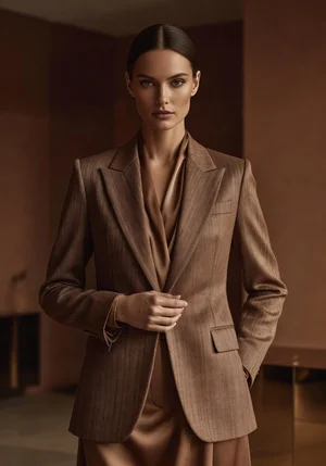
The tone sits somewhere between coffee and chocolate. Not too red. Not too yellow. Just this balanced warmth that photographs beautifully.
When you apply it as a photo filter, it adds instant sophistication. It makes casual shots look intentional. It gives editorial vibes to everyday photography.
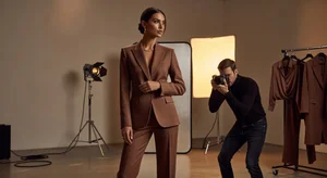
That's probably why fashion photographers latched onto it immediately. It's versatile enough for different styles but specific enough to create a cohesive aesthetic.
How It Changes Photos
The mocha mousse filter does a few specific things to your images.
It shifts the overall color palette toward warm browns and creams. Blues get muted. Greens lean olive. Reds turn terracotta. Everything harmonizes around that central warm tone.
Shadows get richer without going black. There's depth but not harshness. Highlights stay soft, never blown out or stark.
The effect feels expensive somehow. Like you spent extra time color grading when really you just applied the filter. That perceived effort matters when you're building a professional portfolio.
Where It Works Best
Fashion photography is the obvious application. The warm tones complement skin beautifully across different complexions. It adds elegance without trying too hard.
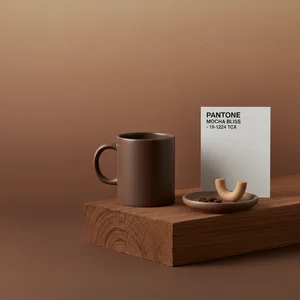
Product photography benefits too, especially for luxury goods. Coffee brands. Leather goods. Cosmetics. Anything where you want to convey quality and warmth.
Lifestyle content looks great with mocha filtering. Interior shots, food photography, travel images. The filter ties everything together with that cohesive warmth.
It doesn't work as well for high energy content. Sports. Action. Vibrant events. The muted palette dampens energy. Save it for content where mood matters more than excitement.
Building a Mocha Aesthetic
If you're going all in on the trend, consistency is everything.
Use the mocha filter across your entire feed. Not just one photo here and there. Every image should have that warm brown foundation. That's what creates the aesthetic people associate with your brand.
Pair it with complementary colors. Cream, tan, soft olive green, muted terracotta. Avoid bright blues and vibrant greens that fight against the warmth.
Choose subjects that enhance the vibe. Natural textures, organic shapes, minimal compositions. The filter works best when the content already leans toward sophistication.
The Timing Question
Color trends have a lifespan. Mocha mousse is hot right now. Will it stay relevant in six months? A year?
Hard to say. But here's the thing: even when trends pass, good color grading stays good. If the mocha aesthetic serves your brand and content, ride it as long as it works.
Just be ready to evolve when it starts feeling stale. Trends are tools, not commitments.
For now though, mocha is having its moment. And if warm, sophisticated brown speaks to your style, this is the time to lean into it fully.