Neo-Minimalism Design Movement 2026: Adding Warmth Over | Cliptics

I've been noticing something subtle happening across the design world lately. The minimalism we've known for years is changing. Not disappearing. Not being replaced. Just... evolving into something different. Something that feels less sterile and more human.
This shift has a name now. Neo-minimalism. And it's quietly redefining what "clean design" means in 2026.
What strikes me most about this movement isn't what it adds, but how it adds it. Neo-minimalism maintains the clarity and restraint we associate with minimalism, but introduces warmth in ways that feel intentional rather than decorative. It's minimalism that breathes. That invites you in rather than keeping you at arm's length.
I've spent the past few months studying this evolution, and what I've found challenges a lot of what we thought minimalism had to be.
The Problem With Pure Minimalism
There's something I need to say first. Minimalism worked. It still works. The movement gave us cleaner interfaces, better information hierarchy, and designs that respect people's attention. Those principles remain valuable.
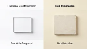
But somewhere along the way, minimalism became synonymous with coldness. Stark white backgrounds. Razor-thin sans-serif typography. Interactions stripped down to their mechanical essence. Designs that felt efficient but emotionally distant.
I remember working on a project last year where the stakeholder kept saying "make it cleaner" which somehow always translated to "make it whiter, flatter, more clinical." The end result was technically excellent. It was also completely forgettable. No personality. No warmth. Nothing that made you want to spend time there.
That's the tension neo-minimalism addresses. How do you maintain clarity without sacrificing humanity? How do you simplify without sterilizing?
What Actually Makes It Different
Neo-minimalism isn't about adding decoration. It's about replacing coldness with warmth while keeping the same level of restraint.
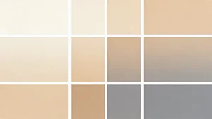
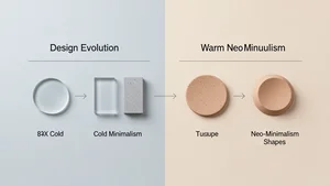
The color palettes shift first. Instead of stark white, you see warm creams and soft beiges. Instead of pure black text, you encounter deep charcoals and warm grays. These aren't dramatic changes. A #FFFFFF becomes #FAF8F5. A #000000 becomes #2C2C2C. Subtle shifts that completely change how a design feels.
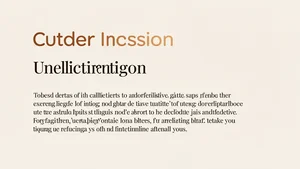
Typography becomes more expressive while remaining clean. You still see generous spacing and clear hierarchy, but the typefaces themselves carry more personality. Rounded sans-serifs instead of geometric ones. Serif fonts used for body text in ways that would have seemed cluttered five years ago but now feel sophisticated and readable.
Spacing gets more intentional. Traditional minimalism often maximized whitespace to the point where elements felt isolated from each other. Neo-minimalism uses spacing to create relationships. Elements breathe but still connect. The negative space serves the design rather than dominating it.
Textures reappear, but subtly. Not heavy patterns or gradients. Think paper grain textures at 3% opacity. Barely visible noise layers. Soft shadows that suggest depth without creating the harsh drop shadows of earlier design eras. These micro-details add tactility without adding visual weight.
Shapes soften. Hard right angles give way to gentle curves. Border radius values increase from 4px to 12px or 16px. Buttons and cards feel more organic, more touchable. The geometry remains simple, but the execution feels warmer.
How This Shows Up In Practice
I've been watching how designers are actually setting up neo-minimalism, and certain patterns keep emerging.
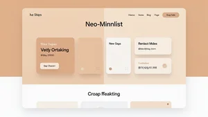
Brand websites are leading this shift. Companies that once presented themselves with austere minimalism now use warm backgrounds, softer shadows, and more inviting color schemes. The layouts remain spacious and uncluttered, but the atmosphere changes completely. You want to stay and explore rather than extract information and leave.
E-commerce sites are embracing this particularly effectively. Product photography against warm neutral backgrounds instead of pure white. Subtle textures that evoke natural materials. Typography that feels personal rather than corporate. The shopping experience becomes less transactional and more experiential.

Portfolio sites for creatives have become testing grounds for neo-minimalist approaches. Designers are using this aesthetic to showcase work in environments that feel curated but not precious. The work remains the focus, but the framing feels more intimate.
Even SaaS applications are adopting elements of this movement. Dashboard interfaces with warmer color schemes. Softer UI components. Illustrations that complement rather than overpower. The functionality stays paramount, but the experience becomes more pleasant.
The Technical Side You Need To Know
Setting up neo-minimalism requires understanding the technical details that create these subtle effects.
Start with your color system. If you're using pure whites and blacks, that's your first change. Create a warm neutral scale. Your lightest color might be #FAF8F5 or #FBF9F6. Your darkest might be #2B2B2B or #1A1A19. Build your entire palette from these anchors rather than from pure black and white.
For gradients, move away from stark contrasts. Use CSS gradient generators to create soft atmospheric transitions between warm tones. A gradient from #FBF9F6 to #F5F1EB creates depth without drama. Layer these gradients subtly in backgrounds and cards.
Typography requires careful selection. Look for sans-serif fonts with humanist characteristics rather than geometric ones. Fonts like Inter, Plus Jakarta Sans, or Satoshi work well. For serifs, consider modern options like Newsreader or Spectral that maintain minimalist clarity while adding warmth.
Shadows become critical for neo-minimalism. Avoid harsh drop shadows. Use layered shadows with larger blur radius and lower opacity. A shadow like 0 4px 16px rgba(0,0,0,0.04), 0 2px 8px rgba(0,0,0,0.02) creates subtle depth. The goal is suggestion rather than definition.
Textures work best when barely visible. Add subtle noise textures at 2-4% opacity. Use SVG patterns for paper grain effects. Layer these over solid backgrounds to add tactility without visual noise. The effect should be subliminal.
Border radius values typically range from 8px to 20px depending on component size. Buttons might use 12px. Cards might use 16px. Larger sections might use 24px. The curves should feel natural, not exaggerated.
What This Means For Brand Design
Neo-minimalism creates interesting opportunities for brand identity work.
The warmth allows brands to feel more approachable while maintaining sophistication. A law firm can project professionalism without feeling intimidating. A wellness brand can feel premium without feeling exclusive. The aesthetic framework supports a wider range of brand personalities than stark minimalism allowed.
Color becomes a more nuanced tool. Instead of one bold brand color against white backgrounds, you can build relationships between warm neutrals and your brand colors. A vibrant blue feels different against warm cream than against stark white. This opens up new ways to establish visual hierarchy and emotional tone.

Logo design shifts subtly. Marks that might have felt too soft or rounded in the stark minimalist era now feel perfectly balanced. Wordmarks with slightly more character work better. The restraint remains, but the expression has more range.
Photography and illustration integration becomes easier. The warm backgrounds create better harmony with human subjects and natural imagery. Product photography feels more contextualized. The overall composition feels more unified.
Tools That Actually Help
Creating neo-minimalist designs is easier with the right tools.
For web designers, an AI image editor becomes valuable for creating and modifying the subtle textures and backgrounds that define this aesthetic. You can generate paper textures, adjust warmth in images, and create custom background treatments that would be tedious to build manually.
Color palette generators that support warm neutral scales help establish your foundational colors. Look for tools that let you generate harmonious warm tones rather than just random color combinations.
Component libraries are starting to catch up. Several design systems now offer neo-minimalist variants with warmer defaults, softer shadows, and more organic shapes. These can accelerate setup while maintaining consistency.
Typography pairing tools help find combinations that work in this aesthetic. The balance between sans-serif and serif becomes more important in neo-minimalism, so tools that suggest harmonious pairings save experimentation time.
The Balance You're Actually Looking For
Here's what I've realized after working within this movement. Neo-minimalism isn't a formula. It's a mindset about balance.
The balance between simplicity and personality. Between restraint and warmth. Between efficiency and experience. You're constantly making micro-decisions about where to add softness and where to maintain crispness.
Some elements should stay stark. Navigation often works best with high contrast and sharp focus. Call-to-action buttons benefit from clear definition. Data visualizations need clarity over warmth. Not everything should be soft.
Other elements benefit from warmth. Backgrounds, cards, supporting text, and environmental elements create the atmosphere. This is where the warm tones, subtle textures, and soft shadows live. The framework that holds the focused elements.
The skill is knowing which elements serve which purpose. Where does the user need efficiency? Where do they need comfort? How do you create a design that serves both needs simultaneously?
What I Think This Really Means
Neo-minimalism represents something larger than a design trend. It's a recognition that efficiency and humanity aren't opposing forces. That simplicity doesn't require coldness. That restraint can coexist with warmth.
We spent years stripping things down, believing that less was always more. Now we're learning that less can be more while also being warmer. The principles of minimalism remain valuable. Clear hierarchy. Intentional use of elements. Respect for user attention. But the execution can feel more human.
What excites me about this movement is its sustainability. This isn't trend-chasing. It's evolution. The fundamentals remain sound while the execution becomes more nuanced. Designs created in this aesthetic won't feel dated in two years because they're built on timeless principles with contemporary warmth.
For web designers, brand designers, and business owners thinking about visual identity, neo-minimalism offers a path forward. You don't have to choose between clean and warm anymore. You can have both. The question is how you'll balance them for your specific needs.
That balance is where the interesting work happens. Where design becomes less about following rules and more about understanding why those rules existed in the first place. What problem were they solving? Does the solution still serve that problem? Can we solve it better?
These are the questions that lead to meaningful design rather than derivative design. And right now, in 2026, neo-minimalism is giving us permission to ask them.