Photorealistic vs Stylized AI Images: When to Use Each for | Cliptics
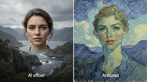
You're staring at two AI generated images on your screen. One looks like it could've been shot by a professional photographer. The other has that artistic, illustrated quality that catches your eye. Both are beautiful. Both tell a story. But which one actually serves your brand?
This isn't just an aesthetic choice. It's a strategic decision that affects how your audience perceives your message, trusts your content, and remembers your brand. I've watched teams agonize over this question, and honestly, the answer isn't always obvious.
So let's break this down together. Not with vague creative theory, but with a practical framework you can actually use to make confident decisions about your visual content strategy.
The Trust Equation
Here's something I've learned from watching how audiences respond to different visual styles: photorealism and stylization trigger completely different psychological responses.
Photorealistic images carry an implicit promise of authenticity. When someone sees a photorealistic AI image of a product demonstration or a customer testimonial scenario, their brain processes it similarly to documentary photography. There's an unconscious assumption that this represents reality, even when viewers know it's AI generated.
That perception matters enormously in certain contexts. Financial services, healthcare, real estate, and B2B technology sectors often need that credibility boost. When you're asking someone to trust you with their money, health, or business infrastructure, photorealistic visuals reinforce the message that you're serious, established, and grounded in reality.
Stylized images work differently. They signal creativity, personality, and intentional artistic choice. Your audience knows immediately that what they're seeing is an artistic interpretation, not a documentary capture. That transparency actually builds a different kind of trust, one based on creative authenticity rather than representational accuracy.

The strategic question isn't which approach is better. It's which type of trust does your specific message need to establish?
When Photorealism Makes Strategic Sense
Let me walk you through scenarios where photorealistic AI images consistently outperform stylized alternatives.
Product visualization tops the list. If you're launching a new smartphone, furniture line, or fashion collection, photorealistic images let potential customers see exactly what they're getting. The texture of fabric, the finish on metal, the way light reflects off glass. These details matter when purchase decisions are on the line.
Before and after transformations represent another sweet spot for photorealism. Weight loss journeys, home renovations, skincare results. These narratives depend on believability. Stylization would undermine the core message by introducing artistic interpretation where people need to see actual change.
Documentary style content marketing also demands photorealism. Behind the scenes glimpses of your manufacturing process, team collaboration moments, or facility tours all benefit from that "you are there" quality that photorealistic generation provides.
News and editorial content is perhaps the most obvious category. When you're illustrating breaking news, financial analysis, or investigative reporting, photorealism maintains journalistic credibility in ways that stylization simply cannot.
But here's a critical nuance many brands miss. Photorealism isn't just about looking real. It's about aligning with audience expectations for your specific industry and message type.
The Strategic Case for Stylization
Now let's flip the equation. When does stylization become not just acceptable, but strategically superior?
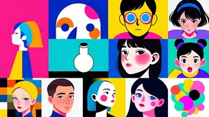
Brand differentiation sits at the top of this list. In crowded markets where every competitor is using similar stock photography or photorealistic AI imagery, a distinctive stylized aesthetic cuts through the noise. Think about how instantly recognizable brands with illustrated mascots or signature art styles become. That visual consistency builds brand equity over time.
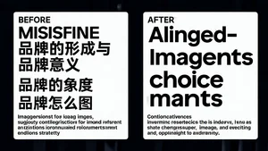
Complex concept visualization often works better with stylization. Try explaining cloud computing architecture, emotional intelligence, or circular economy principles with photorealistic images. It's awkward, right? Stylized illustration lets you simplify, emphasize key elements, and create visual metaphors that photorealism struggles to achieve.
Entertainment and lifestyle brands frequently benefit from stylization because it amplifies emotional resonance. Gaming companies, music festivals, fashion forward brands, and youth oriented products often find that stylized visuals better capture the energy, aspiration, and emotional experience they're selling.
Sensitive topics present another strategic use case for stylization. Mental health content, medical procedures, challenging social issues. Sometimes photorealism feels too heavy, too invasive, or too triggering. Stylization provides enough visual distance to discuss difficult subjects while maintaining sensitivity.
And here's something interesting. Stylization can actually increase engagement in social media contexts. Scroll stopping power often comes from unexpected visual approaches. When everyone else is using photorealistic images, a well executed stylized approach stands out in crowded feeds.
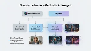
The Decision Framework
Let me give you a practical framework you can actually use tomorrow.
Start by asking three fundamental questions about each piece of content you're creating.
First, what's the primary goal? Are you building credibility, sparking creativity, explaining complexity, or driving emotional connection? Your core objective should guide your visual approach.
Second, what are your industry expectations? Some sectors have established visual conventions that audiences expect. Financial services, healthcare, and legal industries tend toward photorealism. Creative industries, education, and entertainment lean toward stylization. You can certainly break these conventions, but you should do it intentionally, not accidentally.
Third, what's your brand positioning? If you're positioning as the innovative disruptor, stylization might reinforce that message. If you're positioning as the trusted established authority, photorealism likely serves you better.
Beyond these foundational questions, consider your specific context. Where will this image appear? A photorealistic image that works beautifully on a landing page might feel too serious for Instagram Stories. A stylized illustration perfect for email newsletters might lack impact on billboard advertising.
Who's your specific audience for this particular piece of content? Younger audiences often respond well to stylized approaches. Professional B2B audiences may expect photorealism. But these are generalizations, not rules. Test and measure within your specific audience segments.
The Hybrid Approach Nobody Talks About
Here's where things get really interesting. You're not locked into an either or decision.
Some of the most sophisticated visual strategies I've seen use both approaches strategically across different touchpoints. Photorealistic images for product pages and customer testimonials. Stylized images for blog headers and social media content. The consistency comes from color palette, composition principles, and brand voice, not from forcing every image into the same visual style.
You can even blend approaches within single pieces of content. Start with a photorealistic hero image to establish credibility, then use stylized supporting images to explain complex concepts or add visual variety. The contrast itself becomes a strategic tool.

Tools like AI Image Generator let you explore both directions without committing significant resources upfront. You can test different approaches, see what resonates with your specific audience, and refine your strategy based on actual performance data rather than assumptions.
What the Data Actually Shows
Let me share some patterns I've observed from brands successfully navigating this decision.
E-commerce brands using photorealistic product images see higher conversion rates than those using stylized illustrations, particularly for high consideration purchases. But those same brands often get better social media engagement with stylized lifestyle content that shows their products in creative, illustrated contexts.
SaaS companies tend to perform better with stylized images for explainer content and concept visualization, but photorealistic images for case studies and team pages build more trust during the consideration phase.
Content publishers face perhaps the most nuanced challenge. News articles demand photorealism for credibility. Opinion pieces often benefit from stylized header images that signal interpretation rather than reportage. Listicles and how to guides can go either way depending on topic seriousness.
The takeaway isn't that one approach works better universally. It's that strategic alignment between your content type, audience expectations, and visual approach drives better results than defaulting to whatever's easiest to generate.
The Common Mistakes I Keep Seeing
Let's talk about where brands go wrong with this decision.
The biggest mistake is choosing based on personal preference rather than strategic fit. Just because your creative director loves anime style illustrations doesn't mean they're right for your enterprise software platform. Just because photorealism is trending doesn't mean it serves your youth oriented fashion brand.
Another common error is inconsistency without purpose. Using photorealistic images one week and stylized the next with no strategic rationale confuses your audience and dilutes brand recognition. If you're going to use both approaches, make sure there's a clear logic to when and why.
Some brands also make the mistake of letting technical limitations drive strategic decisions. "We're using stylized images because photorealistic is too hard to generate" is backwards thinking. Tools like AI Photo Filters make both approaches accessible. Your strategy should drive your tools, not the other way around.
And here's a subtle one. Failing to consider the full customer journey. An image that works perfectly to attract attention in social media might not build enough trust to close a sale on your product page. Map your visual approach to each stage of your customer's journey.
Emerging Opportunities
The landscape is evolving faster than most brands realize. New capabilities are opening up strategic possibilities that didn't exist even six months ago.
Photo to Anime and Photo to Cartoon transformations let you create cohesive stylized versions of existing photographic assets. This means you can maintain the authenticity of real team photos or actual product shots while adapting them to a stylized visual brand language.
That flexibility changes the strategic calculus. You're no longer choosing between photorealistic or stylized at the beginning of your creative process. You can start with photorealistic assets and adapt them to stylized approaches for specific channels or audiences while maintaining core authenticity.
AI image generation is also getting better at nuance. The spectrum between strictly photorealistic and heavily stylized is filling in with options like illustrated realism, painterly photorealism, and graphic documentation styles. These hybrid approaches give you more strategic flexibility to find the exact visual tone that serves your specific brand needs.
Making Your Decision
Here's my honest recommendation. Don't make this decision once for your entire brand and lock it in forever.
Start by establishing clear strategic principles. Define when photorealism serves your goals and when stylization makes more sense. Document these guidelines so your team has a framework for consistent decision making.

Then test rigorously. Create photorealistic and stylized versions of the same content. Run them with real audience segments. Measure not just engagement, but downstream metrics like trust indicators, purchase intent, and brand recall.
Use what you learn to refine your strategic guidelines. Maybe you discover that your B2B audience responds better to stylized explainer graphics than you expected. Maybe your consumer audience craves more photorealistic product context than you assumed. Let data inform your strategy, but don't let it override clear strategic thinking about brand positioning.
And stay flexible. As your brand evolves, as your audience shifts, as new capabilities emerge, your visual strategy should adapt. The goal isn't to find the perfect answer and freeze it in time. It's to build a sustainable decision framework that serves your brand's evolving needs.
Where This Leaves Us
The question isn't whether photorealistic or stylized AI images are better. It's which approach, in which contexts, for which audiences, serves your specific brand objectives most effectively.
Photorealism builds credibility, represents products accurately, and meets expectations in traditional professional contexts. Stylization differentiates brands, simplifies complex concepts, and creates emotional resonance through artistic interpretation.
The brands winning with AI generated visuals aren't picking sides. They're making strategic decisions image by image, campaign by campaign, guided by clear principles about what each approach accomplishes.
Your visual strategy is too important to leave to chance or default to whatever's easiest. It's worth the strategic thinking to align your image choices with your brand positioning, audience expectations, and specific content goals.
The tools are ready. The capabilities exist. The only question is whether you'll use them strategically or randomly. I know which approach leads to better outcomes, and I think you do too.