Podcast Cover Art in 2026: Design Rules That Get Your Show | Cliptics
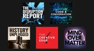
Your podcast cover art is doing more work than you think. It's on the browse screen where a potential listener is deciding in under two seconds whether to tap into your show. It's at 60x60 pixels in the search results row, where most details become visual noise. It's on the home screen of a phone when your episode notification appears. In every context, it's the visual ambassador for the quality of what's inside.
Getting this right isn't optional. Apple Podcasts and Spotify both have specific requirements that determine whether your show is even available for discovery. And beyond the technical requirements, design decisions made without understanding how podcast art is actually consumed result in show art that fails to attract the listeners it could reach.
Technical Requirements: What Gets You Approved
Apple Podcasts and Spotify have converged on similar technical specifications, but the exact numbers matter.
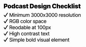
Minimum resolution: 1400x1400 pixels. Maximum resolution: 3000x3000 pixels. The standard for quality production is 3000x3000 pixels. Submitting at minimum resolution risks appearing compressed or pixelated on high-DPI displays.
Format: JPEG or PNG, in the RGB color space (not CMYK, which is for print). PNG preserves better quality for text-heavy designs; JPEG is sufficient for photographic or gradient-heavy designs.
File size: maximum 512KB for most platforms, though some accept up to 4MB. At 3000x3000 pixels, proper JPEG compression keeps file size well under 512KB while preserving visual quality.
Color space note: CMYK images submitted to Apple will be rejected or display with significantly wrong colors. Verify you're exporting in RGB before submission.
Content: No URLs, no contact information, no explicit content indicators, no external platform references (don't put "Listen on Spotify" on art submitted to Apple Podcasts). Both platforms actively review artwork for content violations and will reject or suspend listings for violations.
The Discovery Design Problem
Here's the design challenge that technical specifications don't address: podcast cover art needs to work at multiple scales simultaneously.
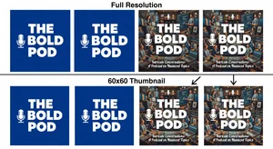
At 3000x3000 (for display on high-resolution screens), intricate design detail is visible and effective. At 300x300 (featured section thumbnails on mobile), moderate detail works. At 60x60 (search results row), only large bold elements are distinguishable. At notification size, only the dominant color and shape are perceivable.
Most podcast cover art fails at the smallest sizes. Design decisions that look sophisticated at full resolution become indistinguishable noise at thumbnail size. The practical design rule: if you can't read your show title and identify your primary visual element at 100x100 pixels, the design needs revision.
The Design Principles That Work
High contrast: the single most important design decision for cover art performance at small sizes. A white or light background with dark text outperforms medium-contrast combinations at every scale. A very dark background with bright accent text also works well. Avoid medium-value color combinations where neither element has clear dominance.
Limit text: your show name is often the only text that belongs on cover art. Taglines and descriptions that are readable at full size become visual clutter at thumbnail sizes and illegible at smaller sizes. If your show name is long, consider whether an abbreviated version or visual shorthand can do the same job more effectively in the square format.
Bold, simple typography: the fonts that read well on podcast cover art are clean, bold, and high in visual weight. Thin or script fonts that look elegant at full resolution become illegible at 100 pixels wide. Test every font choice at 100x100 before committing.
Single dominant visual element: shows with one clear visual focus (a bold icon, a recognizable character, a strong photographic subject, or a typographic treatment that functions as the visual) consistently outperform designs that try to communicate multiple ideas through multiple visual elements.
Color distinctiveness: browse the podcast directory for your category and note the dominant color choices. Color differentiation from your competitors' show art isn't just aesthetic preference. It's discoverability mechanics: a show that visually stands out in a row of similar-colored artworks captures attention before content evaluation begins.
Category-Specific Design Conventions
Different podcast categories have visual conventions that audiences use to quickly categorize and find content. Working within genre conventions (while differentiating within them) is different from ignoring them.
True crime: dark color palettes, shadow photography, high contrast. Shows that design outside this convention risk not being recognized as true crime by genre-browsing listeners.
Business and entrepreneurship: professional photography (real or illustrated), muted corporate color palettes, strong typography. The professional signaling in business podcast art is important for credibility with the professional audience.
Comedy: bolder colors, illustrated or character-based art, personality-forward photography (host faces with expressive elements). The visual tone should communicate the show's energy.
Health and wellness: clean, warm, aspirational color palettes. Photography or clean illustration. Overloaded or complex designs conflict with the genre's presentation norms.
Knowing your category conventions helps you design with genre awareness while choosing how to differentiate. Standing out within a recognizable visual genre is the goal, not standing out from the genre entirely.
Testing Your Cover Art Before Publishing
The test that catches most design failures: screenshot your cover art and view it in the actual context where it will appear.
Take a screenshot of any Spotify browse page. Place your artwork in the grid at the approximate size it will appear. Step back from your monitor to about arms' length. This approximates normal viewing distance and scale. Does your show title remain readable? Is the primary visual element distinct?
Email yourself the artwork and view it as a phone notification. At this scale, only the dominant color and largest text element should be visible. Is the experience still coherent?
Ask someone who hasn't seen the design to describe what they see in the first two seconds of looking at it. If their description matches your design intent, the art is communicating. If it doesn't, something in the hierarchy is wrong.
When to Update Your Cover Art
Cover art updates are one of the most underutilized tools in podcast growth strategy. Updating artwork:
- Can trigger re-categorization in some podcast discovery algorithms
- Signals active production to potential listeners browsing your back catalog
- Allows you to apply lessons from your audience and from watching what works in your category
The threshold for updating: if your show has been live for 12+ months and you haven't revisited the artwork, it's worth evaluating against current category standards. The competitive visual environment of podcast directories changes as successful shows set new visual norms.
The show with great cover art doesn't win because design is the most important thing about a podcast. It wins because design is the first thing a potential listener evaluates, and first evaluations determine whether the content ever gets a chance to be heard.
Get the technical requirements right. Design for the smallest size you'll appear. Use contrast and simplicity as your primary tools. And test your work in the actual contexts where it will appear before you submit. 
The show inside deserves the listener. The cover art's job is to earn that first tap.