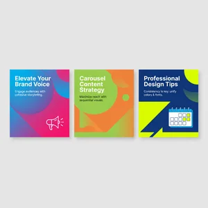
Social Media Carousel Posts AI Template Generator for Non | Cliptics

Last month I watched someone spend three hours trying to create a carousel post in Canva.
She kept getting stuck on alignment. The fonts didn't feel cohesive across slides. The color scheme looked good on slide two but weird on slide four. By the end, she was frustrated, exhausted, and the carousel still looked homemade.
I get it completely. Carousel posts are deceptively difficult. They're not just individual images, they're a visual story that needs to flow. Each slide connects to the next. The design needs consistency while maintaining visual interest. And if you don't have a design background, achieving that balance feels almost impossible.
But here's what I've discovered through creating hundreds of carousels for different accounts: AI template generation has made this dramatically easier. Not easier in a "still takes two hours but now it's bearable" way. Actually easier. As in, you can create professional looking carousels in 20 to 30 minutes, even if you've never touched design software before.
Why Carousels Actually Matter Right Now
Before we get into the how, let's talk about why carousels deserve your attention.
Instagram's algorithm currently loves them. A good carousel gets more reach than a single image post, more engagement than most video content except Reels. The swipe through behavior keeps people on your post longer, which signals value to the platform.
But more importantly, carousels let you tell complete stories. Educational content that needs multiple points. Before and after transformations. Step by step tutorials. Mini case studies. List posts. All the content types that perform well but don't fit into a single image.
The problem has always been creating them efficiently. Until recently, your options were pretty limited. Hire a designer, which gets expensive fast. Learn design software, which takes months. Use rigid templates that make everything look generic. Or struggle through it yourself and hope for the best.
AI changes that equation entirely.
The Old Way vs The New Way
I remember when creating a carousel meant opening Photoshop or Illustrator. You'd start with blank artboards, build a design system from scratch, copy elements across slides while trying to maintain consistency, export everything individually, then upload to Instagram hoping the resolution looked okay.
Even with Canva, which simplified some parts, you still faced design decisions at every turn. Typography choices. Color theory. Visual hierarchy. Spacing and alignment. All the fundamentals that designers study for years.
The AI approach flips this completely. Instead of building from blank canvas, you start with natural language. You describe what you want, the AI generates options, you refine and customize. The heavy lifting of design fundamentals happens automatically.
What used to take 2 to 3 hours now takes 20 to 30 minutes. What required design expertise now requires clear communication about your goals.
How I Actually Create AI Carousels
My process has evolved through trial and error. Here's what consistently works.
Start with content planning before any design work. Write out exactly what each slide will communicate. Not just topics, but specific messages. Slide one introduces the hook. Slide two presents the first main point. Slide three builds on that. And so on.
This planning is critical because AI generates better templates when you're specific about structure. "Create a 5 slide carousel about productivity tips" generates generic results. "Create a 5 slide carousel: slide 1 is an attention grabbing question, slides 2 through 4 each present one specific productivity technique with an example, slide 5 is a call to action" generates something you can actually use.
Once content is mapped, I move to visual direction. What's the mood? Professional and clean? Bold and energetic? Minimal and sophisticated? What colors align with the topic and brand? What kind of imagery supports the message?
I typically use the AI image generator to create individual slide designs. The key is maintaining consistency across the set through detailed prompts that reference the same visual parameters.
For example, if I'm creating a productivity carousel with five slides, my first prompt might be: "Professional social media carousel slide, clean modern design, navy blue and white color scheme, bold sans serif typography, subtle geometric background pattern, slide 1 of 5, attention grabbing question layout."
Then for subsequent slides, I reference the same visual elements: "Same design style, navy blue and white, same typography and background pattern, slide 2 of 5, content layout with icon and text."
The AI image editor becomes essential for refinement. If one slide's colors are slightly off, or the spacing doesn't quite match the others, I can make targeted adjustments without regenerating everything.
The Details That Make Carousels Work
Through creating carousels across different niches, I've noticed certain patterns that separate amateur from professional looking results.
Typography consistency is probably the most important element. Every slide should use the same font family, with maybe two weights maximum. Heading size should be identical across slides. Body text should maintain the same size and line spacing. This sounds obvious, but it's where most people slip up.
Color palette needs to be locked and limited. Pick 2 to 3 main colors and stick with them throughout. Even if individual slides have different content, the color story should feel unified. This is actually where AI excels, once you establish the palette in your prompts, it maintains it automatically.
Visual hierarchy guides the viewer's eye in the right order. Each slide should have one clear focal point. If there's an image, text, and icon competing for attention, the design feels chaotic. AI generators sometimes struggle with hierarchy, so this is often what I refine manually.

Slide transitions create flow. Even though Instagram doesn't animate between slides, there should be visual continuity. Maybe a design element that appears in the same position across all slides. Or a color that carries through. Something that ties the experience together.
The first and last slides deserve special attention. Slide one needs to stop the scroll, which means bold text, intriguing question, or eye catching visual. The last slide should have a clear next step, whether that's following your account, checking your bio, or engaging with the post.
Content Types That Work Perfectly as Carousels
Not everything should be a carousel, but certain content formats absolutely thrive in this structure.
Educational listicles are perfect. "7 Ways to Improve Your Writing" becomes seven slides, each focusing on one technique with explanation and example. The swipe through interaction matches how people naturally consume list content.
Step by step tutorials translate beautifully. Each slide shows one clear step. Before and after examples work the same way. Problem on slide one, solution process across middle slides, final result at the end.
Data visualization and statistics benefit from the multi slide format. You can build a narrative through numbers, revealing information progressively rather than cramming everything into one overwhelming graphic.
Behind the scenes storytelling lets you create mini documentaries. The journey of creating a product, the process behind a service, a day in the life content. Carousels give you room to develop that narrative.
Myth busting content has natural structure. Common misconception on odd slides, truth revealed on even slides, with a summary at the end.
Where AI Templates Actually Struggle
I want to be honest about limitations because understanding them helps you work more effectively.
Highly specific brand elements don't always translate well. If your brand uses a very particular illustration style or custom graphic elements, the AI might approximate rather than replicate exactly. You may need to add those elements manually afterward.
Complex data visualization can be hit or miss. Simple charts and graphs work fine. Intricate infographics with multiple data points and relationships sometimes come out cluttered or unclear. For those, AI generation might just get you started, with refinement needed.
Text accuracy needs checking. Sometimes the AI generates placeholder text that looks right but isn't exactly what you specified. Always review every slide for text accuracy before publishing.
Accessibility considerations require manual attention. AI doesn't automatically ensure sufficient color contrast for readability, or consider how designs work for people with visual impairments. Those are choices you need to make consciously.

Platform specific optimization sometimes needs tweaking. Instagram's carousel format has particular dimension requirements. The AI generates at standard sizes, but you might need to adjust crops or safe zones to ensure nothing important gets cut off in the feed preview.
My Real Workflow Start to Finish
When I'm creating carousels regularly, here's my actual process.
Monday morning is batch content planning. I map out 3 to 4 carousel topics for the week, writing out the slide by slide breakdown for each. This takes about an hour and sets me up for efficient production.
Then I move into generation sessions. I create all slides for one carousel together, maintaining the same prompt structure across them. Generate, review, regenerate if needed. For a 5 slide carousel, this typically takes 15 to 20 minutes once you have your prompts dialed in.
Refinement happens next. I review the full set for consistency, make any color or spacing adjustments using the AI image editor, and add any brand specific elements that the AI couldn't generate perfectly.
Final touches include adding text overlays with exact copy, ensuring accessibility, and optimizing file sizes for Instagram. Then scheduling or publishing.
The entire process, from concept to published carousel, takes 30 to 45 minutes per carousel once you've done it a few times. Compare that to the multi-hour process before AI tools, and the efficiency gain is substantial.
What This Means for Social Media Managers
I keep thinking about how this changes what's possible for small teams and solo creators.
When carousel creation took 2 to 3 hours each, you could maybe produce one or two per week. That limited how much educational content you could create, how often you could post high engagement formats, how much you could experiment with different approaches.
Now, you can create a carousel daily if your content strategy calls for it. You can test different visual styles quickly to see what resonates. You can respond to trending topics with timely, professional looking content instead of rushing out something that looks thrown together.
This isn't about replacing creativity or strategic thinking. Those are still essential. But it removes the technical design bottleneck that prevented good ideas from becoming good content.
For agencies managing multiple clients, the time savings multiply. For brands with limited budgets, it's professional design capability without the designer salary. For creators building authority through educational content, it's the ability to produce consistently without burning out.
Where I See This Going
The tools are improving remarkably fast. What required careful prompt engineering six months ago now works with simpler instructions. What looked slightly AI generated before now passes as professional design.
I'm particularly interested in where template customization goes next. Imagine describing your full brand guidelines once, then every carousel generated automatically incorporates those specific fonts, colors, spacing rules, and visual elements. That level of personalization while maintaining the speed of AI generation would be transformative.
Interactive elements could be fascinating. Carousels that adapt based on what performed well in previous posts. AI suggestions for optimal slide count based on topic complexity. Automatic A/B testing of different visual approaches.
But even with today's capabilities, the opportunity is real. Anyone managing social media can create professional carousel content without design expertise or expensive software. The barrier to producing engaging, educational, visually cohesive social content has dropped dramatically.
That democratization is what excites me most. Not the technology itself, but seeing what people create when design skills are no longer the limiting factor.