Thumbnail Psychology: Why People Click | Cliptics
I've been staring at thumbnails for years now. Not just casually scrolling past them, but actually studying them. Trying to figure out why my hand reaches for one video and completely ignores the one right next to it. And here's what's strange: most of the time, I can't even explain why I clicked.
That's what makes this topic so fascinating. The decision to click a thumbnail happens in roughly 1.5 seconds. That's not enough time for rational analysis. It's barely enough time to read a title. So what's actually happening in that tiny window? Turns out, quite a lot.
The 1.5-Second Decision Your Brain Makes
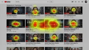
When you scroll through YouTube, your brain is doing something remarkable. It's processing dozens of thumbnails simultaneously using what neuroscientists call pre-attentive processing. This is the same system that helped our ancestors spot predators in tall grass. It operates below conscious awareness, scanning for patterns that signal "this is worth your attention."
Three things trigger this ancient system more than anything else: faces, contrast, and novelty. Your brain is hardwired to detect faces. It's so deeply wired that we see faces in clouds, in electrical outlets, in the front grilles of cars. A thumbnail with a human face activates the fusiform face area of your brain before you've even registered what you're looking at.
But not just any face. Eye-tracking studies show that faces displaying strong emotion, surprise, curiosity, excitement, get significantly more visual fixation than neutral expressions. This isn't manipulation. It's biology. We evolved to pay attention to emotional signals from other humans because those signals often meant something important was happening.
The Curiosity Gap and Why It Works
There's a concept in behavioral psychology called the information gap theory, proposed by George Loewenstein back in the 1990s. The idea is simple but powerful: when people perceive a gap between what they know and what they want to know, they experience something that feels almost like an itch. A mild discomfort that can only be relieved by getting the information.
Great thumbnails exploit this constantly. They show you just enough to create a question in your mind but not enough to answer it. A reaction face without context. A before image without the after. A red circle highlighting something you can't quite make out. Each of these creates a tiny information gap that your brain desperately wants to close.
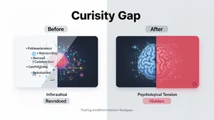
The creators who understand this don't just slap text on an image. They engineer curiosity. They think about what piece of information to withhold and what piece to reveal. It's a balancing act. Show too little and people scroll past because there's nothing to latch onto. Show too much and the curiosity gap closes before they click.
This is also why clickbait eventually stops working. If you keep creating curiosity gaps that the video doesn't satisfy, viewers learn to distrust your thumbnails. The gap becomes associated with disappointment rather than discovery. Your brain literally recalibrates its response.
Color, Contrast, and the Pop-Out Effect
Vision researchers have studied something called the pop-out effect for decades. When a single item differs dramatically from its surroundings, it captures attention automatically. You don't choose to look at it. Your visual system forces you to.
This is why saturated colors against muted backgrounds work so well in thumbnails. It's why red and yellow tend to perform better than blues and greens in certain contexts. These warm colors activate the visual system more aggressively. They're closer to the colors of fire, blood, ripe fruit, all things our ancestors needed to notice quickly.
But here's the part most people miss. The effectiveness of a thumbnail's color scheme depends entirely on what surrounds it. If every thumbnail in a feed uses bright red, then the one using clean white space will pop out instead. The psychology isn't about any specific color. It's about contrast with the environment. Smart creators check what their thumbnail looks like in the context of a search results page, not just in isolation.
The Text Problem Nobody Talks About
Adding text to thumbnails seems obvious. More information should help people decide to click, right? Actually, the research is more complicated than that.
When eye-tracking studies measure how people scan thumbnail grids, text-heavy thumbnails often receive less total visual processing time. The reason is cognitive load. Your brain has to switch from image processing, which is fast and parallel, to text reading, which is slow and sequential. That switch costs precious milliseconds in a 1.5-second decision window.
The thumbnails that use text most effectively limit it to two or three words maximum. Short enough to be processed almost as an image rather than as language. "I QUIT" hits differently than "Why I Decided To Leave My Job After 10 Years." The first can be grasped in a single eye fixation. The second requires actual reading, and most people won't bother.
This is also why font choice matters more than most creators realize. Bold, high-contrast fonts with thick strokes are processed faster than thin, elegant typefaces. The brain doesn't care about aesthetics in that 1.5-second window. It cares about legibility at small sizes.
Social Proof and the Bandwagon Trigger
There's another psychological mechanism at play that operates at a subtler level. When a thumbnail shows multiple people reacting to something, or when the view count visible in the interface is high, it triggers what psychologists call social proof. The reasoning, mostly unconscious, goes something like: if other people found this interesting, it's probably worth my attention too.
This is why collaboration thumbnails and reaction-style formats tend to perform well. Two recognizable faces create a stronger social signal than one. A group of people all looking in the same direction creates an almost irresistible urge to look where they're looking.
Some creators have gotten clever about embedding social proof directly into their thumbnails. Screenshots showing high engagement, images suggesting viral moments, visual cues that imply "everyone is talking about this." It works because the bandwagon effect is one of the most solid findings in social psychology. We are deeply, fundamentally influenced by what others pay attention to.
Why Some Great Thumbnails Still Fail
Here's the uncomfortable truth that pure psychology can't fully explain. Sometimes a thumbnail does everything right, strong face, clear emotion, curiosity gap, good contrast, and it still underperforms. Why?
Because thumbnails don't exist in isolation. They interact with titles, with channel reputation, with timing, with the viewer's current mood and browsing intent. A psychologically perfect thumbnail for a cooking video shown to someone searching for car repair advice is still going to get ignored.
The algorithm also plays a role that's hard to separate from psychology. YouTube's recommendation system decides which audiences see your thumbnail, and if it shows your video to the wrong audience, no amount of psychological optimization will save it. The thumbnail might be doing its job perfectly, capturing attention and generating clicks from the right viewers, but if those viewers aren't being served the video, the numbers won't reflect it.
Putting It All Together
The creators who consistently achieve high click-through rates aren't necessarily the ones with the best design skills. They're the ones who understand human attention as a system. They think about faces, emotion, curiosity gaps, contrast, cognitive load, and social proof as interconnected levers rather than isolated tricks.
If you're looking to actually apply this, tools like Cliptics AI image tools can help you prototype and test different thumbnail concepts quickly, so you can experiment with these psychological principles without spending hours in Photoshop for each variation.
But the most important thing isn't any single technique. It's developing the habit of asking: what is my viewer's brain doing in that 1.5-second window? What will their pre-attentive system latch onto? What curiosity gap am I creating? And most critically, does my video actually deliver on the promise my thumbnail makes?
Because in the long run, the psychology of clicking is inseparable from the psychology of trust. Every thumbnail is a promise. Every video is either a fulfillment or a betrayal of that promise. The creators who understand both sides of that equation are the ones who build audiences that last.