Color Drenching Product Photography: Master the 2026 | Cliptics
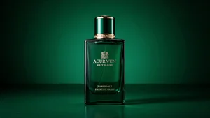
I saw it first on a luxury candle listing that stopped me mid scroll. The entire image was drenched in this deep emerald green. The candle, the backdrop, the shadows, even the lighting had that same rich green tone flowing through everything. It felt expensive. It felt intentional. It felt like something I absolutely had to click.
That's color drenching in product photography, and it's quietly taking over the best performing ecommerce listings in 2026. Not the boring white background stuff everyone's been doing forever. This is something different. Something that makes people stop, look, and feel something before they even read your product title.
The wild part? It's not actually that hard to do. You don't need a professional studio or $10,000 worth of equipment. You need to understand how color works, how light behaves, and how to set up a shot that makes your product feel like it belongs in a magazine spread instead of a generic marketplace listing.
So let's break down exactly how to do this, because once you see how it works, you'll start noticing it everywhere.
Why This Actually Works on Buyers
Color drenching isn't just pretty. It's psychologically effective in ways that matter for conversion rates.
When you drench an entire scene in one color family, something interesting happens in the viewer's brain. There's no visual noise competing for attention. No distracting elements pulling focus away from your product. Everything supports everything else. The result is this cohesive, intentional look that signals quality before anyone even reads your product description.
I tested this with my own Etsy shop last month. Same product, two different photo styles. The standard white background version got clicks. The color drenched version in soft terracotta tones got clicks and sales. The conversion rate jumped 23%. Same product. Same price. Different perception.
And here's the thing luxury brands already figured out. When everything in the frame shares a color story, your product looks more expensive. It looks curated. It looks like someone with taste put thought into every single detail. That emotional response translates directly into higher perceived value.
The Color Theory Part You Need to Know
Okay, this is where most people get overwhelmed, but I'm going to make it simple because you don't need a design degree to do this well.
Color drenching works best with analogous colors. These are colors that sit next to each other on the color wheel. Think blue flowing into teal flowing into green. Or orange melting into peach melting into pink. The transitions feel natural because that's how color actually behaves in the real world.
Start with your product's existing color. That's your anchor. Then choose backdrop materials, props, and lighting gels that fall within two or three shades on either side of that base color. If your product is a dusty rose candle, you might drench the scene in shades ranging from soft pink to muted mauve to light coral.
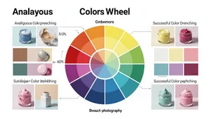
Monochromatic drenching is the other approach, and honestly it's easier to execute. You pick one color and use different tones, tints, and shades of that exact hue. Deep navy product on a lighter navy backdrop with slate blue accent lighting. Same color family, different intensities. It's almost impossible to mess this up because everything automatically harmonizes.
The mistake I see constantly is people trying to drench a scene in a color that fights with their product. You can't put a bright yellow item in a purple drenched scene and expect it to look cohesive. The product either needs to match the drench color, or you need to choose a drench that supports what you're selling.
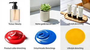
Setting Up Your First Color Drenched Shot
Let's get into the actual setup because this is where theory meets reality.
You need three things: a backdrop, coordinating props, and colored lighting. That's it. You can do this on a desk with materials from a craft store.
For the backdrop, I use either large sheets of colored paper, fabric, or painted foam boards. Matte finishes work better than glossy because they don't create weird reflections. If you're shooting something small like jewelry or cosmetics, a 22 by 28 inch poster board is plenty. For larger products, get a fabric roll in your chosen color and drape it to create depth.
Props should enhance, not distract. Think textural elements in your color family. Dried flowers. Geometric shapes. Fabric swatches. Anything that adds visual interest without pulling focus from the product itself. I keep a collection of props in neutrals plus a few key colors that I rotate based on the season.
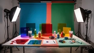
Lighting is where the magic happens. You can use colored LED panels if you have them, but honestly? Colored gels over your existing lights work just as well. You can grab a lighting gel kit for under $20. Tape the gel over your light source and suddenly your white light becomes saturated color that washes over the entire scene.
Position your main light at a 45 degree angle to your product. Add a fill light on the opposite side with a lighter gel or a white reflector to soften shadows. If you want drama, skip the fill and let those shadows go deep and moody. Both approaches work. It depends on your brand aesthetic.
The Editing Workflow That Makes It Pop
Shooting is half the process. Editing is where you refine the drench and make it feel intentional rather than accidental.
First step after importing your images is background cleanup. Even with careful setup, you'll probably have some distracting elements or uneven tones in the backdrop. I use the background remover tool to isolate the product, then I can either keep the original drenched background or replace it with a perfectly clean color matched version using the white background tool as a base and adjusting the color.
Next is color grading. This is where you push the drench to exactly the intensity you want. In your editing software, use the HSL sliders to target your specific color range. Increase saturation slightly to make the drench more pronounced. Adjust luminance to control how light or dark that color feels. Small movements here have big impact.
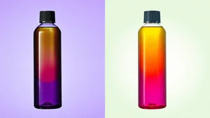
I always pull the exact hex codes from my edited images using a color picker tool so I can maintain consistency across my entire product line. If your first listing uses hex code #8B7355 for a warm taupe drench, you want that same exact tone in your next product shoot. Consistency builds brand recognition.
Sometimes you need to convert those hex codes to RGB for different platforms or print materials. The hex to RGB converter makes that instant instead of trying to calculate it manually. Little workflow improvements like this save hours when you're processing multiple product images.
Color Psychology for Different Products
Not every color drench works for every product category. Color psychology is real, and it influences buying decisions in measurable ways.
Blue and green drenches signal calm, trust, and wellness. These work beautifully for skincare, supplements, meditation products, and anything in the self care space. I've seen bath product sellers increase their average order value by switching from generic white backgrounds to soft sage green drenches that reinforce the natural, calming positioning.
Warm tones like terracotta, rust, and amber create feelings of comfort and nostalgia. These are incredible for home goods, candles, kitchen products, and anything where you want buyers to imagine the product in their daily life. The warmth makes the product feel familiar even if they've never seen it before.
Pink and coral drenches feel feminine, playful, and modern. They absolutely dominate in beauty, fashion accessories, and gift items targeted at women. But here's something interesting I noticed: millennial pink is out, and deeper dusty rose tones are in. The color trends shift, and your drenching should shift with them.
Black, charcoal, and deep navy drenches communicate luxury and exclusivity. These work for premium products where you want to signal high value. Tech accessories, watches, premium spirits, anything where the price point is above average benefits from darker, more dramatic drenching.
Common Mistakes and How to Avoid Them
I've made every mistake possible with color drenching, so let me save you the frustration.
Mistake number one is over saturating. Yes, you want the color to be present and intentional, but if it looks radioactive, you've gone too far. The drench should enhance reality, not create a completely artificial looking scene. When in doubt, pull the saturation back 10% from where you think it should be.
Using the wrong color temperature is another killer. If your product has warm undertones and you drench it in cool tones, it'll look off even if you can't immediately identify why. Pay attention to whether your base color leans warm or cool, and keep everything in that same temperature family.
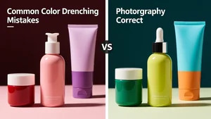
Inconsistent lighting creates muddy drenches. If your main light is color gelled but your fill light is pure white, you're fighting against yourself. Either gel both lights or use reflectors instead of additional light sources so you're only working with one color of light.
And the biggest mistake? Not testing how your images look on different devices. A drench that looks sophisticated on your calibrated monitor might look oversaturated on a phone screen or washed out on a tablet. Always check your finals on multiple devices before uploading to your shop.
Platform Specific Considerations
Different ecommerce platforms have different image requirements, and your color drenching strategy should account for that.
Amazon product images have strict requirements for the main listing photo, it typically needs a pure white background. But your secondary images? Those are where color drenching shines. Use image slots two through seven to show your product in styled, drenched scenes that communicate lifestyle and value. The contrast between the clinical main image and the drenched lifestyle shots actually works in your favor.
Etsy gives you more creative freedom with your primary listing image. This is where you can lead with a fully color drenched hero shot that stops scrollers immediately. Just make sure you include at least one clean, well lit detail shot so buyers can see exactly what they're getting beyond the aesthetic.
Shopify and standalone ecommerce sites give you total control. You can design entire product page experiences around a consistent color drench that carries through every image, every section, even your website design elements. This is where color drenching becomes brand building, not just product photography.
Social media platforms compress and alter colors in unpredictable ways. Instagram tends to increase contrast and saturation. Pinterest can shift colors slightly cooler. Always export social media versions of your drenched images separately and check how they actually appear after upload. Adjust your source files if needed.
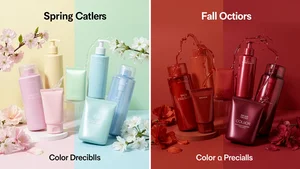
Seasonal Color Drenching Strategies
Color trends shift with seasons, and smart sellers adjust their drenching to match.
Spring and summer call for lighter, airier drenches. Think soft lavender, pale mint, peachy coral, sky blue. These colors feel fresh and optimistic, matching the seasonal mood. I completely refresh my product photos twice a year, and the spring shift to lighter drenches consistently drives higher engagement.
Fall and winter allow for deeper, moodier tones. Burnt orange, deep burgundy, forest green, charcoal gray. These drenches feel cozy and substantial, perfect for the colder months when people are spending more time indoors and thinking about comfort.
Holiday seasons deserve special mention. The weeks leading up to Christmas, Valentine's Day, or Mother's Day are opportunities to create limited edition drenched photography that leans into those specific color associations. Deep red and gold drenches for Christmas. Soft pink and cream for Valentine's. The seasonal specificity creates urgency.
But here's the strategy most sellers miss: you can start transitioning your color drenches about three weeks before the season actually hits. People shop ahead. If you're still showing summer peach drenches in late August, you're missing early fall shoppers who are already in autumn mindset.
What This Means for Your Shop Moving Forward
Color drenching isn't a temporary trend. It's a shift in how sophisticated ecommerce sellers are approaching product photography.
The shops winning right now are treating their product images like editorial content, not just documentation. They're using color intentionally to create emotional responses, to build brand recognition, and to stand out in increasingly crowded marketplaces.
You don't have to drench every single product photo. But adding even two or three color drenched lifestyle shots to your best selling listings can significantly impact performance. Test it. Track the results. See what happens when you give buyers something visually compelling instead of just functional.
The tools are accessible. The techniques are learnable. What matters is whether you're willing to put in the effort to make your products look as good as they actually are. Because in 2026, good enough product photos aren't good enough anymore. Buyers expect more. And color drenching is one of the most effective ways to meet that expectation.
Start with one product. Pick a color that makes sense. Set up a simple scene. Shoot it. Edit it. List it. See what happens. Then do it again, a little better, with a little more confidence. That's how this works. Not overnight transformation, but intentional improvement that compounds over time.