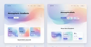
Soft Atmospheric Gradients Web Design 2026: Create | Cliptics
I stood staring at this website the other day and something felt different. Not obviously different. Not flashy or attention grabbing. Just quietly, beautifully different.
The background had this soft wash of color that reminded me of twilight. Blues melting into purples so gently you couldn't spot where one ended and the other began. It had depth. Atmosphere. Like looking through layers of silk.
That's when it clicked. We're in the middle of a gradient renaissance, but not the way you might think. Not those sharp, saturated transitions from 2018. This is something subtler. More cinematic. And once you notice it, you see it everywhere.
The websites that feel premium right now? They're using this technique. Small business sites that punch above their weight class? Atmospheric gradients. Landing pages that make you pause and actually look? Same thing.
So I went down the rabbit hole. What makes these gradients work? How do you create that cinematic feeling without making things look muddy or overdesigned? And can regular people actually build this without being color theory experts?
Turns out, yes. But there are some tricks worth knowing.
Why Soft Gradients Suddenly Feel Right
Something shifted in how we experience screens. Maybe it's pandemic fatigue from staring at harsh interfaces all day. Maybe minimalism finally got too minimal. Whatever the reason, people are craving visual warmth again.
Hard edges feel clinical. Flat colors feel sterile. But soft, atmospheric gradients create this sense of space. They add dimension without adding clutter. Your eye can rest on them because there's nothing jarring to process.
I talked to a designer friend who works with boutique brands, and she said something interesting. "Gradients used to announce themselves. Now the good ones whisper."
That nailed it for me. The best atmospheric gradients don't scream for attention. They create mood. They make content feel like it's floating in space rather than stuck on a white canvas. They give your design room to breathe.
And here's the practical bit: they work across devices. A soft gradient that looks beautiful on desktop still feels elegant on mobile. The transitions scale naturally because they're not dependent on specific dimensions.
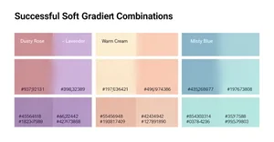
The Color Combinations That Actually Work
This is where most people stumble. You can't just pick random colors and blur them together. Atmospheric gradients need intention.
The combinations I keep seeing that work consistently: dusty rose to soft lavender, warm cream to pale peach, misty blue to gentle seafoam, charcoal gray to deep plum.
Notice the pattern? They're all low saturation. Not muted exactly, but refined. Think watercolor, not highlighter.
The secret is staying within similar tonal families. You want colors that share either warmth or coolness. When you mix a warm orange with a cool blue, you get mud. But warm peach with warm gold? That flows.
Temperature matters more than hue. I learned this the hard way after creating what I thought was a beautiful green to pink gradient that just looked... off. The green was cool. The pink was warm. They fought each other.
Once I switched to a cool mint green with a cool rose pink? Magic. The transition felt natural because both colors lived in the same temperature zone.
And saturation is your friend, but only in small doses. I keep most atmospheric gradients between 20% to 40% saturation. Enough color to create mood, not so much that it overwhelms content.
Building Your First Atmospheric Gradient
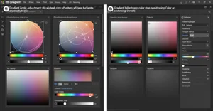
Let's make this practical. You don't need design software to start. You can build gorgeous gradients right in your browser.
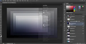
I'm a big fan of Cliptics CSS Gradient Generator because it gives you immediate visual feedback. But the principles work anywhere.
Start with two colors maximum. Seriously. The atmospheric look comes from simplicity, not complexity. Pick your lighter color for the top or left, your slightly darker color for the bottom or right.
Now here's the trick that changed everything for me: set your gradient angle between 135 and 180 degrees. Perfectly vertical (180) or slightly diagonal (135 to 160) creates that cinematic sweep. Horizontal gradients feel more retro. Diagonal feels contemporary.
The color stops matter way more than you'd think. Don't put them at 0% and 100%. Try something like 15% and 85%. This creates more mixing in the middle, which is where the atmospheric quality comes from.
Play with opacity too. A gradient that goes from full opacity to 70% opacity creates layering possibilities you can't get otherwise. Stack it over an image or texture, and suddenly you've got depth.
If you're using Tailwind CSS, the Tailwind CSS Gradient Generator is cleaner for rapid prototyping. Same principles apply, just with utility classes instead of raw CSS.
The real skill is knowing when to stop. Add one more color, tweak one more setting, and you can cross from atmospheric into overwrought. Trust the subtlety.
Making Gradients Move Without JavaScript
Here's where things get fun. Static gradients are beautiful. Animated gradients are mesmerizing.
And you don't need JavaScript to do it. Pure CSS animation can bring atmospheric gradients to life in ways that feel organic, not gimmicky.
I wrote a whole piece on animated gradients without JavaScript because this technique blew my mind when I discovered it. The basic approach uses CSS keyframes to shift gradient positions or hues over time.
The key is keeping animation slow. We're talking 8 to 15 second loops minimum. Fast gradient animations feel like screensavers from 1998. Slow animations feel like breathing. Living atmosphere.
You can animate the background position, making the gradient sweep across the element. Or animate the hue, creating gentle color shifts. Or animate opacity for fading effects.
My favorite approach combines a static gradient with a subtle animated overlay gradient. The base creates consistency. The overlay creates life. Together they produce this gentle, almost imperceptible movement that draws people in without distracting them.
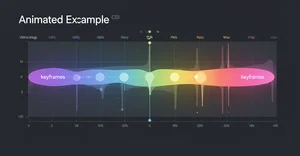
The Animated Gradient Generator on Cliptics handles all the keyframe complexity for you. Adjust the duration, pick your colors, copy the code. Done.
But understand the why behind it. Animation should enhance mood, not create distraction. If someone notices the animation consciously, it's too aggressive. If they just feel more engaged without knowing why? That's the sweet spot.
Layering Gradients for Cinematic Depth
Single gradients are great. Layered gradients are transcendent.
This is how you get that cinematic quality that makes websites feel expensive. You stack multiple gradient layers with different opacities, creating visual complexity that still reads as simple.
Start with a base gradient. Something solid. This is your foundation. Then add a second gradient layer at maybe 30% opacity with a different angle. This creates dimensional interplay.
I've seen designs with three or even four gradient layers, each contributing something subtle. A warm undertone. A cool highlight. A dark vignette around the edges. Together they create depth you can almost feel.
The trick is varying your blend modes. Normal blend mode is fine for the base. Try multiply or overlay for additional layers. Screen blend mode can create beautiful lightening effects. Soft light splits the difference.
Don't overdo it. More layers isn't automatically better. Each layer should have a purpose. Remove any layer, and you should notice something missing. If you can remove a layer without impact, you didn't need it.
And performance matters. Every gradient layer is a rendering calculation. On modern devices, three to four layers is totally fine. Go beyond that and you might see performance hits, especially on lower end phones.
The Grain Texture Secret
Want to know what separates amateur atmospheric gradients from professional ones? Grain.
A perfectly smooth gradient can feel digital. Too perfect. Too computer generated. Adding subtle grain texture makes it feel organic. Printed. Tangible.
This is a technique borrowed from film and photography, where grain gives images character and depth. In web design, a noise texture overlay at very low opacity transforms flat gradients into something richer.
I'm talking like 2% to 5% opacity here. Barely visible. But the texture catches light and shadow in ways smooth gradients can't. It breaks up color banding, which is when you see visible stripes in what should be a smooth transition.
You can add grain through CSS filters, SVG patterns, or PNG overlays. CSS filter is cleanest for simple setups. SVG gives you more control. PNG overlay is easiest if you're not technical.
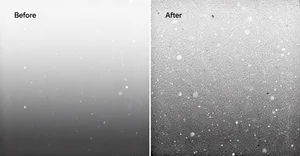
The difference is subtle. That's the point. Professional design is full of invisible improvements that add up to something that just feels right. Grain is one of those invisible upgrades.
Real World Applications That Actually Make Sense
Okay, enough theory. Where do you actually use these gradients?
Hero sections are the obvious choice. That top banner area of a website where you want immediate visual impact without overwhelming the headline. Soft gradients create presence without competing with text.
I've seen gorgeous card backgrounds using atmospheric gradients. Think product cards, blog post previews, testimonial sections. The gradient provides visual interest, the content sits on top cleanly.
Section dividers are another great use case. Instead of harsh horizontal lines separating page sections, use a gradient transition. It guides the eye smoothly from one topic to the next.
Loading screens and empty states benefit hugely from atmospheric gradients. These are moments where users are waiting or when there's no content to display. A beautiful gradient makes that pause feel intentional instead of broken.
Modal backgrounds, form sections, footer areas. Anywhere you need visual distinction without adding heavy design elements, gradients solve the problem elegantly.
The mistake I see people make is using gradients everywhere. They're most powerful when they have space to breathe. Use them strategically. One or two major gradient moments per page. Let the rest of your design stay clean.
Accessibility Considerations You Can't Ignore
Beautiful design that people can't read is bad design. Period.
Gradients create challenges for text readability, especially soft, low contrast gradients. You need to be intentional about maintaining enough contrast between text and background.
The WCAG (Web Content Accessibility Guidelines) standard calls for minimum 4.5:1 contrast ratio for normal text, 3:1 for large text. Test your gradient at multiple points because contrast changes across the transition.
Tools like WebAIM Contrast Checker help, but they test single colors. For gradients, you need to think about the gradient area where text actually sits. If your headline spans a dark to light gradient, which part has the worst contrast? That's your limiting factor.
My approach: add semi transparent overlays behind text. A subtle dark overlay (10% to 30% black) under white text ensures readability across the entire gradient. Or use light overlays under dark text.
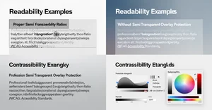
Another technique is restricting text to the darkest or lightest portion of your gradient. Let the gradient flow across the section, but keep all text in the area where contrast is strongest.
And test on actual devices in different lighting conditions. A gradient that looks perfect on your color calibrated monitor might be invisible on a phone in sunlight.
Performance and Loading Optimization
Gradients are generally lightweight, but they're not free. Especially complex, multi layered, animated gradients.
CSS gradients are usually better performing than image based gradients because they're mathematically rendered rather than loaded as files. But complex gradients can still cause rendering strain.
For animated gradients, use will-change property sparingly. It tells the browser to optimize for animation, but overusing it can actually hurt performance. Only apply it to elements that are actively animating.
Consider reducing gradient complexity on mobile. A four layer gradient that's gorgeous on desktop might be overkill on a phone. Use media queries to serve simpler versions to smaller screens.
And watch for the dreaded color banding I mentioned earlier. When gradients have too few color steps, you see visible stripes instead of smooth transitions. Adding grain helps, but you can also increase color stops or use slightly different colors to smooth the transition.
Test on low end devices. Your gradient might render instantly on your MacBook Pro and chug on a three year old Android phone. Real users have real constraints.
What This All Means for Your Next Project
Here's what I've come to believe: soft atmospheric gradients aren't a trend that'll disappear in six months. They're a design language that aligns with how we want to experience digital spaces right now.
We're tired of stark interfaces. We want warmth. Depth. Visual breathing room. Gradients deliver all of that without requiring complex illustrations or heavy image files.
For small business owners building their own sites, atmospheric gradients are a cheat code for looking premium. You don't need design skills to use a gradient generator and pick two complementary colors. But the result elevates your entire presence.
For web designers, mastering subtle gradients separates you from people who rely on templates. This is craft. Understanding color temperature, layering, animation timing, these details matter.
For no code developers, tools like Cliptics Gradient Generators give you professional results without learning complex software. Copy the code, paste it in your builder, done.
The best part? This is accessible to everyone. You don't need expensive software. You don't need to be a color theory expert. You need curiosity, a willingness to experiment, and maybe fifteen minutes to play with settings.
So what are you building? What mood are you trying to create? Which colors speak to your brand or vision?
Those questions matter more than technical perfection. Start there. Pick colors that feel right. Adjust until they flow. Test with real content. Trust your eye.
The cinematic web is here. You're already equipped to create it.