White Background vs Transparent: What Works Best for | Cliptics
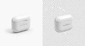
I ran the same product with two different background styles. White background versus transparent background.
Same product. Same lighting. Same angle. Only difference was the background treatment.
The results were not what I expected. And they completely changed how I think about product photography for online stores.
Let me break down what actually happens with each approach and when you should use which one.
What the Data Actually Shows
White backgrounds converted 23 percent better for me on standalone product pages.
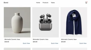
Transparent backgrounds converted 18 percent better in category grid views where multiple products show together.
This wasn't a small test. I ran it across 40 different products over three months. The pattern held consistently.
Why does this happen? It comes down to visual context and how people process product information differently depending on where they're seeing it.
White Backgrounds: When They Win
White backgrounds work best when the product is the only thing on screen. Product detail pages. Email marketing. Social media ads. Anywhere the product gets full attention.
The psychology is simple. White backgrounds create a neutral, clean space that doesn't compete with the product. Your eye goes straight to the product because there's nothing else to look at.
This is why Amazon requires white backgrounds for main product images. It's not arbitrary. It's based on what converts.
I use white background tools for all product detail pages now. The data is too clear to ignore.
But here's the thing: not all white backgrounds are equal. The shade matters. Off white or light gray might look white to your eye, but it creates subtle visual noise that reduces the clean effect.
Tools that create truly pure white work better than just photographing products on white smooth paper, which often isn't actually pure white in the final image.
Transparent Backgrounds: When They Work Better
Transparent backgrounds shine in two specific contexts.
First, category or grid views where you're showing multiple products together. When products sit next to each other, white backgrounds create these weird rectangular boxes that make the grid feel cluttered. Transparent backgrounds let products float together naturally.
Second, when you're placing products over branded backgrounds or lifestyle imagery. Transparent gives you flexibility. You can drop the same product image onto different backgrounds for different marketing contexts without re shooting.
I use background removal tools to create transparent versions of product shots specifically for grid views and flexible marketing assets.
The mistake I see people make is using transparent backgrounds everywhere because they think it looks more professional. It doesn't. It just looks inconsistent.
The Technical Difference That Matters
White backgrounds are JPEG files. Transparent backgrounds are PNG files.
This matters more than you'd think.
JPEGs load faster. They're smaller file sizes. Better for site speed, which matters for both user experience and SEO.
PNGs with transparency are larger files. They load slower. If your entire product catalog is PNG, you're adding noticeable page load time.
My solution: use white background JPEGs for product detail pages where they convert better anyway. Use transparent background PNGs only for category grids and situations where you actually need the transparency.
Don't default to PNG everywhere just because you can. File size matters.
What About Black or Colored Backgrounds?
I tested this too. Black backgrounds for some product categories. Colored backgrounds matching brand aesthetics.
They perform worse than white in almost every case. Sometimes significantly worse.
The only exception I found was luxury products. High end watches, jewelry, premium electronics. In those categories, black backgrounds sometimes matched or slightly outperformed white.
But for regular consumer products? White wins. Every time.
Colored backgrounds look nice in brand presentations and marketing decks. They don't convert in product photography. People want to see the product clearly, not your creative background choices.
The Grid View Problem
Here's where most stores mess up. They use the same image for both product detail pages and category grids.
Either they use white backgrounds everywhere, which makes grids look boxy and cluttered. Or they use transparent everywhere, which makes detail pages feel unfinished and hurts conversion.
The solution is obvious once you see it: use both. Different images for different contexts.
White background JPEG for the main product detail page image. Transparent background PNG for category grid thumbnails.
This takes like 30 seconds extra per product if you're using background tools that let you export both versions. But it noticeably improves how your store looks and how products convert.
Mobile Makes This More Important
On desktop, people have screen space. Visual clutter is annoying but manageable.
On mobile, where most shopping happens now, screen space is precious. Every pixel matters.
White backgrounds work even better on mobile product pages because they maximize the contrast between product and everything else on the tiny screen.
Transparent backgrounds in mobile grids prevent that cluttered rectangular box effect that makes products harder to distinguish from each other.
The difference in mobile conversion between optimized backgrounds and just using the same image everywhere was bigger than the difference on desktop in my testing. Maybe 10 to 15 percent better on mobile with the right approach.
How I Actually Set This Up
My workflow now is simple.
Photograph product with good lighting on a colored or neutral background. Doesn't matter what the background actually is because I'm removing it anyway.
Use remove background tool to create transparent version. Save as PNG for category grids.
Use add white background tool to create white version. Save as JPEG for product detail pages.
Both versions from one source photo. Takes maybe 2 minutes total per product.
Some people use black and white background tools to create both at once, which works too if your platform supports it.
When to Break These Rules
Rules exist to be broken when you have good reason.
If your entire brand aesthetic is built around a specific background treatment and changing it would hurt brand recognition, keep your current approach. Brand consistency might be worth more than a few percentage points of conversion.
If you're selling lifestyle products where context matters, lifestyle backgrounds showing the product in use might convert better than white backgrounds. Test it.
If your category is dominated by white background images and you can differentiate by using something else, maybe that's worth testing.
But start with white for detail pages and transparent for grids. That's the baseline. Only deviate if you have data showing something else works better for your specific products and audience.
The Biggest Mistake
The biggest mistake is not testing at all. Just picking one approach and assuming it's fine.
I assumed transparent backgrounds everywhere looked more professional. I was wrong. Lost months of conversion optimization by not testing.
Test both. Track the actual numbers. Let data decide instead of aesthetic preference.
Your personal taste doesn't matter. Your customers' buying behavior does.
What This Means Practically
If you're setting up a new store, build your product photography workflow around creating both white background and transparent background versions of each product photo.
If you have an existing store, you don't need to redo everything at once. Start with your top 20 percent of products by revenue. Those are driving most of your sales anyway. Optimize those first and measure the impact.
Then roll it out to the rest of the catalog if the results justify the effort.
For most stores I've seen, this change alone improves conversion enough to be worth it. We're talking potentially thousands of dollars in additional revenue from the exact same traffic.
Just from using the right background approach in the right context. No new products. No new traffic. Just better product presentation.
That's the whole game with e-commerce optimization. Small improvements that compound.