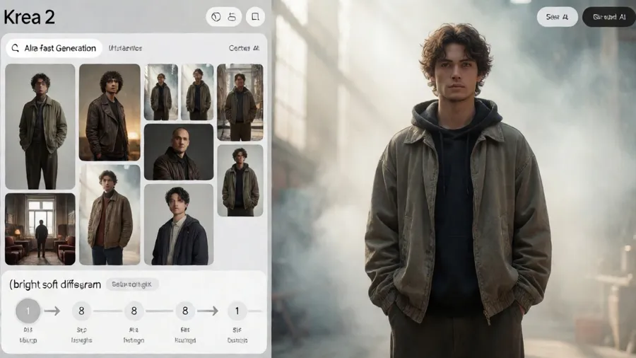
Krea 2 Turbo generates images in 1.8 seconds. That's not a typo. Under two seconds from prompt to finished image.
But here's what nobody tells you: the speed is actually the boring part. What makes Krea 2 different is how it handles style references. Not through prompts. Through moodboards.
I didn't get this at first. I kept writing elaborate style descriptions in my prompts, wondering why they weren't working. Then I realized I was using the tool backwards.
Style References Change Everything#
Traditional AI image models make you describe style with words. "Film noir aesthetic, high contrast black and white, dramatic shadows, 1940s cinematography." You're translating a visual concept into language, and the AI translates it back into visuals. Information gets lost both ways.
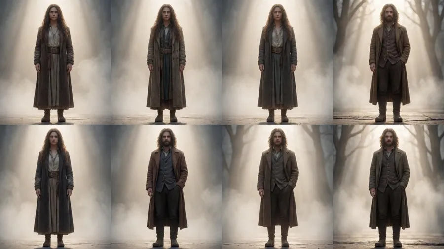
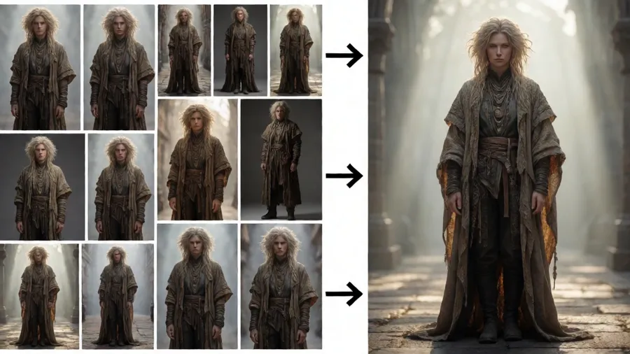
Krea 2 Turbo lets you show the model what you mean. You upload 1-5 reference images, and it learns your style from those. The prompt becomes just the content. The references handle everything else.
I tested this with a simple subject: a woman drinking coffee in a cafe.
First attempt, traditional prompting: "Woman drinking coffee in a cafe, moody atmospheric lighting, cinematic color grading, film photography aesthetic, muted tones, intimate composition."
Result: Generic. The AI guessed at what "moody" and "cinematic" meant, and it guessed differently than I wanted.
Second attempt with style references: Uploaded three film photography examples (warm tones, soft grain, natural window light). Prompt: "Woman drinking coffee in a cafe."
Result: Perfectly matched the feel of my reference images. The lighting, the color palette, the grain, even the compositional choices all aligned.
The difference was dramatic. And it taught me something. Krea 2 wants you to separate what from how. The prompt describes what's in the image. The references show how it should look.
How to Build a Moodboard That Works#
You get up to 5 reference images. Use them wisely.
If all five images share a common visual language, Krea 2 will nail that style. If they're all over the place, the model gets confused and averages them into mush.
Good moodboard: Five product photos with the same lighting setup, same color grading, same background treatment. All shot by the same photographer or in the same style.
Bad moodboard: One vintage film photo, one digital minimalist shot, one oil painting, one anime screenshot, one 3D render. The AI can't figure out what you actually want.
I learned to think of the moodboard as showing the model "this exact visual approach." Not inspiration. Not vibes. Literal examples of how the output should look.
Number of images matters less than consistency. Two highly coherent references beat five contradictory ones.
And you don't need famous examples. Screenshots from your favorite show work. Your own photos work. Stock images that match the aesthetic work. The model doesn't care about pedigree. It cares about visual consistency.
The 8-Step Secret#
Krea 2 Turbo generates in 8 diffusion steps. Most models need 20-50 steps. That's how it gets the speed.
Fewer steps means less refinement. Which sounds bad until you realize that overrefinement is what makes AI images look sterile. That plastic, overly perfect quality comes from too many passes.
8 steps gives you images that feel slightly raw. A touch of randomness. Imperfect in a good way. More like something a person made quickly than something a computer calculated perfectly.
This affects how you prompt. Details that would normally matter a lot (specific fabric textures, exact hair styles, precise object placement) get softened by the quick generation. The model gets the big strokes right and improvises the small stuff.
So I stopped obsessing over micro-details in my prompts. "A man in a suit" works as well as "A man in a charcoal gray wool suit with notched lapels and a burgundy silk tie." The 8-step process can't render that level of specificity anyway.
Focus on composition, subject, environment. Let the style references and the quick generation handle everything else.
Text Rendering Actually Works#
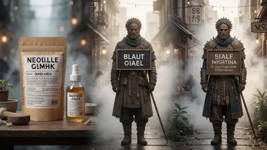
Krea 2 can render readable text. Not perfectly. Not every time. But way better than most models.
If you need a sign, a logo, a label, a book cover with text, Krea 2 has a decent shot at making it legible. The trick is keeping it short and specifying exactly what the text should say.
Bad prompt: "A coffee shop storefront with a sign"
Good prompt: "A coffee shop storefront with a sign that reads BLUE BOTTLE in sans-serif letters"
The model knows what you want and has a target to hit. It won't nail the exact typeface, but it'll get you something readable with those words.
Short text works better than long. One to three words is the sweet spot. Full sentences start getting garbled. And complicated fonts (script, decorative, heavy serifs) fail more often than clean sans-serif or simple serif faces.
I've had good luck with: store signs, product labels, book spines, posters, business cards. Anything where the text is a clear focal point and you can describe what it should say.
I've had bad luck with: handwritten notes, dense paragraphs, stylized logos, text at weird angles. The model tries, but it's not reliable enough to count on.
Speed as a Creative Tool#
Under 2 seconds per image changes how you think. You can test ideas faster than you can fully describe them.
I started treating Krea 2 like a sketch pad. Got an idea? Generate it. See what works. Adjust. Generate again. Do this 10 times in 30 seconds.
That rapid iteration unlocks a different creative process. Instead of carefully planning one perfect image, you explore a concept through multiple quick attempts. The best result often comes from attempt 6 or 7, after you've seen what works and what doesn't.
I keep the same style references loaded and just vary the prompts. Change the subject. Change the composition. Change the action. Each generation shows me a new angle on the same aesthetic.
This works incredibly well for client work. Instead of presenting one option, I can show them 15 variations in the time it used to take to make 3. They pick what resonates. I refine from there.
The speed stops feeling like a gimmick once you internalize it. It becomes the whole workflow.
Prompting Strategy for Krea 2#
After a month of daily use, here's my approach.
Build your moodboard first. Spend time here. Find 3-5 images that genuinely represent the look you want. Make sure they're visually coherent. Load them into Krea.
Write prompts that describe content, not style. Subject, action, setting. Maybe composition if it's specific. But skip all the aesthetic descriptors. The moodboard handles that.
Keep prompts under 50 words. Krea 2 is optimized for speed, which means it's optimized for clarity over complexity. Simple, direct description beats elaborate poetry.
Generate. Look at the result. If the style is wrong, fix your moodboard. If the content is wrong, fix your prompt. If both are right but something feels off, try a different composition or angle.
Iterate fast. Don't overthink it. The model is quick enough to just try things.
What Doesn't Work#
Hyper-realism fails more often than stylized work. The 8-step process doesn't have the resolution time to render perfect skin texture or photo-accurate details. Aim for believable rather than indistinguishable from reality.
Complex multi-subject scenes get messy. Krea 2 excels at clear compositions with one main subject. Add three people interacting with different props in a cluttered environment, and the model starts making mistakes.
Abstract concepts struggle without good references. "Hope" or "melancholy" or "transformation" need visual anchors. Show the model what those look like through your moodboard, or the results will be generic.
Precise brand matching is hit or miss. If you need something that exactly matches corporate guidelines, this isn't the tool. Use it for exploration and then refine elsewhere.
Why This Matters#
Krea 2 Turbo is the first AI image model I've used where the speed actually enables a different way of working. Not just doing the same thing faster, but approaching the whole task differently.
The moodboard system makes visual communication clearer. Instead of struggling to describe an aesthetic, you show examples. That's more natural for most people.
And the combination (fast generation plus visual style control) lets you explore ideas in real time. That's new. That's actually useful.
Wrapping Up#
Krea 2 Turbo wants clean, simple prompts describing content. The style comes from your reference images, not your words. Keep your moodboard visually consistent. Use the speed to iterate fast and explore variations. Expect slightly rough results that feel alive rather than overpolished.
The sub-2-second generation isn't just impressive. It's functional.