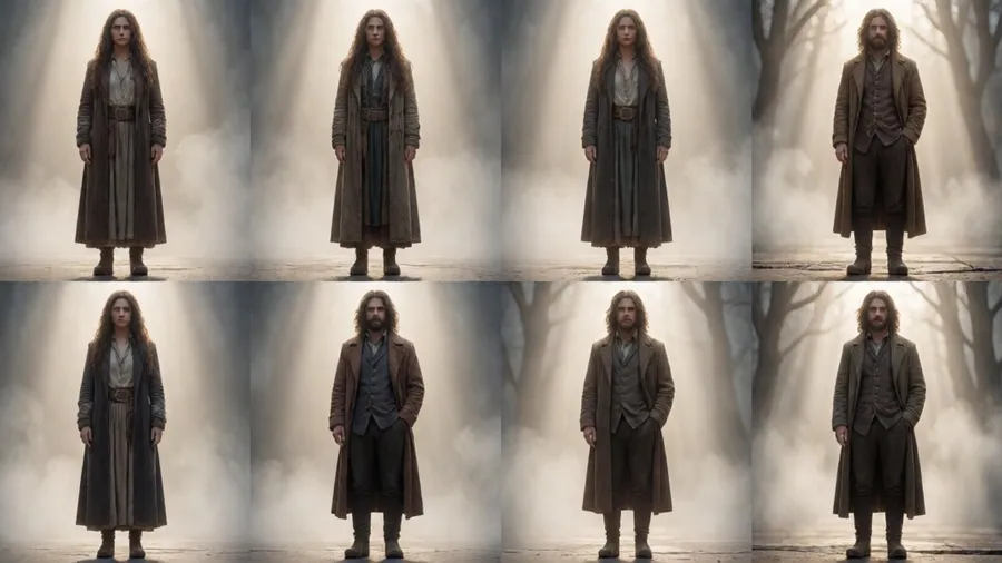
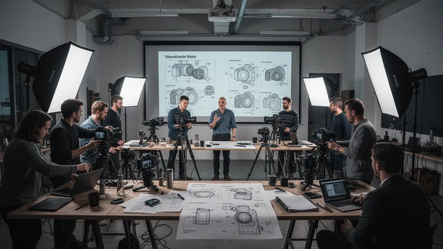
A creative director I know stopped using stock photography completely last year. Everything she needs now comes from AI generation. Not because it's faster or cheaper, though it is both. Because she can finally get exactly what she envisions without compromise.
When I asked her how she got that good at prompting, she said something that stuck with me: "I stopped thinking about prompts as instructions for AI. I started thinking about them as descriptions a photographer would give their team before a shoot."
That shift in perspective changes everything.
This is the guide I wish I'd had when I started. Not model-specific tricks. Universal photography fundamentals that make any AI image model produce professional results.
The Three Pillars: Lighting, Composition, Camera#
Every professional photograph is built on these three foundations. Master them, and your AI prompts will work across FLUX, Midjourney, Stable Diffusion, or whatever model comes next.
They're universal because they're based on physics and human perception, not software. Light behaves the same way whether captured by a camera sensor or generated by an algorithm. Composition principles that work in painting work in photography work in AI images.
Learn the language once, use it everywhere.
Lighting: The Foundation#
Light does three things in an image: reveals form, creates mood, and directs attention. Control those three, and you control the emotional impact.
Direction and Quality#
Light direction describes where it's coming from relative to the subject.
Front lighting: Light source behind the camera, illuminating the subject evenly. Flattens form, minimizes texture, creates a clean commercial look. "Soft front lighting for even illumination."
Side lighting: Light from 90 degrees to the subject. Emphasizes texture and dimension through shadows. Dramatic. "Hard side lighting from the left, creating deep shadows on the right side."
Back lighting: Light source behind the subject. Creates silhouettes or rim light. Atmospheric and dramatic. "Strong backlight creating a rim of light around the subject's edges."
Top lighting: Light from above. Can be flattering (soft and diffused) or harsh (direct overhead). "Soft overhead lighting like overcast daylight."
Bottom lighting: Light from below. Unnatural and eerie unless motivated by a visible source. "Motivated bottom light from a campfire glow."
Quality matters as much as direction.
Hard light: Creates sharp, defined shadows. Direct sunlight, small light sources. Dramatic, high contrast. "Hard direct sunlight creating crisp shadows."
Soft light: Creates gradual, feathered shadows or no shadows at all. Overcast skies, large diffused sources. Flattering, gentle. "Soft diffused light from a large window."
Describe both. "Soft side lighting from a window, creating gentle shadows that define the face."
Lighting Ratios#
The ratio between key light (main) and fill light (shadow fill) controls mood.
High ratio (8:1 or more): Deep, dramatic shadows. Film noir, mystery, intensity. "High contrast lighting with minimal fill, deep shadows on the unlit side."
Medium ratio (4:1 to 8:1): Dimensional but not dramatic. Editorial, portrait work. "Moderate contrast with subtle fill light softening shadows."
Low ratio (2:1 to 4:1): Soft, open shadows. Beauty, commercial, approachable. "Low contrast with strong fill light, minimal shadow depth."
Color Temperature#
Light has color, measured in Kelvin. This controls the emotional temperature of your image.
Warm (2700K to 4000K): Orange, red, golden tones. Cozy, intimate, nostalgic. Candlelight, golden hour, tungsten bulbs. "Warm 3200K tungsten lighting creating amber tones."
Neutral (4000K to 5500K): White, balanced. Professional, clean, honest. Daylight, flash. "Neutral daylight color temperature, 5500K."
Cool (5500K to 8000K+): Blue, teal tones. Clinical, modern, melancholic, or fresh. Overcast skies, shade, blue hour. "Cool 6500K light with blue tones, like open shade."
Mixing temperatures creates visual interest. "Warm tungsten interior light contrasting with cool blue twilight visible through windows."
Composition: Directing the Eye#
Composition controls where viewers look and in what order. These rules are guidelines, not laws. But know them before you break them.
Rule of Thirds#
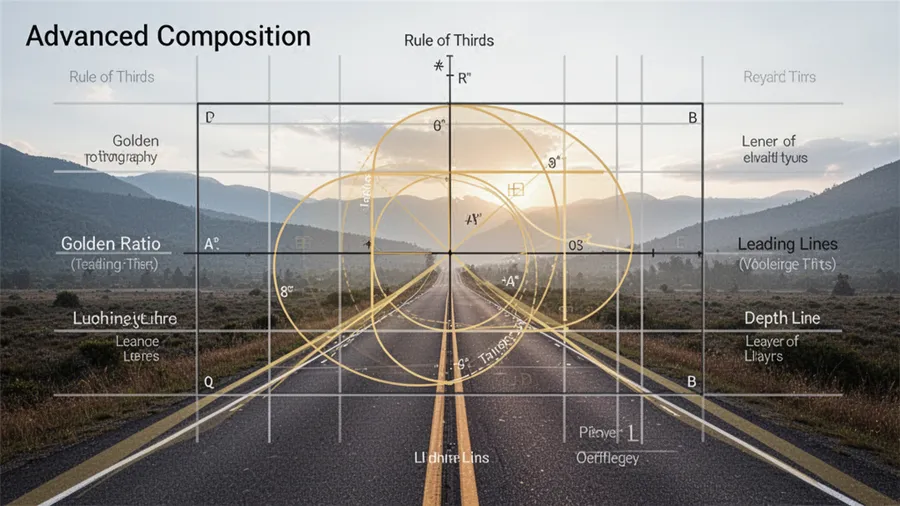
Divide the frame into a 3x3 grid. Place important elements at the intersections or along the lines. This creates balanced but dynamic compositions.
"Subject positioned at the right third intersection, looking into the empty left two-thirds of the frame."
The negative space (empty area) becomes as important as the subject.
Leading Lines#
Use natural or architectural lines to guide the eye toward the subject. Roads, fences, architectural elements, natural contours.
"Railway tracks leading the eye from the foreground to the subject in the background center."
Lines create depth and narrative direction.
Depth and Layering#
Organize elements into foreground, midground, and background layers. This creates three-dimensional feeling in a two-dimensional image.
"Foreground: Blurred flowers frame the bottom. Midground: Subject in sharp focus. Background: Soft bokeh of distant trees."
Describe each layer's content and focus level.
Framing#
Use environmental elements to create frames within the frame. Doorways, windows, archways, tree branches.
"Subject framed by a doorway, the door frame creating a natural vignette around them."
This draws attention to the subject and adds context.
Negative Space#
Empty space around the subject. Minimalist compositions use this heavily. It creates breathing room and emphasis.
"Subject occupies only the right third, large area of empty sky in the left two-thirds creating minimalist feel."
Less can be more powerful than more.
Camera Language: Technical Control#
Camera choices affect perspective, depth, and the relationship between elements.
Focal Length#
This is probably the single most impactful technical choice.
14mm to 24mm (Ultra-wide): Exaggerated perspective. Close objects huge, distant objects tiny. Environmental context, dramatic space. "Shot with 20mm ultra-wide lens, exaggerating depth and space."
35mm (Wide normal): Slight environmental context, natural perspective. Street, documentary, editorial. "35mm lens for natural perspective with environmental context."
50mm (Normal): How human eyes see. Neutral, versatile, truthful. "50mm standard lens, neutral perspective."
85mm to 135mm (Portrait telephoto): Compressed perspective. Flattering for faces. Isolates subjects from background. "85mm portrait lens, compressing background and isolating subject."
200mm+ (Telephoto): Extreme compression. Distant subjects appear close together. Sports, wildlife, isolation. "200mm telephoto creating strong background compression."
Longer focal lengths narrow field of view and compress depth. Wider focal lengths expand field of view and exaggerate depth.
Aperture and Depth of Field#
Aperture controls how much is in focus.
f1.4 to f2.8 (Wide open): Extremely shallow depth of field. Subject sharp, background melts into creamy bokeh. Cinematic, dreamy, isolating. "Shot at f1.8 for razor-thin depth of field, subject's eyes sharp while nose and ears soft."
f4 to f5.6 (Medium): Moderate depth. Subject in focus, background recognizable but soft. Balanced. "f5.6 for moderate depth, subject sharp with background gently blurred."
f8 to f11 (Deep): Large depth of field. More in focus from foreground to background. Landscapes, architecture, documentary. "f11 for deep depth of field keeping foreground and background sharp."
f16+ (Maximum): Everything sharp. Landscapes, technical photography. "f22 for maximum sharpness throughout the entire frame."
Describe focus depth relative to what matters. "Shallow depth of field with the product label sharp and packaging edges soft."
Perspective and Angle#
Where you place the camera relative to the subject changes meaning.
Eye level: Neutral, honest, equal relationship with subject. "Eye-level perspective, camera height matching subject's eyes."
Low angle (looking up): Makes subject appear powerful, imposing, heroic. "Low angle shot looking up at subject, making them appear dominant."
High angle (looking down): Makes subject appear vulnerable, small, or provides god's-eye view. "High angle shot looking down, showing subject in context of their environment."
Dutch angle (tilted horizon): Creates tension, unease, dynamic energy. "15-degree Dutch angle creating visual tension."
Bird's eye (directly overhead): Graphic, pattern-focused, removes normal perspective. "Directly overhead bird's eye view, flattening perspective."
Putting It All Together#
Professional prompts layer these elements deliberately. Here's a full example breakdown:
"Editorial portrait of a chef in a professional kitchen. Shot with an 85mm lens at f2.0, creating shallow depth of field that keeps the chef sharp while the kitchen behind them blurs into recognizable but soft context. Lit with motivated practical lighting from overhead kitchen fixtures and a soft fill bouncing from the stainless steel surfaces, creating a documentary realism aesthetic with warm 3200K color temperature. Low angle shot, positioning the camera slightly below eye level to convey authority and mastery. Composed using the rule of thirds with the chef positioned at the right intersection point, their gaze directed toward the left third creating visual balance. Foreground shows soft-focus cooking equipment, midground is the chef in sharp focus, background shows the blurred but visible kitchen environment."
That's 130 words covering:
- Subject and context
- Focal length and aperture (85mm, f2.0)
- Depth of field strategy
- Lighting (motivated overhead, soft fill, color temp)
- Camera angle (low)
- Composition (rule of thirds, gaze direction)
- Layering (foreground, mid, background)
Every element serves the goal: authoritative chef portrait with professional kitchen context.
Advanced Color Theory#
Beyond color temperature, color relationships create mood and visual harmony.
Complementary colors: Opposite on the color wheel. High contrast, vibrant. Orange and teal (film look), red and green, yellow and purple. "Complementary orange and teal color palette, warm subject against cool background."
Analogous colors: Adjacent on the wheel. Harmonious, cohesive. Greens and blues, reds and oranges. "Analogous warm palette using red, orange, and yellow tones."
Monochromatic: Variations of a single hue. Unified, sophisticated. "Monochromatic blue palette ranging from navy to powder blue."
Color accents: Mostly neutral with one pop of color. Directs attention. "Desaturated muted tones with a single bright red accent drawing the eye."
Film and Digital Aesthetics#
Reference film stocks and digital rendering for specific looks.
Kodak Portra 400: Warm, muted, pastel skin tones. Wedding, portrait classic. "Color graded like Kodak Portra 400 film, warm muted tones with gentle pastel quality."
Fuji Velvia: Saturated, punchy colors. Landscape classic. "Fuji Velvia aesthetic, highly saturated greens and blues."
Kodak Tri-X: Classic black and white with grain. Photojournalism. "Black and white with Kodak Tri-X grain structure, high contrast."
Digital clean: No grain, perfect sharpness. Modern commercial. "Clean digital rendering, no film grain, tack sharp."
Cinematic grading: Teal shadows, orange highlights. Modern film look. "Cinematic color grading, teal and orange, with lifted blacks and subtle desaturation."
Workflow: From Concept to Execution#
-
Define the goal: What is this image for? What should it communicate?
-
Choose the composition: How should elements be arranged to support the goal?
-
Design the lighting: What mood does it need? What lighting creates that?
-
Select camera treatment: What focal length and aperture serve the composition and lighting?
-
Add color strategy: What color palette reinforces the mood?
-
Write the prompt: Layer these decisions into clear description.
-
Generate and evaluate: Did it work? What needs adjustment?
-
Iterate: Refine based on results.
This process works regardless of model.
Common Expert-Level Techniques#
Environmental storytelling: Use background details to add narrative without explicitly stating them. "Background shows well-worn tools and personal photographs, suggesting years of dedication."
Motivated lighting: Every light source should have a logical reason to exist in the scene. "Visible desk lamp provides the key light, window on the left adds fill, creating realistic motivated lighting."
Atmospheric perspective: Distant elements appear more muted and blue due to atmospheric haze. "Foreground sharp and saturated, background progressively desaturated and blue-shifted through atmospheric haze."
Chiaroscuro: Extreme contrast between light and dark for dramatic effect. Caravaggio paintings, film noir. "Chiaroscuro lighting with deep blacks and bright highlights, minimal midtones."
The Only Rule That Matters#
All of these techniques serve one purpose: effective visual communication. If breaking a rule tells the story better, break it. If simpler is clearer, go simpler.
The difference between amateur and professional isn't following more rules. It's making conscious choices and executing them clearly.
Wrapping Up#
Pro-level AI prompts apply photography fundamentals. Master lighting (direction, quality, ratio, color temp), composition (rule of thirds, leading lines, depth, negative space), and camera language (focal length, aperture, perspective). Layer these elements deliberately. Describe what a professional photographer would execute on set. The model isn't magic. It's a tool that responds to clear, informed direction.
Learn photography. Apply it to AI. That's the whole masterclass.