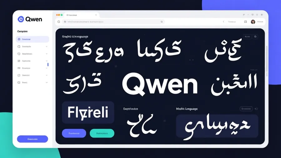
Every AI image model I've used treats text as a problem to barely tolerate. You ask for a sign that says "OPEN" and get "OPĖN" or "ØPƎN" or sometimes just artistic squiggles that vaguely suggest letters.
Qwen Image is different. It can actually render text. Real, readable text. In multiple languages.
I didn't believe this until I tested it myself. Generated a product label with English and Chinese text, and both were legible. Not perfect. But legible. That's a completely different category of capability.
If you need text in your AI images (product mockups, marketing materials, social media graphics, signage, book covers), Qwen Image is currently the only model that can reliably deliver.
What Makes Text Work in Qwen#
Most image models treat text as just another visual element. They see letters as shapes and try to approximate those shapes based on what they've seen before. That's why you get gibberish. The model doesn't understand that letters form words with meaning.
Qwen Image has a text-rendering module built into its architecture. It knows what words are. It knows how to compose readable glyphs. It understands spacing, alignment, and basic typographic principles.
This fundamentally changes what you can ask for.
Bad prompt for most models: "Coffee shop sign with the text BLUE BOTTLE COFFEE"
Same prompt for Qwen: Actually works. You'll get readable text that says approximately what you asked for.
The difference is staggering. I spent an entire afternoon generating mockups for a client that would have required Photoshop work with any other model. Qwen handled it directly.
How to Prompt for Text#
The formula is simple but specific. Tell Qwen exactly what text you want, where it should appear, and what it should look like.
Structure: [Image description], [text content in quotes], [text style and placement]
Example: "A vintage coffee shop storefront with a hanging sign above the door. The sign reads 'DAILY BREW' in serif letters painted in cream color on dark green background. Below the main sign, a smaller chalkboard reads 'Fresh pastries' in handwritten style."
That level of specificity gets you results. If you just say "a coffee shop with signs," Qwen will add text, but it'll guess at the content and style.
Always put the actual text in quotes. This signals to the model that these specific words matter, not just word-shaped decorations.
Describe the typography. Sans-serif, serif, script, handwritten, bold, thin, uppercase, lowercase, modern, vintage. These terms guide the text appearance.
Specify placement. "At the top," "centered on the package," "in the upper left corner," "running along the bottom edge." Spatial precision helps.
Multi-Language Text#
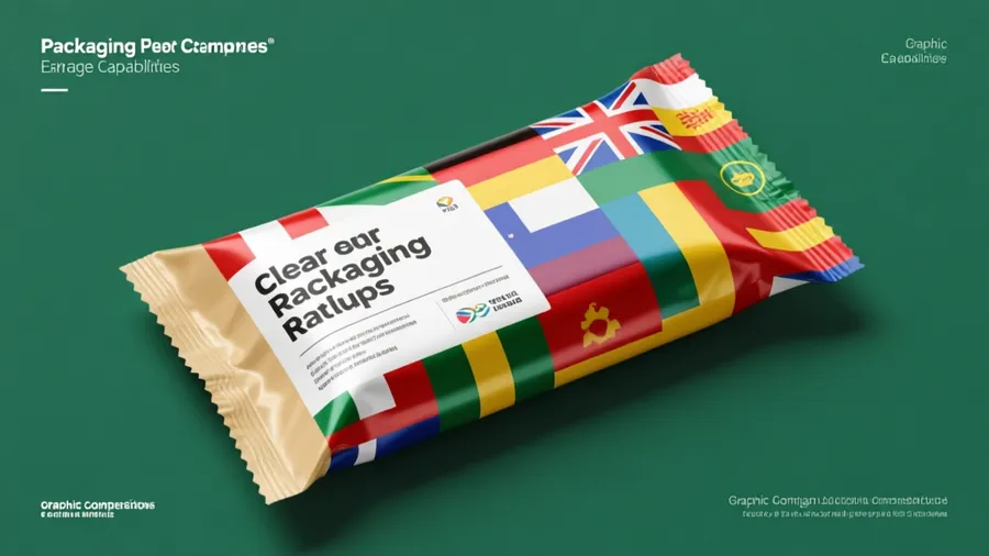
Qwen Image handles Chinese exceptionally well. Makes sense given its origin. But it also manages English, Japanese, Korean, and several other languages with varying degrees of success.
For Chinese text, I've had near-perfect results. The characters are crisp, correctly formed, properly spaced. This is huge for anyone creating content for Chinese-speaking markets.
For bilingual designs, describe both text elements separately.
Example: "Product packaging for tea. The front panel shows '龙井茶' in large traditional Chinese characters at the top. Below that, 'LONGJING GREEN TEA' in English sans-serif capitals. Minimalist design with cream background and subtle botanical illustration."
I tested this exact prompt. Got a beautiful package mockup with both text elements readable and properly integrated into the design.
For English, keep it short. One to five words works consistently. Full sentences start degrading. Paragraphs fail completely.
For non-Latin scripts (Arabic, Thai, Hindi), results are inconsistent. Sometimes perfect, sometimes garbled. Test before relying on it.
Spatial Composition Control#
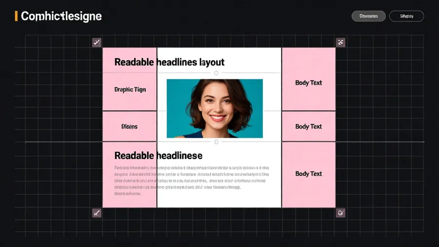
Qwen responds well to layout terminology. If you're familiar with graphic design principles, use them.
Visual hierarchy: Describe what's primary, secondary, tertiary. "The word SALE in huge bold letters dominates the top half. Below that, smaller text reads 'Up to 50% off' in a subtle serif font."
Grid-based layouts: "Centered composition with the product name in the middle third. Tagline in the bottom quarter. White space in the top half."
Alignment: Left-aligned, right-aligned, centered, justified. Qwen understands these and will compose accordingly.
Text zones: Imagine the image divided into regions and place text deliberately. "Upper left corner for logo text, center for headline, bottom strip for fine print."
I started thinking of prompts like wireframes. Where does each text element live? What size relative to other elements? What's the reading order?
This level of control isn't perfect, but it's shockingly good compared to other models.
Text Style Vocabulary#
Qwen responds to specific typographic descriptions.
Font categories: Sans-serif (clean, modern, minimal), serif (traditional, formal, readable for body text), script (flowing, elegant, decorative), display (bold, attention-grabbing, headlines), monospace (technical, code-like).
Weight and style: Thin, light, regular, medium, bold, black, italic, condensed, extended.
Era and aesthetic: Victorian ornate, Art Deco geometric, mid-century modern, brutalist, contemporary minimal, grunge distressed, retro 80s.
Application context: Magazine headline, product label, hand-painted sign, neon signage, embossed leather, screen-printed poster.
The more specific you are, the better Qwen matches your intent.
Example: "Poster for a jazz concert. The word 'JAZZ' in large Art Deco style letters, geometric and bold, gold color. Below that, 'Live at Blue Note' in elegant script font, smaller and white."
Got exactly that. The Art Deco letters had the right geometric character. The script was appropriately refined. Both were readable.
What Works Best#
Short text. One to three words per text element is the sweet spot. You can push to five or six, but accuracy drops.
High contrast. White text on dark background or dark text on light background. Avoid low-contrast combinations where text bleeds into the background.
Clean backgrounds. Simple, uncluttered areas make text more readable. If you want text over a complex image, describe a clear zone for it. "Text appears on a white banner overlaying the photo."
Standard orientations. Horizontal or vertical text works great. Diagonal, curved, or warped text fails more often.
Typography that matters. If the exact font choice is critical to your brand, Qwen probably won't nail it. But if you need "modern sans-serif" or "classic serif," that level of description works.
Common Problems and Fixes#
Misspellings: Qwen gets close but sometimes swaps letters. Generate multiple times. One will usually be correct.
Extra decoration: Sometimes adds flourishes or design elements you didn't ask for. Be explicit: "Clean text only, no decorative elements around the letters."
Wrong placement: If text appears in the wrong spot, be more specific about location. Use directional terms and spatial references.
Inconsistent results: Text generation has more variance than other elements. Generate 3-5 times and pick the best one.
Small text fails: Anything that would be smaller than about 10% of the image tends to degrade. Keep text large enough to be a focal point.
Practical Use Cases#
I've used Qwen Image successfully for:
Product mockups with brand names and descriptions. Labels, packaging, boxes.
Social media graphics with headlines and quotes. Instagram posts, Facebook covers, Twitter headers.
Book covers with titles and author names. The text is readable and integrated into the cover art.
Menu designs with dish names and prices. Restaurant menus, cafe boards.
Signage concepts. Storefronts, wayfinding, environmental graphics.
Poster designs with event information. Concert posters, movie posters, exhibition announcements.
What doesn't work: business cards (too much small text), infographics (too text-heavy), long-form content (more than a sentence).
Prompting Strategy#
Start with the overall image concept. Setting, subject, composition, style.
Add text elements one at a time. For each piece of text, specify the content in quotes, the style, and the position.
Describe the visual relationship between text and image. Is the text overlaying the image? Is it on a separate element like a banner or label? Does it interact with the subject?
Keep text large and prominent. Don't try to pack multiple text elements into one image unless they're clearly separated.
Generate multiple variations. Text rendering isn't 100% consistent. You'll get usable results within 3-5 attempts.
Example full prompt: "Minimalist product photography of a skincare bottle on a white background. The bottle is matte black glass. The label reads 'PURE' in thin sans-serif capitals at the top, and 'Hydrating Serum' in smaller serif text below. Clean, modern, high-end aesthetic. Soft diffused lighting from the left."
That gives Qwen everything it needs. Subject, context, text content, text style, placement, and overall aesthetic.
Why This Matters#
Text in images is everywhere. Brands, marketing, social media, publishing. Being able to generate images with readable text eliminates a huge bottleneck.
Before Qwen, you'd generate an image and then add text in Photoshop or Canva. Now you can get both in one step. That's genuinely faster.
And for multilingual content, especially English and Chinese, Qwen is the only option that works reliably.
Wrapping Up#
Qwen Image is the text rendering model. Keep text short, put it in quotes, describe the typography and placement, and use high contrast. Multi-language support (especially Chinese) is excellent. Spatial composition vocabulary helps control layout. Generate multiple versions to find the cleanest text.
If your AI images need readable text, use Qwen. Nothing else comes close right now.